


 Reply With Quote
too much different colors?
Thread: Just Dance v2.
Results 1 to 12 of 12
-
08-25-2011 #1Expert Member


- Join Date
- Apr 2009
- Gender

- Posts
- 742
- Reputation
 23
23- Thanks
- 51
- My Mood
-


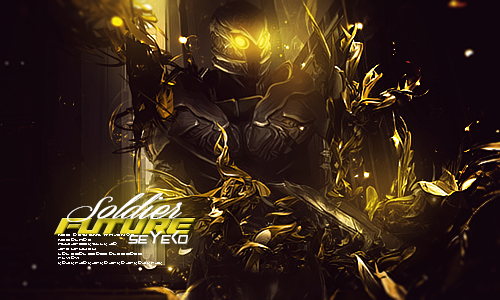
Just Dance v2.
v1.
[IMG]https://i784.photobucke*****m/albums/yy121/SeYeKo-/JustDance.png[/IMG]
v2.
[IMG]https://i784.photobucke*****m/albums/yy121/SeYeKo-/JustDance-1.png[/IMG]
/discuss
-
08-25-2011 #2Hollywood Undead's Bitches.


- Join Date
- Jun 2010
- Gender

- Location
- Posts
- 4,811
- Reputation
- 306
- Thanks
- 398
- My Mood
-

I see what you did there.
-
The Following User Says Thank You to Da Kurlzz For This Useful Post:
ARHQA$Y$YW4AYG4y (08-26-2011)
-
08-25-2011 #3Brony

- Join Date
- Feb 2009
- Gender
- Location
- Posts
- 3,966
- Reputation
- 31
- Thanks
- 423
- My Mood
-

Previous lighting better, text is worse.
-
08-25-2011 #4Banned


- Join Date
- Jul 2010
- Gender
- Location
- Posts
- 1,878
- Reputation
- 69
- Thanks
- 119
- My Mood
-


Compo ?
-
08-25-2011 #5MPGH King

- Join Date
- Aug 2008
- Gender
- Location
- Posts
- 6,380
- Reputation
- 149
- Thanks
- 855
Keep original, I'd like to have the PSD and see if I can maybe fix this up a bit if that's fine with you.
-
08-25-2011 #6Blackhat Hacker

- Join Date
- Mar 2011
- Gender
- Posts
- 1,846
- Reputation
- 150
- Thanks
- 361
- My Mood
-


While on the other hand fecher's didn't appeal to my eyes very much the text which, totally unessecary, was included isn't executed very well and not easy on the eyes to look at and understand what the text says it has too much going on
Also the way the lighting was done was in a very simplistic way and at least to me doesn't look real it looks like something is casting a shadow over everything
I think the colors are too demanding trying to incorporate so many different colors and not using them tactically, most times, look bad and this was the case here there is too large of a range of colors that don't really work well with each other
Adding this to how there is no depth and how simply blurring a background isn't enough to achieve a good perception of depth in a tag I don't really like it very much personally but I would have to say that it has some good parts like the composition the composition in the piece is definitely good though that's not fundamental enough to make the piece good
This
-
The Following User Says Thank You to Keroaplt For This Useful Post:
ARHQA$Y$YW4AYG4y (08-26-2011)
-
08-26-2011 #7Banned
- Join Date
- Jan 2011
- Gender
- Posts
- 4,999
- Reputation
- 20
- Thanks
- 364
- My Mood
-


Low quality. Too much going on and it's hurting my eyes.
-
08-26-2011 #8LIL ADMIN, R.I.P. LIL DAVE


- Join Date
- Feb 2011
- Gender
- Location
- Posts
- 40,134
- Reputation
 4764
4764- Thanks
- 9,674

v2.
I love the "graffiti" style.[ ] [ ] [ ] [ ][ ]
Editor from 06142011 2014
Donator since 09162011
Minion from 10102011 01062011
Minion+ from 01062012 08082012
Moderator from 08082012 10062012
Global Moderator from 10062012 12052017
Staff Administrator from 12052017 05012019
Trusted Member since 07132019
Global Moderator since 09112020

-
The Following User Says Thank You to Hero For This Useful Post:
fecher (08-26-2011)
-
08-26-2011 #9Banned

- Join Date
- Aug 2011
- Gender
- Location
- Posts
- 999
- Reputation
 -1
-1- Thanks
- 344
- My Mood
-


@fecher Choose the first with the write of the second, and put sekero upper of the left arm of the dancer (up-right)
-
The Following User Says Thank You to [G]enesis For This Useful Post:
fecher (08-26-2011)
-
08-26-2011 #10
ThreadstarterExpert Member
- Join Date
- Apr 2009
- Gender
- Posts
- 742
- Reputation
- 23
- Thanks
- 51
- My Mood
-
 Originally Posted by Ryguy
 Here you go
https://www.m-e-d-i-a-f-i-r-e.com/?p17o7vhe58auk5k
take out the "-" in the urlLast edited by fecher; 08-26-2011 at 11:03 AM.
-
08-26-2011 #11Banned
- Join Date
- Aug 2011
- Gender
- Posts
- 1,599
- Reputation
- 2
- Thanks
- 68
- My Mood
-
v1 looks REAL
v2 Little bit of fake/cartoonish (hand, pants, etc.)
-
The Following User Says Thank You to Zeused For This Useful Post:
fecher (08-26-2011)
-
08-26-2011 #12
ThreadstarterExpert Member
- Join Date
- Apr 2009
- Gender
- Posts
- 742
- Reputation
- 23
- Thanks
- 51
- My Mood
-
Originally Posted by Heath Ledger
Yeah it was the type of layer i put it on, i think vivid light ^^ i thought it looked pretty cool ( personal preference ) then fixed the lighting in v2 and put some more affects and use the dodge and burn took on some of the background and effects.

Similar Threads
-
I JUST WANNA LEARN THIS DANCE!!!
By fecher in forum GeneralReplies: 13Last Post: 09-23-2011, 04:35 PM -
Just a Screenshots
By WertyRO in forum Gunz GeneralReplies: 4Last Post: 02-20-2006, 12:22 AM -
just listen
By wannabehacker00 in forum WarRock - International HacksReplies: 8Last Post: 02-08-2006, 10:00 AM -
Just read this i need help
By wannabehacker00 in forum WarRock - International HacksReplies: 4Last Post: 02-06-2006, 03:00 PM -
Just Finished
By Flawless in forum Art & Graphic DesignReplies: 11Last Post: 12-28-2005, 07:04 PM