


 Reply With Quote
This one is a flop imo.
First, you repeated (again...) the mistake of submerging the focal point (a render in this case) into many other chaotic components.
Second, the colors are sharp (too sharp as well in some areas, such as bottom left and top right), very bright and with a little transition between darkness and brightness. Essentially lighting is composed of colored bright stains. Which is bad.
In this one, the depth is kind of screwed up as well: after finally noticing there's someone pointing his/her hand at me, there are quite a few parts of the image whose depth is hard to understand.
For example, the yellow disk at the bottom left of the image, or the whole top right part of the image.
Of course, the background is blurred so it's clear it's behind everything, but the other parts tend to get mixed way too much.
The only thing i actually like are the particles at the bottom right corner...the, yknow, little blue dots and blurred yellow stripes...
In short: many places are over sharpened, the color is not well distributed by using very bright color stains, depth is hard to understand unless i stare at the image for a prolonged amount of time and the focal point is immersed with extraneous components.
Plus, something that is completely unrelated to the artwork you've made, i'm a tad tired of being mentioned left and right, i'm sure a few others are as well.
You really should work on how to behave with others, such as when someone criticizes poorly your work (we've seen it happen recently) or when you ask for advice on Skype (and you know what i'm talking about here).
Of course, anything i haven't mentioned is absolutely fine compared to your usual standards, which is why i haven't mentioned such things.
Thread: Kudoclasm
Results 1 to 9 of 9
-
12-12-2015 #1


- Join Date
- Mar 2014
- Gender

- Location
- Posts
- 5,529
- Reputation
 1371
1371- Thanks
- 1,618
- My Mood
-


Kudoclasm
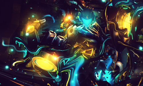
CnC please!
@Democritus @IV2B @Color @Etheral @Mokou-Sama @I Don't Love You @Etheral @EgoRaptor @Doc @HalfBajan @Hova @LogicLast edited by Fucking Moron; 12-12-2015 at 02:49 PM.
-
12-12-2015 #2
ヽಠ_ಠᕤ Headrockin' ᕦಠ_ಠ╯ 

- Join Date
- Jan 2011
- Gender
- Posts
- 1,163
- Reputation
 101
101- Thanks
- 229
- My Mood
-


-
The Following User Says Thank You to IV2B For This Useful Post:
Vader (12-17-2015)
-
12-12-2015 #3
Threadstarter
- Join Date
- Mar 2014
- Gender
- Location
- Posts
- 5,529
- Reputation
- 1371
- Thanks
- 1,618
- My Mood
-
 Originally Posted by IV2B

I'm tired of you not knowing anything about C4D Style.
This piece is actually well executed.
Sure the depth isn't the best, and some other things aren't
But when again was the last time you contributed a piece to this section?
And the lighting is spot on except for like maybe 1 place., are you just blind?
No offense but I get CnC from people who have been doing gfx for 3-10 years and it's not even close to what you say.
And just a fyi
This isn't even one of the 3 I showed you on skype
Last edited by Fucking Moron; 12-12-2015 at 04:12 PM.
-
12-12-2015 #4


- Join Date
- Feb 2011
- Gender
- Location
- Posts
- 6,840
- Reputation
- 1772
- Thanks
- 1,305
- My Mood
-

Same colors as many other pieces, try to expand the color scheme a bit.
The picture is a bit confusing in terms of how it looks/what it is.there's nothing left for you here.
-
12-12-2015 #5
ヽಠ_ಠᕤ Headrockin' ᕦಠ_ಠ╯
- Join Date
- Jan 2011
- Gender
- Posts
- 1,163
- Reputation
- 101
- Thanks
- 229
- My Mood
-
First, you can stay tired, i do not care if you are. Originally Posted by Organized Chaos
Second, i never said the piece is not well executed, i said it's below your standard.
Third, i do not need to create my own artwork to share my opinion, i am not an artist, nor i plan to be, as i chose to become a programmer and that is what i'm aiming to become as of now. Still, i know enough of these kind of images to give an educated insight.
Fourth, yes, i think the lighting is not spot on. There are artifacts around the image (such as the cut flare in front of a finger) and in quite some spots the light is simplified to a blur. But that wasn't even my problem with the lighting, the issue is that it's not smooth at all in that department, many very bright areas are next to very dark ones. Want to call it an issue with "color correction" instead of "lighting"? Sure, if it makes you feel better then go for it.
Lastly, oh boy, i'm sorry if my opinion isn't equal to other people's opinion, i hope that didn't hurt your feelings.
P.s.
https://orig07.deviantart.net/266a/f/...cs-d9jwf1k.png
Oh dayum son, much improvement, very difference. Sorry if i didn't notice that you blurred the lights a little while making the background a little less dark.
That truly was a display of mastery in the use of basic filters to slightly modify your image.
-
12-12-2015 #6
Threadstarter
- Join Date
- Mar 2014
- Gender
- Location
- Posts
- 5,529
- Reputation
- 1371
- Thanks
- 1,618
- My Mood
-
Originally Posted by IV2B
Those are the 2 versions on my DA
-
12-12-2015 #7


- Join Date
- Dec 2008
- Gender

- Location
- Posts
- 24,316
- Reputation
- 3869
- Thanks
- 5,890
- My Mood
-


100% agree with @IV2B
Too contrasted, way too dark for something that has soo many light sources.
The dudes head has lost most of it's detail due to the soft brushed blue lighting.
Despite the hand being in the foreground, your eyes can only focus on the squiggly C4D's that you're using.
You can say it's all part of the style, but with every style there is good execution and there is bad execution. This was executed badly.
Your previous pieces were better than this. I also think you need to work with higher quality renders and focus on enhancing those rather than covering them up.THE ABSOLUTE GREATEST


-
12-12-2015 #8


- Join Date
- Aug 2012
- Gender
- Posts
- 19,896
- Reputation
- 2588
- Thanks
- 7,864
- My Mood
-


Again I have a hard time focusing on what I was looking at, if you want a image that has the possibility to get a lot of things going on with it make sure that the original piece is still visible and when you're done it looks clean. Again it's messy and I agree with Doc that your previous pieces were done better.
Last edited by Color; 12-12-2015 at 08:34 PM.
Muh Tumblr (NSFW)
Click HERE to join the Night Owls if you stay up late on MPGH
Anime Recommendation (3/14/15) | Manga/Manhwa Recommendation (8/20/15)
^ I'll update one of these soon I swear ^
Member Since 8/05/2012
Editor 4/04/13 - 4/21/13
Middleman 7/14/13 - 11/4/13
Battlefield Minion 6/13/14-3/20/15
Steam Minion 7/16/14-3/20/15
Minion+ 10/1/14-3/20/15
M.A.T. Minion 10/19/14-3/20/15
ROTMG Minion 1/14/15-3/20/15
Donator Since 2/26/15 (Thanks @Cursed!)
Steam Minion 5/9/15 - 11/5/15
OSFPS Minion 9/15/15 - 11/5/15
-
12-13-2015 #9Do not Trade - Blacklisted
Permanently 

- Join Date
- Sep 2010
- Gender
- Location
- Posts
- 10,088
- Reputation
- 515
- Thanks
- 690
- My Mood
-

I think it's over contrasted and there is too many lights randomly placed. But you didn't damage the color scheme, which is good.
Overall 7/10 loads of issues wih contrast and levels.Formerly known as gamer4evere


