Results 1 to 9 of 9
  1. #1
    Margherita's Avatar
    Join Date
    Jan 2011
    Gender
    female
    Posts
    11,299
    Reputation
    783
    Thanks
    1,287
    My Mood
    Bashful

    First Sig No Tut

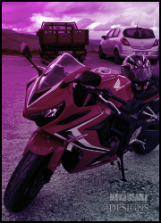
    Here is my first sig that doesn't follow a full tutorial.. Not so good, but I didn't know what to do.


    CnC
    PM Me | VM Me | Rules

    MARGHERITA

  2. #2
    Sentrax82's Avatar
    Join Date
    Sep 2010
    Gender
    male
    Location
    GFX Section
    Posts
    327
    Reputation
    21
    Thanks
    96
    My Mood
    Amused
    Not bad.
    Realy your first sig?
    I'm on MPGH since:
    09-03-09


    ...:::Latest:::...

  3. The Following User Says Thank You to Sentrax82 For This Useful Post:

    Margherita (03-17-2011)

  4. #3
    Margherita's Avatar
    Join Date
    Jan 2011
    Gender
    female
    Posts
    11,299
    Reputation
    783
    Thanks
    1,287
    My Mood
    Bashful
    Quote Originally Posted by Sentrax82 View Post
    Not bad.
    Realy your first sig?
    @Sentrax82
    Kind of, it's my first sig that didn't follow a tutorial. Like the one in my current sig follows a tutorial. I learned everything from tutorials and just put it in one.

    Thanks
    PM Me | VM Me | Rules

    MARGHERITA

  5. #4
    Sentrax82's Avatar
    Join Date
    Sep 2010
    Gender
    male
    Location
    GFX Section
    Posts
    327
    Reputation
    21
    Thanks
    96
    My Mood
    Amused
    Uh Okay... i understand. xD
    I'm on MPGH since:
    09-03-09


    ...:::Latest:::...

  6. #5
    Mokou-Sama's Avatar
    Join Date
    Sep 2010
    Gender
    male
    Location
    Akihabara
    Posts
    10,088
    Reputation
    515
    Thanks
    690
    My Mood
    Amused
    Not bad at all. 8/10 cuz Im jealous... xD
    Keep up the good work

  7. #6
    Ryguy's Avatar
    Join Date
    Aug 2008
    Gender
    male
    Location
    New Jersey
    Posts
    6,380
    Reputation
    149
    Thanks
    855
    Lose the boarders. If anything stick to standard or cinematic black boarders. This simple technique will showcase your work much better and more professionally looking than your current boarders. In some, if not most, boarders are not necessarily essential and I would advice you to take that into consideration also when and if you go back to fix this signature or when you make your next.

    The size is a little displeasing as my taste is more towards bigger canvases only because they usually require a little more thought and work and in the end usually look better. For your next piece I would recommend increasing your canvas size to roughly 300-400px by 100-200px.

    The text is also a little hard to read because the red clashes with the background color. For future work I would advice sticking to a simple color scheme and maybe grabbing a color out of your piece to use as a font color.


    There are a few other things I can point out but I won't right now seeing as from experience its easier to focus on one thing at a time. So try and work on a few of those areas and you may even fix a few of your other flaws.
    [IMG]https://i238.photobucke*****m/albums/ff303/colby1666/Signatures/DayDream-1.png[/IMG]
    x x x x x x

  8. The Following 4 Users Say Thank You to Ryguy For This Useful Post:

    Insane (03-23-2011),Margherita (03-17-2011),NextGen1 (03-17-2011),Taco (03-17-2011)

  9. #7
    Margherita's Avatar
    Join Date
    Jan 2011
    Gender
    female
    Posts
    11,299
    Reputation
    783
    Thanks
    1,287
    My Mood
    Bashful
    Quote Originally Posted by Ryguy View Post
    Lose the boarders. If anything stick to standard or cinematic black boarders. This simple technique will showcase your work much better and more professionally looking than your current boarders. In some, if not most, boarders are not necessarily essential and I would advice you to take that into consideration also when and if you go back to fix this signature or when you make your next.

    The size is a little displeasing as my taste is more towards bigger canvases only because they usually require a little more thought and work and in the end usually look better. For your next piece I would recommend increasing your canvas size to roughly 300-400px by 100-200px.

    The text is also a little hard to read because the red clashes with the background color. For future work I would advice sticking to a simple color scheme and maybe grabbing a color out of your piece to use as a font color.


    There are a few other things I can point out but I won't right now seeing as from experience its easier to focus on one thing at a time. So try and work on a few of those areas and you may even fix a few of your other flaws.
    Thanks for telling me all of that. I'll be sure to take ALL of it into consideration in my next signature. Also, probably fixing this one. Thanks
    PM Me | VM Me | Rules

    MARGHERITA

  10. The Following User Says Thank You to Margherita For This Useful Post:

    NextGen1 (03-17-2011)

  11. #8
    Taco's Avatar
    Join Date
    Aug 2009
    Gender
    male
    Location
    lookin for a 1986 E30 M3
    Posts
    6,387
    Reputation
    352
    Thanks
    419
    My Mood
    Tired
    i likey this.
    Lose the borders, change up the colors a bit, make it a bit bigger, and it'll be my fav.


  12. #9
    Insane's Avatar
    Join Date
    Jun 2010
    Gender
    male
    Posts
    9,057
    Reputation
    1007
    Thanks
    2,013
    I like pretty much all but the border like ryguy said. Good gfx

    Ex Middleman