


render goes well with teh BG but its to bland.
Thread: Fire when ready.
Results 1 to 8 of 8
-
04-26-2011 #1Member


- Join Date
- Jan 2011
- Gender

- Location
- Posts
- 122
- Reputation
 25
25- Thanks
- 41
- My Mood
-


Fire when ready.
An old, overused render but someone requested it, so...
CnC. something feels like it's missing
[IMG]https://i269.photobucke*****m/albums/jj60/dhuynh289/sniperpripyatmpgh.jpg[/IMG]
Also, I work on an LCD screen, at full brightness. If the image looks hella dark, raise your brightness or use an LCDLast edited by se7en_ace; 04-26-2011 at 05:33 PM.
-
04-26-2011 #2Banned


- Join Date
- Apr 2011
- Gender
- Location
- Posts
- 5,553
- Reputation
- 394
- Thanks
- 825

-
04-26-2011 #3
ThreadstarterMember
- Join Date
- Jan 2011
- Gender
- Location
- Posts
- 122
- Reputation
- 25
- Thanks
- 41
- My Mood
-
just as a sniper should Originally Posted by Johnny Knoxville


-
04-26-2011 #4MPGH God III


- Join Date
- Jul 2009
- Gender
- Location
- Posts
- 8,229
- Reputation
- 95
- Thanks
- 808
- My Mood
-

its bland boring and a bad colour choice for monotone, has no wow or pop
[IMG]https://i930.photobucke*****m/albums/ad149/MattPreston/God-of-the-ex.png[/IMG]
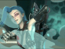
Shifty sexy shit
[IMG]https://i152.photobucke*****m/albums/s198/blackbliss11/scrcrwgift.png[/IMG]
-
04-26-2011 #5
ThreadstarterMember
- Join Date
- Jan 2011
- Gender
- Location
- Posts
- 122
- Reputation
- 25
- Thanks
- 41
- My Mood
-
I agree with the missing wow factor, but what color choice would you use for the monotone? I was wondering this while making it, and with the sniper in a ghillie suit, I thought this might be fitting. What would you suggest might help? Originally Posted by HϤdrᴓKlᴓriK
Plus, should I add a c4d, vector, or something as it's clear that it is bland?
-
04-27-2011 #6Whitehat Hacker


- Join Date
- Aug 2009
- Gender
- Posts
- 2,421
- Reputation
- 212
- Thanks
- 196
- My Mood
-

make it brighter im on a mac with full light and its still dark as shit

-
05-06-2011 #7Do not Trade - Blacklisted
Permanently 

- Join Date
- Sep 2010
- Gender
- Location
- Posts
- 10,088
- Reputation
 515
515- Thanks
- 690
- My Mood
-


I think is great, except the fact the sniper is kinda too sharpened I think. Look at it. Its like when I oversharp renders.
Formerly known as gamer4evere


-
05-06-2011 #8


- Join Date
- Apr 2011
- Gender
- Location
- Posts
- 3,463
- Reputation
- 19
- Thanks
- 200
- My Mood
-

The rifle's too sharped up, it looks low-res in the middle. If you're gonna make it that dark, blend the render more on the left side.
I like that font though, looks like visitor BRK /love
Problem is, the text sticks out in a bad way, and the blurriness ain't too great.Last edited by Wild Bill HickCock; 05-06-2011 at 03:48 PM.
[IMG]https://i381.photobucke*****m/albums/oo259/darkstar9540/wbstrange.png[/IMG]
"I really screwed up this time."
Jeffrey Dahmer