


 Reply With Quote
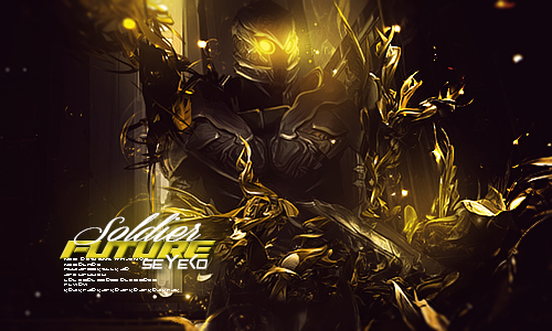
v2's background looks blurry...but its got more color flare to it...
v1 is darker but is not blurry...
I go with v1...
Thread: Improvement
Results 1 to 14 of 14
-
08-22-2011 #1Just Killing People


- Join Date
- May 2011
- Gender

- Location
- Posts
- 1,373
- Reputation
 4
4- Thanks
- 301
- My Mood
-


Improvement
WHICH ONE DO YOU PREFER AND ALSO CNC
v1

v2
 (If I /me helped PRESS THANKS
 )
)
-
08-22-2011 #2LIL ADMIN, R.I.P. LIL DAVE


- Join Date
- Feb 2011
- Gender
- Location
- Posts
- 40,134
- Reputation
 4764
4764- Thanks
- 9,674
 [ ] [ ] [ ] [ ][ ]
Editor from 06142011 2014
Donator since 09162011
Minion from 10102011 01062011
Minion+ from 01062012 08082012
Moderator from 08082012 10062012
Global Moderator from 10062012 12052017
Staff Administrator from 12052017 05012019
Trusted Member since 07132019
Global Moderator since 09112020

-
08-22-2011 #3Newbie

- Join Date
- Nov 2010
- Gender
- Posts
- 80
- Reputation
- 10
- Thanks
- 65

Uhm... I like the first one, because as Shinn said its less blurry. Also, text looks strange though...
-
08-22-2011 #4
ThreadstarterJust Killing People
- Join Date
- May 2011
- Gender
- Location
- Posts
- 1,373
- Reputation
- 4
- Thanks
- 301
- My Mood
-
i really like the text
 (If I /me helped PRESS THANKS)
-
08-22-2011 #5LIL ADMIN, R.I.P. LIL DAVE
- Join Date
- Feb 2011
- Gender
- Location
- Posts
- 40,134
- Reputation
- 4764
- Thanks
- 9,674
The font is pretty good.
[ ] [ ] [ ] [ ][ ]
Editor from 06142011 2014
Donator since 09162011
Minion from 10102011 01062011
Minion+ from 01062012 08082012
Moderator from 08082012 10062012
Global Moderator from 10062012 12052017
Staff Administrator from 12052017 05012019
Trusted Member since 07132019
Global Moderator since 09112020
-
08-22-2011 #6Banned


- Join Date
- Jan 2011
- Gender
- Location
- Posts
- 5,284
- Reputation
- 111
- Thanks
- 636
- My Mood
-

 V1. Looks sick.
-
08-22-2011 #7


- Join Date
- Jan 2011
- Gender

- Posts
- 11,299
- Reputation
- 783
- Thanks
- 1,287
- My Mood
-

-
08-22-2011 #8
Young angel; if you hate me tell me burn in heaven♥. 
- Join Date
- May 2011
- Gender
- Location
- Posts
- 1,778
- Reputation
- 339
- Thanks
- 4,456
- My Mood
-


Oh.. why use caps all the time..
"Do not argue with an idiot. He will drag you down to his level and beat you with experience."Princess since: 7/3/2012Need something translated from/to English? PM/VM me!
-
08-22-2011 #9Blackhat Hacker

- Join Date
- Mar 2011
- Gender
- Posts
- 1,846
- Reputation
- 150
- Thanks
- 361
- My Mood
-


first one is better

-
08-23-2011 #10
ThreadstarterJust Killing People
- Join Date
- May 2011
- Gender
- Location
- Posts
- 1,373
- Reputation
- 4
- Thanks
- 301
- My Mood
-
it's not caps Originally Posted by katylovez

the tipe of letter is like that(If I /me helped PRESS THANKS)
-
08-23-2011 #11
Young angel; if you hate me tell me burn in heaven♥.
- Join Date
- May 2011
- Gender
- Location
- Posts
- 1,778
- Reputation
- 339
- Thanks
- 4,456
- My Mood
-
Hmmph. Was talking about your text. Originally Posted by SKIENT
"Do not argue with an idiot. He will drag you down to his level and beat you with experience."Princess since: 7/3/2012Need something translated from/to English? PM/VM me!
-
08-23-2011 #12
ThreadstarterJust Killing People
- Join Date
- May 2011
- Gender
- Location
- Posts
- 1,373
- Reputation
- 4
- Thanks
- 301
- My Mood
-
ha ok
LOL(If I /me helped PRESS THANKS)
-
08-23-2011 #13Expert Member

- Join Date
- Apr 2009
- Gender
- Posts
- 742
- Reputation
- 23
- Thanks
- 51
- My Mood
-

Text brings this down, and render is way to small, keep readin them tuts
-
08-26-2011 #14Banned
- Join Date
- Aug 2011
- Gender
- Posts
- 1,599
- Reputation
- 2
- Thanks
- 68
- My Mood
-
I like the first one better.

 [/URL]
Similar Threads
-
Direct X 10 improved gamming
By llvengancell in forum WarRock - International HacksReplies: 7Last Post: 09-11-2007, 08:08 PM -
Help to improve my hack
By Elliwood in forum WarRock - International HacksReplies: 3Last Post: 06-06-2007, 10:48 AM -
[Vid] Wallhax Improved By Me
By castaway in forum WarRock Korea HacksReplies: 16Last Post: 05-28-2007, 10:22 AM -
Radio improvements
By poker in forum EntertainmentReplies: 2Last Post: 05-25-2007, 01:03 AM -
new sig (needs improvement)
By ace76543 in forum Art & Graphic DesignReplies: 8Last Post: 03-15-2007, 06:34 AM