


sorry bro, fecher got my vote. I like your style and all but the execution here was just poor. The only thing i dont like about fechers is the guys head. something happened with the lighting and its fked up sorta. Anyways....
Thread: [Battle] Fecher Vs Not_bawls
Results 1 to 15 of 28
-
08-25-2011 #1Expert Member


- Join Date
- Apr 2009
- Gender

- Posts
- 742
- Reputation
 23
23- Thanks
- 51
- My Mood
-


[Battle] Fecher Vs Not_bawls
Fecher:
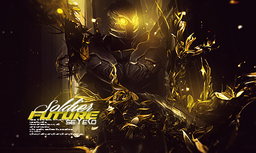
[IMG]https://i784.photobucke*****m/albums/yy121/SeYeKo-/JustDance.png[/IMG]
Not_Bawls:
[IMG]https://i784.photobucke*****m/albums/yy121/SeYeKo-/Topazfagownedv3.png[/IMG]
Need to post and explain why you voted for the person u picked
Thx. all votes that are not posted will be removed.Last edited by fecher; 08-25-2011 at 03:04 PM.
-
08-25-2011 #2MPGH King


- Join Date
- Aug 2008
- Gender

- Location
- Posts
- 6,380
- Reputation
- 149
- Thanks
- 855
-
08-25-2011 #3Just Killing People

- Join Date
- May 2011
- Gender
- Location
- Posts
- 1,373
- Reputation
- 4
- Thanks
- 301
- My Mood
-


i say fecher too
(If I /me helped PRESS THANKS )
)
-
08-25-2011 #4Blackhat Hacker

- Join Date
- Mar 2011
- Gender
- Posts
- 1,846
- Reputation
- 150
- Thanks
- 361
- My Mood
-


My vote goes to Ethereal while he had problems with overall lighting and depth it was able to maintain a good atmosphere the vibrant dark colors really add to this and just sheer quality of the work done makes it more appealing to me personally.
I'm not sucking his dick seen as how I never really got along very well with him, and I was never his friend really.
While on the other hand fecher's didn't appeal to my eyes very much the text which, totally unessecary, was included isn't executed very well and not easy on the eyes to look at and understand what the text says it has too much going on
Also the way the lighting was done was in a very simplistic way and at least to me doesn't look real it looks like something is casting a shadow over everything
I think the colors are too demanding trying to incorporate so many different colors and not using them tactically, most times, look bad and this was the case here there is too large of a range of colors that don't really work well with each other
Adding this to how there is no depth and how simply blurring a background isn't enough to achieve a good perception of depth in a tag I don't really like it very much personally but I would have to say that it has some good parts like the composition the composition in the piece is definitely good though that's not fundamental enough to make the piece good
-
The Following User Says Thank You to Keroaplt For This Useful Post:
ARHQA$Y$YW4AYG4y (08-27-2011)
-
08-25-2011 #5MPGH Expert

- Join Date
- Jun 2010
- Gender
- Location
- Posts
- 1,091
- Reputation
- 148
- Thanks
- 119
 Lolwtf...?
 Originally Posted by Ryguy


-
The Following User Says Thank You to Assalamu alaikum For This Useful Post:
ARHQA$Y$YW4AYG4y (08-26-2011)
-
08-25-2011 #6
ThreadstarterExpert Member
- Join Date
- Apr 2009
- Gender
- Posts
- 742
- Reputation
- 23
- Thanks
- 51
- My Mood
-
Someone voted but didnt post.... Cynic... explain yourself?
-
08-25-2011 #7MPGH Expert
- Join Date
- Jun 2010
- Gender
- Location
- Posts
- 1,091
- Reputation
- 148
- Thanks
- 119
Edit your post and say that you have to vote in thread too, Originally Posted by fecher
because you never stated that as a rule.
That will clear that issue up.
-
08-25-2011 #8
ThreadstarterExpert Member
- Join Date
- Apr 2009
- Gender
- Posts
- 742
- Reputation
- 23
- Thanks
- 51
- My Mood
-
its in the main thread of battles, that is stickied o.O but okay i will
-
08-25-2011 #9Blackhat Hacker
- Join Date
- Mar 2011
- Gender
- Posts
- 1,846
- Reputation
- 150
- Thanks
- 361
- My Mood
-
Skient didn't say why he voted for you but apparently you don't care
-
08-25-2011 #10
ThreadstarterExpert Member
- Join Date
- Apr 2009
- Gender
- Posts
- 742
- Reputation
- 23
- Thanks
- 51
- My Mood
-
atleast he posted... Originally Posted by Keroaplt
-
08-25-2011 #11Brony


- Join Date
- Feb 2009
- Gender
- Location
- Posts
- 3,966
- Reputation
- 31
- Thanks
- 423
- My Mood
-

Bawls because fecher's background doesn't go with any part of the signature, there's like light smuding here around the render, which is horrible to do in the first place (good thing to know again, don't do it), and the colors don't mesh well enough. Also, the text. Just don't do it. Bawls, you do sooo much better than this. I expected a lot more from you, but this is still very well done at the very least. The lighting is odd, the purple jello is both well placed and at the same time not... There's no background much either, you could have worked on that as well. Kudos to you both.
-
The Following User Says Thank You to Matt For This Useful Post:
ARHQA$Y$YW4AYG4y (08-27-2011)
-
08-25-2011 #12MPGH Expert
- Join Date
- Jun 2010
- Gender
- Location
- Posts
- 1,091
- Reputation
- 148
- Thanks
- 119
I know I know.. Originally Posted by Matt
Haven't been actively doing Gfx much though breh.
Gonna take me a bit to get my shit back together.
-
08-25-2011 #13LIL ADMIN, R.I.P. LIL DAVE


- Join Date
- Feb 2011
- Gender
- Location
- Posts
- 40,134
- Reputation
 4764
4764- Thanks
- 9,674

I liked bawls's style, but fetcher's was really nice...
The style of fetcher's just fit my preference, smooth, it exaggerated, etc.[ ] [ ] [ ] [ ][ ]
Editor from 06142011 2014
Donator since 09162011
Minion from 10102011 01062011
Minion+ from 01062012 08082012
Moderator from 08082012 10062012
Global Moderator from 10062012 12052017
Staff Administrator from 12052017 05012019
Trusted Member since 07132019
Global Moderator since 09112020

-
08-25-2011 #14Expert Member
- Join Date
- Jan 2010
- Gender
- Posts
- 565
- Reputation
- 15
- Thanks
- 37
- My Mood
-


Is this seriously a close battle?
bawls. executed a shit tonne better. style is nicer, cleaner, just overall, better. Flow is better on second, too linear on the first one, even though render is way more dynamic.
this shouldn't even be a tie imo.[IMG]https://i152.photobucke*****m/albums/s198/blackbliss11/blackorbs_zps443616a7.png[/IMG]
-
The Following User Says Thank You to +dd.Shift For This Useful Post:
Assalamu alaikum (08-25-2011)
-
08-25-2011 #15Brony
- Join Date
- Feb 2009
- Gender
- Location
- Posts
- 3,966
- Reputation
- 31
- Thanks
- 423
- My Mood
-
This isn't a graphics site = everything's shit up Originally Posted by +dd.Shift

Similar Threads
-
WWII Online Battle over europe - hack request
By Joe.. in forum Hack RequestsReplies: 1Last Post: 12-06-2012, 02:59 PM -
Savage - Battle for Newerth
By Krilliam in forum General Game HackingReplies: 9Last Post: 06-11-2007, 05:20 PM -
Battle Star Galactica Prequel
By Dave84311 in forum SCI-FIReplies: 1Last Post: 04-27-2006, 06:49 AM -
Battle Royale
By Chronologix in forum Art & Graphic DesignReplies: 17Last Post: 01-19-2006, 04:43 AM -
Battle Star Galactica
By Dave84311 in forum SCI-FIReplies: 4Last Post: 01-05-2006, 10:31 AM