


 Reply With Quote
i like it
Thread: Sensational Spiderman
Results 1 to 13 of 13
-
09-23-2011 #1


- Join Date
- Mar 2010
- Gender

- Location
- Posts
- 5,126
- Reputation
 152
152- Thanks
- 615
- My Mood
-


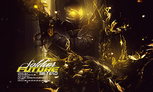
Sensational Spiderman
CnC is appreciated.

v2

Last edited by Synchromanica; 09-23-2011 at 04:57 PM.

-
09-23-2011 #2Just Killing People


- Join Date
- May 2011
- Gender
- Location
- Posts
- 1,373
- Reputation
- 4
- Thanks
- 301
- My Mood
-

 (If I /me helped PRESS THANKS
 )
)
-
09-23-2011 #3Brony


- Join Date
- Feb 2009
- Gender
- Location
- Posts
- 3,966
- Reputation
- 31
- Thanks
- 423
- My Mood
-

 That's not CnC. Lose the border, lose the text, don't over sharpen or over blur, lighting and effects need work.
 Originally Posted by SKIENT

-
09-23-2011 #4
Threadstarter
- Join Date
- Mar 2010
- Gender
- Location
- Posts
- 5,126
- Reputation
- 152
- Thanks
- 615
- My Mood
-
Lost border, lost text, removed the over sharpen and blur, attempted to fix lighting, and not sure how I can fix the effects. :\ Originally Posted by Matt
-
09-23-2011 #5Brony
- Join Date
- Feb 2009
- Gender
- Location
- Posts
- 3,966
- Reputation
- 31
- Thanks
- 423
- My Mood
-
Better; effects don't blend very well, the yellow thing on his left arm, or the yellow thing on his shoulder. Colors don't match well together.
Color Scheme Designer 3
-
09-23-2011 #6
Threadstarter
- Join Date
- Mar 2010
- Gender
- Location
- Posts
- 5,126
- Reputation
- 152
- Thanks
- 615
- My Mood
-
How about this?

-
09-23-2011 #7Brony
- Join Date
- Feb 2009
- Gender
- Location
- Posts
- 3,966
- Reputation
- 31
- Thanks
- 423
- My Mood
-
A tab bit too much colored.
-
09-23-2011 #8Banned


- Join Date
- Aug 2011
- Gender
- Location
- Posts
- 11,788
- Reputation
 854
854- Thanks
- 1,216
looks simple but nice
-
09-23-2011 #9Brony
- Join Date
- Feb 2009
- Gender
- Location
- Posts
- 3,966
- Reputation
- 31
- Thanks
- 423
- My Mood
-
I should just report you for not giving actual CnC. Originally Posted by Greed☠☣
-
09-23-2011 #10Whitehat Hacker

- Join Date
- Aug 2009
- Gender
- Posts
- 2,421
- Reputation
- 212
- Thanks
- 196
- My Mood
-


it still looks lq or blurry for some reason

-
09-23-2011 #11
Threadstarter
- Join Date
- Mar 2010
- Gender
- Location
- Posts
- 5,126
- Reputation
- 152
- Thanks
- 615
- My Mood
-
Lowered Saturation and made it a little lighter.

-
09-23-2011 #12Expert Member

- Join Date
- Apr 2009
- Gender

- Posts
- 742
- Reputation
- 23
- Thanks
- 51
- My Mood
-

Pretty cool i like it man, nice effects and blending (:
-
09-24-2011 #13Reality is a lie


- Join Date
- Jan 2009
- Gender
- Location
- Posts
- 19,893
- Reputation
- 659
- Thanks
- 1,349
- My Mood
-

Actually i like that one better, if not a bit too one-colorish. Originally Posted by Shinobi
-------
on the first one: Too sharp, and the second s on the Sensational is too...low? it looks more like a t to me.
----------
And.......sensational spiderman? jesus, like spiderman needs another one. Its not like he has any timeline arc outside of 2099.

Similar Threads
-
3 siggys-Spiderman, Saving Private Ryan, and an Irish siggy
By m164life in forum Art & Graphic DesignReplies: 9Last Post: 04-26-2008, 04:59 AM -
Have any one here played spiderman 3 live??
By xtrylanx in forum GeneralReplies: 4Last Post: 09-15-2007, 06:06 PM -
Photoshop Spiderman Speed Paint
By condor01 in forum GeneralReplies: 0Last Post: 06-09-2007, 02:05 PM -
Emo people use the net! (Spiderman 3)
By arunforce in forum GeneralReplies: 4Last Post: 05-09-2007, 02:36 PM -
My new Spiderman sig.
By EfiniRx7 in forum Art & Graphic DesignReplies: 18Last Post: 04-05-2007, 07:25 PM