


 Reply With Quote
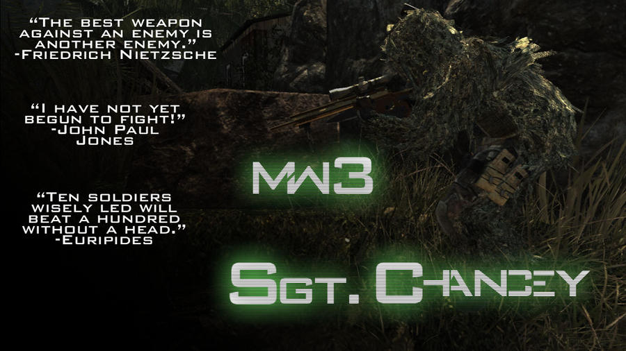
I don't how how Sgt is straight yet Chancey isn't. And I don't like how 3 is bigger than MW. And It would be better if MW3 was in line with Sgt Chancey.
Thread: Ok, I'm being real this time
Results 1 to 7 of 7
-
11-20-2011 #1Dual-Keyboard Member


- Join Date
- Feb 2010
- Gender

- Location
- Posts
- 330
- Reputation
 25
25- Thanks
- 23
- My Mood
-


Ok, I'm being real this time
I threw this together while I had some free time today, just finished, and I know my first post sucked, I did that on purpose to be honest. But this time I'm real, tell me what you think and what I could improve on/change. (I made it because I needed a new desktop background.) This was one of 2 renditions, the other had green streaks under the "Sgt. Chancey" that curved back, it is uploaded on the same DeviantArt account (opti-x.Deviantart) but I prefer this one.

There's a hack for that.
-
11-20-2011 #2


- Join Date
- Dec 2008
- Gender

- Location
- Posts
- 24,316
- Reputation
 3869
3869- Thanks
- 5,890
- My Mood
-

 THE ABSOLUTE GREATEST


-
11-20-2011 #3
ThreadstarterDual-Keyboard Member
- Join Date
- Feb 2010
- Gender
- Location
- Posts
- 330
- Reputation
- 25
- Thanks
- 23
- My Mood
-
ahk, all the letters in Chancey are actually in line, but I had to raise the "hancey" to make it all work, and I kinda liked the 3 a little bigger so I left it, then forgot about it (I went and ate dinner), and I started with the MW3 and centered it, I went through like 50 different setups, other than that, how do you like it (overall, good/bad/not worth keeping) Originally Posted by Doc

There's a hack for that.
-
11-20-2011 #4
- Join Date
- Dec 2008
- Gender
- Location
- Posts
- 24,316
- Reputation
- 3869
- Thanks
- 5,890
- My Mood
-
Not bad for what you're going for.
THE ABSOLUTE GREATEST
-
11-20-2011 #5
ThreadstarterDual-Keyboard Member
- Join Date
- Feb 2010
- Gender
- Location
- Posts
- 330
- Reputation
- 25
- Thanks
- 23
- My Mood
-
Thanks, I'll hopefully make something good one of these days... Originally Posted by Doc
There's a hack for that.
-
11-26-2011 #6New Member

- Join Date
- Nov 2011
- Gender
- Posts
- 8
- Reputation
- 10
- Thanks
- 0
- My Mood
-


CoD sucks, sorry. But hey at least you have a FF VIII avatar which is awesome :P
[IMG]https://sigs.**********/sig-swtor/af28efaf70b9aa1e.png[/IMG]
 Fight the power!!
Fight the power!!

StrongBob64 is here!!!
-
11-26-2011 #7


- Join Date
- Oct 2009
- Gender
- Posts
- 13,715
- Reputation
- 2077
- Thanks
- 3,264
- My Mood
-

You got too much text slapped all over the place.
You could brought out more of the sniper and his surroundings too..
as is it's too dark. But yeah, the main thing is all the text. No one is going to pay attention to the background,
because the text is too distracting.
Similar Threads
-
My resignation (for real this time)
By Insane in forum GeneralReplies: 81Last Post: 01-15-2011, 12:43 PM -
gift for scrcrw this time a real gift
By name13 in forum ShowroomReplies: 4Last Post: 10-15-2010, 12:35 AM -
Glitch room this time its real!!
By xxxohye in forum CrossFire GlitchesReplies: 0Last Post: 06-25-2010, 02:44 AM -
Working Aimbot. REAL this time..
By MasterChi3f in forum Combat Arms Hacks & CheatsReplies: 6Last Post: 08-27-2009, 06:10 PM -
siggy, for real this time lol
By SgtMiclan in forum ShowroomReplies: 27Last Post: 06-08-2009, 01:26 AM