


 Reply With Quote
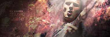
Second one is off to a good start. First one has bad text and it's too blurry.
Results 1 to 8 of 8
-
01-12-2012 #1Dual-Keyboard Member


- Join Date
- Mar 2009
- Gender

- Location
- Posts
- 342
- Reputation
 8
8- Thanks
- 78
- My Mood
-


[WIP]WebDesign ExtremeStylePlayers[waring big images]
hey all =D
well... since i'm trying to make a new site... i wanna ask you what do you think about this =D
the v1:

view full size
i had to work on it again because of some problems (mainly for resolution D: too small for a site)
so i made this... which i'm still working on ^^

view full size
i hope to see your critics =DLast edited by dae67; 01-12-2012 at 11:39 PM.
-
01-13-2012 #2Banned


- Join Date
- Jan 2011
- Gender
- Posts
- 4,999
- Reputation
- 20
- Thanks
- 364
- My Mood
-


-
01-13-2012 #3
ThreadstarterDual-Keyboard Member
- Join Date
- Mar 2009
- Gender
- Location
- Posts
- 342
- Reputation
- 8
- Thanks
- 78
- My Mood
-
welll thanks =D
this is another updated version ^^

click here to see the full image
-
01-14-2012 #4


- Join Date
- Oct 2009
- Gender
- Posts
- 13,715
- Reputation
 2077
2077- Thanks
- 3,264
- My Mood
-
 Add a gradient to the box. Also, you have so much blue in this theme that it seems almost pointless to have that one silver bar in there.
 Originally Posted by dae67

You either need to balance it by adding more elements of silver or keep it a blue theme.
-
01-14-2012 #5


- Join Date
- Dec 2008
- Gender

- Location
- Posts
- 24,316
- Reputation
- 3869
- Thanks
- 5,890
- My Mood
-


I think the blue outlining of the box should be darker. If you put content in there I think the outline will distract people who try and view it.
THE ABSOLUTE GREATEST


-
01-14-2012 #6
≧◉◡◉≦ 
![[SMA] Paradise`'s Avatar](/forum/customavatars/avatar1039932_283.gif "[SMA] Paradise`'s Avatar")
- Join Date
- Nov 2011
- Gender
- Location
- Posts
- 8,922
- Reputation
- 1781
- Thanks
- 3,049
- My Mood
-

Make the blue outline box darker and add some stuff on the button.
-
01-22-2012 #7Advanced Member

- Join Date
- Jun 2010
- Gender
- Posts
- 156
- Reputation
- 9
- Thanks
- 197
- My Mood
-

 Bottom* Originally Posted by Google'
Yeah I was gonna say the same thing, also the text on the nav bar is hard to see. Maybe make it brighter I guess
I like the blue one, but change the theme 2 blue and silver. Don't just go with pure blue xD, cuz I did like the silver bar at the bottom.
-
01-22-2012 #8Leecher
- Join Date
- Jan 2012
- Gender
- Posts
- 19
- Reputation
- 10
- Thanks
- 0
I am liking the blue one a bit more.
Similar Threads
-
Big List of Free Web Services
By sp5710 in forum Spammers CornerReplies: 20Last Post: 12-22-2018, 07:54 PM -
[Image] Tupac sex tape IMAGES
By GiGux in forum GeneralReplies: 22Last Post: 10-05-2011, 04:01 PM -
DK Images
By The_Enigma in forum GunBound Hacks / BotsReplies: 2Last Post: 06-15-2006, 03:40 AM -
Banned Image
By arunforce in forum Art & Graphic DesignReplies: 11Last Post: 05-26-2006, 04:05 PM -
"Visit My Blog" Image \ Signature
By Bull3t in forum Art & Graphic DesignReplies: 0Last Post: 05-21-2006, 11:19 AM