


 Reply With Quote
Umm.... I don't know what to say since it is your first.
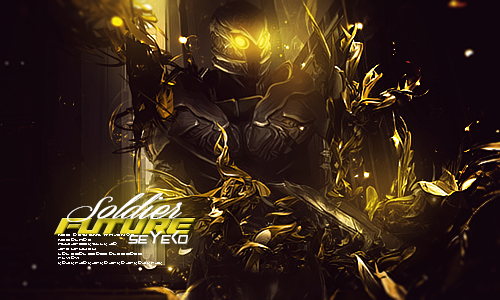
The render does not even match the background colors
When making a signature you should have the render match the background colors
I dunno
Thread: My first sig
Results 1 to 12 of 12
-
04-26-2012 #1Banned


- Join Date
- Oct 2010
- Gender

- Location
- Posts
- 3,619
- Reputation
 -405
-405- Thanks
- 6,106
- My Mood
-


My first sig
It's my first sig i made after many tutorials

I made this in short time

Be kind with me please
Last edited by Hexicidal; 04-26-2012 at 10:39 AM.
-
04-26-2012 #2Banned

- Join Date
- Oct 2011
- Gender
- Posts
- 17,967
- Reputation
 4088
4088- Thanks
- 6,418

-
04-26-2012 #3
ThreadstarterBanned
- Join Date
- Oct 2010
- Gender
- Location
- Posts
- 3,619
- Reputation
- -405
- Thanks
- 6,106
- My Mood
-
This is my problem , i don't know how to make a good render Originally Posted by Royce da 5'9"

---------- Post added at 07:38 PM ---------- Previous post was at 07:29 PM ----------
How about this?
-
04-26-2012 #4Brony


- Join Date
- Feb 2009
- Gender
- Location
- Posts
- 3,966
- Reputation
 31
31- Thanks
- 423
- My Mood
-

Untrue, as long as it's complementing colors. Where do you get this information, dude? Originally Posted by Royce da 5'9"
-
04-26-2012 #5Banned
- Join Date
- Oct 2011
- Gender
- Posts
- 17,967
- Reputation
- 4088
- Thanks
- 6,418
Lol sorry I that weird moment when you see something in a dream and it really happends Originally Posted by Matt
OT:
where in the first signature is there complementing colors
-
04-26-2012 #6Expert Member


- Join Date
- Apr 2009
- Gender

- Posts
- 742
- Reputation
- 23
- Thanks
- 51
- My Mood
-

I personally really like the second one. just get some forground effects and blend it in somemore and it would turn out pretty good
-
04-26-2012 #7
≧◉◡◉≦ 
![[SMA] Paradise`'s Avatar](/forum/customavatars/avatar1039932_283.gif "[SMA] Paradise`'s Avatar")
- Join Date
- Nov 2011
- Gender
- Location
- Posts
- 8,922
- Reputation
- 1781
- Thanks
- 3,049
- My Mood
-


Try changing up the fonts a bit, looks like in your sig you been using the same font, try changing it up at times, but I personally like the 2nd one.
-
04-27-2012 #8Banned
- Join Date
- Aug 2011
- Gender
- Location
- Posts
- 4,190
- Reputation
- -287
- Thanks
- 355
- My Mood
-

 You didn't match the background ..Looms ok for your first. Originally Posted by Royce da 5'9"
-
04-29-2012 #9
ThreadstarterBanned
- Join Date
- Oct 2010
- Gender
- Location
- Posts
- 3,619
- Reputation
- -405
- Thanks
- 6,106
- My Mood
-
Ok i will try thanks
-
04-29-2012 #10Blackhat Hacker

- Join Date
- Mar 2011
- Gender
- Posts
- 1,846
- Reputation
- 150
- Thanks
- 361
- My Mood
-


With colors the second one has good color choices the first one is totally wrong.
For a first tag you started off well because at least you have a good idea of what you should do you don't try to add weird ass effects you make simple bg+render+adjustments as you progress you can work with more complex elements but you seem to be going in a good direction Read a couple of tutorials too
-
04-29-2012 #11Banned
- Join Date
- Mar 2011
- Gender
- Location
- Posts
- 6,625
- Reputation
- 584
- Thanks
- 2,267
- My Mood
-

I Like the 2nd one Alot.
-
04-30-2012 #12


- Join Date
- Apr 2012
- Gender
- Posts
- 3,262
- Reputation
- 234
- Thanks
- 425
- My Mood
-

Well, i actually think the sig is fine, but the quality lacks allot.


Similar Threads
-
new artist first sig(sucks)
By darkone1149 in forum Art & Graphic DesignReplies: 18Last Post: 02-08-2006, 01:34 PM -
My First Sig ...
By $GHOST$ in forum Art & Graphic DesignReplies: 10Last Post: 02-06-2006, 02:01 AM -
MY GALLERY I MADE ALL THESE TODAY MY FIRST SIGS lol
By $GHOST$ in forum Art & Graphic DesignReplies: 6Last Post: 02-05-2006, 07:13 AM -
First sig
By SadisticGrin in forum Art & Graphic DesignReplies: 20Last Post: 01-19-2006, 04:38 AM -
My First Sig
By OutZida in forum Art & Graphic DesignReplies: 17Last Post: 01-14-2006, 03:36 PM