Page 1 of 2 12 LastLast
Results 1 to 15 of 20
  1. #1
    Mayion's Avatar
    Join Date
    Oct 2012
    Gender
    male
    Location
    Bed
    Posts
    13,504
    Reputation
    4018
    Thanks
    8,372
    My Mood
    Twisted

    New Sign - No much work

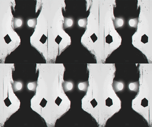
    I like Assassin's Creed so I've created that, Any Feedback is welcome, Positive - Negative I'm going to learn from you so please don't try to troll,


    Thank you.
    I do not use any type of messenger outside of MPGH.
    Inactive but you can reach me through VM/PM.


    Donator - 30 August 2013
    Battlefield Minion - 26 October 2013

    Blackshot Minion - 14 January 2014/16 September 2014
    Minecraft Minion - 7 February 2014/16 September 2014
    WarRock Minion - 23 February 2014
    League of Legends Minion - 21 March 2014

    Minion+ - 15 May 2014
    Other Semi-Popular First Person Shooter Minion - 8 August 2014
    CrossFire Minion - 23 October 2014
    Programming Section Minion - 13 November 2014
    Marketplace Minion - 7 December 2014

    Official Middleman - 7 December 2014 - 27 June 2015
    Moderator - 29 December 2014
    Project Blackout Minion - 10 January 2015
    News Force Interviewer - January 2015
    Steam Games Minion - 21 March 2015
    Dragon Nest Minion - 31 March 2015
    Publicist - April 2015 - 21 September 2015
    Global Moderator - 25 August 2015
    Super User - 13 August 2016


  2. #2
    Gio's Avatar
    Join Date
    Mar 2013
    Gender
    male
    Location
    Work
    Posts
    7,149
    Reputation
    1227
    Thanks
    3,467
    My Mood
    Twisted
    Twerk TEAAAAAAAAAAAAAAAM.

    Not bad , but I don't like background ;|

    I regard the theatre as the greatest of all art forms, the most immediate way in which a human being can share with another the sense of what it is to be a human being. -Wilde

    Member Since: 7 March 2013
    Donator Since: 14 January 2014
    Editor Since: 10 August 2013
    Manager Since: 27 September 2013
    Middleman Since: 31 January 2014
    BattleOn Minion Since: 13 August 2013
    Dragon Nest Minion Since: 12 September 2013
    Minecraft Minion Since: Don't Remember
    Social Games Minion Since: Don't Remember
    Realm Of The Mad God Minion Since: Don't Remember
    Alliance of Valiant Arms Minion Since: Don't Remember
    Pharaoh #5: 2 January 2014
    Former Staff Since: 5 February 2015


  3. #3
    ヽಠ_ಠᕤ Headrockin' ᕦಠ_ಠ╯
    MPGH Member
    IV2B's Avatar
    Join Date
    Jan 2011
    Gender
    male
    Posts
    1,163
    Reputation
    101
    Thanks
    229
    My Mood
    Inspired
    I dont like the two background lines:they aren't defined and look like he's quirting outta his blades lol!
    the background is poor in general,the text isn't well done (doesn't fit the theme) and there is zero blending :x

  4. #4
    Mayion's Avatar
    Join Date
    Oct 2012
    Gender
    male
    Location
    Bed
    Posts
    13,504
    Reputation
    4018
    Thanks
    8,372
    My Mood
    Twisted
    Quote Originally Posted by IV2B View Post
    I dont like the two background lines:they aren't defined and look like he's quirting outta his blades lol!
    the background is poor in general,the text isn't well done (doesn't fit the theme) and there is zero blending :x
    I love your feedbacks :|
    Anyway I don't have the text sense and I don't have good skills at PS to make the sign good as yours, I don't know how to use brushes (Like ur sign) .
    I do not use any type of messenger outside of MPGH.
    Inactive but you can reach me through VM/PM.


    Donator - 30 August 2013
    Battlefield Minion - 26 October 2013

    Blackshot Minion - 14 January 2014/16 September 2014
    Minecraft Minion - 7 February 2014/16 September 2014
    WarRock Minion - 23 February 2014
    League of Legends Minion - 21 March 2014

    Minion+ - 15 May 2014
    Other Semi-Popular First Person Shooter Minion - 8 August 2014
    CrossFire Minion - 23 October 2014
    Programming Section Minion - 13 November 2014
    Marketplace Minion - 7 December 2014

    Official Middleman - 7 December 2014 - 27 June 2015
    Moderator - 29 December 2014
    Project Blackout Minion - 10 January 2015
    News Force Interviewer - January 2015
    Steam Games Minion - 21 March 2015
    Dragon Nest Minion - 31 March 2015
    Publicist - April 2015 - 21 September 2015
    Global Moderator - 25 August 2015
    Super User - 13 August 2016


  5. #5
    Mokou-Sama's Avatar
    Join Date
    Sep 2010
    Gender
    male
    Location
    Akihabara
    Posts
    10,088
    Reputation
    515
    Thanks
    690
    My Mood
    Amused
    I suggest you do something like this,
    Pick up the render again. try duplicating it, smudge it around and liquify it. Place the original render in front of that layer.
    Apply gradient layers. Add extras (vectors, c4ds, brushes)(google them and download a few or get some packs) and place on signature, cut unnecessary parts.
    Play with lighting and bam, you got a nice signature, I think. shouldnt be very bad. you current sig isnt bad, its just kinda plain and no blending. Text color doesnt match anything there. dont go using overall more than 3 colors, 4 in special cases IMO.
    I think this my opinion, not sure if you will get anything useful of it, but try it.
    Formerly known as gamer4evere


    Participated on:
    MPGH GAMING NIGHT 08/03/2015 - Town of Salem


  6. #6
    Mayion's Avatar
    Join Date
    Oct 2012
    Gender
    male
    Location
    Bed
    Posts
    13,504
    Reputation
    4018
    Thanks
    8,372
    My Mood
    Twisted
    Quote Originally Posted by gamer4evere View Post
    I suggest you do something like this,
    Pick up the render again. try duplicating it, smudge it around and liquify it. Place the original render in front of that layer.
    Apply gradient layers. Add extras (vectors, c4ds, brushes)(google them and download a few or get some packs) and place on signature, cut unnecessary parts.
    Play with lighting and bam, you got a nice signature, I think. shouldnt be very bad. you current sig isnt bad, its just kinda plain and no blending. Text color doesnt match anything there. dont go using overall more than 3 colors, 4 in special cases IMO.
    I think this my opinion, not sure if you will get anything useful of it, but try it.
    Going to use that, Thank you
    I do not use any type of messenger outside of MPGH.
    Inactive but you can reach me through VM/PM.


    Donator - 30 August 2013
    Battlefield Minion - 26 October 2013

    Blackshot Minion - 14 January 2014/16 September 2014
    Minecraft Minion - 7 February 2014/16 September 2014
    WarRock Minion - 23 February 2014
    League of Legends Minion - 21 March 2014

    Minion+ - 15 May 2014
    Other Semi-Popular First Person Shooter Minion - 8 August 2014
    CrossFire Minion - 23 October 2014
    Programming Section Minion - 13 November 2014
    Marketplace Minion - 7 December 2014

    Official Middleman - 7 December 2014 - 27 June 2015
    Moderator - 29 December 2014
    Project Blackout Minion - 10 January 2015
    News Force Interviewer - January 2015
    Steam Games Minion - 21 March 2015
    Dragon Nest Minion - 31 March 2015
    Publicist - April 2015 - 21 September 2015
    Global Moderator - 25 August 2015
    Super User - 13 August 2016


  7. #7
    Mokou-Sama's Avatar
    Join Date
    Sep 2010
    Gender
    male
    Location
    Akihabara
    Posts
    10,088
    Reputation
    515
    Thanks
    690
    My Mood
    Amused
    Quote Originally Posted by Mayion View Post


    Going to use that, Thank you
    Optionally, you can go search online for plugins to aid you, they can be useful especially on simple sigs sometimes they could make a diference.
    Formerly known as gamer4evere


    Participated on:
    MPGH GAMING NIGHT 08/03/2015 - Town of Salem


  8. #8
    ヽಠ_ಠᕤ Headrockin' ᕦಠ_ಠ╯
    MPGH Member
    IV2B's Avatar
    Join Date
    Jan 2011
    Gender
    male
    Posts
    1,163
    Reputation
    101
    Thanks
    229
    My Mood
    Inspired
    Quote Originally Posted by Mayion View Post


    I love your feedbacks :|
    Anyway I don't have the text sense and I don't have good skills at PS to make the sign good as yours, I don't know how to use brushes (Like ur sign) .
    Actually,making sigs is composed out of 3 phases:
    Early phase (yours): you just started out.
    Medium phase (Mine): you can do decent-good stuff.
    Late phase: images blessed by God.

    In the early phase it's all about experimenting everything,just literally try every filter,effect,render,style,font,brush,resource you can.
    Then you'll for sure find a few that work better than others (in my case,paint splatters and blending) and focus on those only mainly.
    Once entering medium phase (as your images begin to bet better) you'll also implement other styles and stuff into your knowledge.

    What you should do is: take the render you used,delete everything else,then do it all over trying to test as much things as possible.
    It'll take alot but you'll have a good understanding on pretty much everything...or just watch some lame tutorials :/

  9. The Following User Says Thank You to IV2B For This Useful Post:

    [MPGH]Mayion (11-16-2013)

  10. #9
    ヽಠ_ಠᕤ Headrockin' ᕦಠ_ಠ╯
    MPGH Member
    IV2B's Avatar
    Join Date
    Jan 2011
    Gender
    male
    Posts
    1,163
    Reputation
    101
    Thanks
    229
    My Mood
    Inspired
    Quote Originally Posted by gamer4evere View Post
    I suggest you do something like this,
    Pick up the render again. try duplicating it, smudge it around and liquify it. Place the original render in front of that layer.
    Apply gradient layers. Add extras (vectors, c4ds, brushes)(google them and download a few or get some packs) and place on signature, cut unnecessary parts.
    Play with lighting and bam, you got a nice signature, I think. shouldnt be very bad. you current sig isnt bad, its just kinda plain and no blending. Text color doesnt match anything there. dont go using overall more than 3 colors, 4 in special cases IMO.
    I think this my opinion, not sure if you will get anything useful of it, but try it.
    You fool,rainbow style jutsu!

  11. #10
    Harpoon.'s Avatar
    Join Date
    Oct 2013
    Gender
    male
    Location
    Tᴏᴍᴏʀʀᴏᴡ
    Posts
    622
    Reputation
    57
    Thanks
    390
    My Mood
    Yeehaw
    I'd personally get rid of the lines/streaks. Other than that, it looks pretty good.

  12. #11
    Thinking is the Enemy of Creativity. It's Self-Conscious, & Anything Self-Conscious is Lousy.
    Premium Member
    Elocrypt.'s Avatar
    Join Date
    Sep 2009
    Gender
    male
    Location
    Amazon.
    Posts
    3,070
    Reputation
    273
    Thanks
    292
    My Mood
    Amused
    Use this tutorial - Video Sig Tutorial +PSD by Blackbird97 on deviantART and practice.

    Feedback - Should I be honest?

    Last edited by Elocrypt.; 11-16-2013 at 09:55 PM.

  13. #12
    thehappydarkside's Avatar
    Join Date
    May 2013
    Gender
    male
    Location
    San Diego
    Posts
    75
    Reputation
    24
    Thanks
    4
    My Mood
    Bored
    It's pretty good, but I'd change the Background.

  14. #13
    Mayion's Avatar
    Join Date
    Oct 2012
    Gender
    male
    Location
    Bed
    Posts
    13,504
    Reputation
    4018
    Thanks
    8,372
    My Mood
    Twisted
    Quote Originally Posted by Invis. View Post
    Use this tutorial - Video Sig Tutorial +PSD by Blackbird97 on deviantART and practice.

    Feedback - Should I be honest?

    Yes sure.
    I do not use any type of messenger outside of MPGH.
    Inactive but you can reach me through VM/PM.


    Donator - 30 August 2013
    Battlefield Minion - 26 October 2013

    Blackshot Minion - 14 January 2014/16 September 2014
    Minecraft Minion - 7 February 2014/16 September 2014
    WarRock Minion - 23 February 2014
    League of Legends Minion - 21 March 2014

    Minion+ - 15 May 2014
    Other Semi-Popular First Person Shooter Minion - 8 August 2014
    CrossFire Minion - 23 October 2014
    Programming Section Minion - 13 November 2014
    Marketplace Minion - 7 December 2014

    Official Middleman - 7 December 2014 - 27 June 2015
    Moderator - 29 December 2014
    Project Blackout Minion - 10 January 2015
    News Force Interviewer - January 2015
    Steam Games Minion - 21 March 2015
    Dragon Nest Minion - 31 March 2015
    Publicist - April 2015 - 21 September 2015
    Global Moderator - 25 August 2015
    Super User - 13 August 2016


  15. #14
    Cynic's Avatar
    Join Date
    Aug 2009
    Gender
    male
    Location
    Bed
    Posts
    2,038
    Reputation
    62
    Thanks
    246
    I'm gonna go for honesty here, it's what Doc, Ethereal, Itseyeko, Keroaplt and Scrwrw did when I was learning to move from this to better things and I think it's the entire reason why I improved. So, to put it bluntly, it needs a lot of improvement.
    I think that it could use a lot more colour. The idea you had of going for a dark background is good as the dark will contrast with his white clothing, but it could use some red highlights to match the red highlights in the render. Also try looking up the rule of three. The placement of the render isn't exactly ideal.
    I also don't see the need for the green and black clouds in the text. Where's the green coming from? It seems so clash with the rest of the tag. Lastly, right now, it seems as if you made the background and then stuck the render on. You really need to try to blend the render in, perhaps with some duped renders that've been smudged as @gamer4evere said, this'll make it look like the render actually belongs in the piece.

    I know it's a lot of reading, but try to read through this when you have a chance. https://www.mpgh.net/forum/40-tutoria...re-making.html
    It'll teach you everything you need to know about composition and colour, and I'm pretty sure it has some stuff about blending too.

    [IMG]https://i281.photobucke*****m/albums/kk231/drsynyster/cynic.png[/IMG]

  16. The Following User Says Thank You to Cynic For This Useful Post:

    Elocrypt. (11-19-2013)

  17. #15
    Mokou-Sama's Avatar
    Join Date
    Sep 2010
    Gender
    male
    Location
    Akihabara
    Posts
    10,088
    Reputation
    515
    Thanks
    690
    My Mood
    Amused
    Quote Originally Posted by Cynic View Post
    I'm gonna go for honesty here, it's what Doc, Ethereal, Itseyeko, Keroaplt and Scrwrw did when I was learning to move from this to better things and I think it's the entire reason why I improved. So, to put it bluntly, it needs a lot of improvement.
    I think that it could use a lot more colour. The idea you had of going for a dark background is good as the dark will contrast with his white clothing, but it could use some red highlights to match the red highlights in the render. Also try looking up the rule of three. The placement of the render isn't exactly ideal.
    I also don't see the need for the green and black clouds in the text. Where's the green coming from? It seems so clash with the rest of the tag. Lastly, right now, it seems as if you made the background and then stuck the render on. You really need to try to blend the render in, perhaps with some duped renders that've been smudged as @gamer4evere said, this'll make it look like the render actually belongs in the piece.

    I know it's a lot of reading, but try to read through this when you have a chance. https://www.mpgh.net/forum/40-tutoria...re-making.html
    It'll teach you everything you need to know about composition and colour, and I'm pretty sure it has some stuff about blending too.
    And never forget to try everything, once you find out the style you like the most, keep going for it!
    It's like lots of things in life: Trial and error.
    Formerly known as gamer4evere


    Participated on:
    MPGH GAMING NIGHT 08/03/2015 - Town of Salem


Page 1 of 2 12 LastLast

Similar Threads

  1. New Hack doesn't work help!
    By Remorse in forum Combat Arms Hacks & Cheats
    Replies: 29
    Last Post: 01-06-2009, 06:41 PM
  2. OK, New Pub Doesn't Work.
    By Guitar Hero in forum Combat Arms Hacks & Cheats
    Replies: 24
    Last Post: 12-17-2008, 02:35 PM
  3. New Hack in C++ working after 7/27 update
    By profilik in forum WarRock - International Hacks
    Replies: 30
    Last Post: 07-28-2007, 06:19 AM
  4. New Updated 100% all working
    By warrockk1ngs in forum WarRock - International Hacks
    Replies: 58
    Last Post: 06-10-2007, 12:01 PM
  5. (NEW PATCH) Trainer dont work anymore
    By miregal in forum WarRock - International Hacks
    Replies: 19
    Last Post: 06-06-2007, 10:26 PM