


 Reply With Quote
molot (10-07-2014)
Results 1 to 10 of 10
-
10-06-2014 #1Banned


- Join Date
- Nov 2011
- Gender

- Posts
- 127
- Reputation
 10
10- Thanks
- 9
- My Mood
-


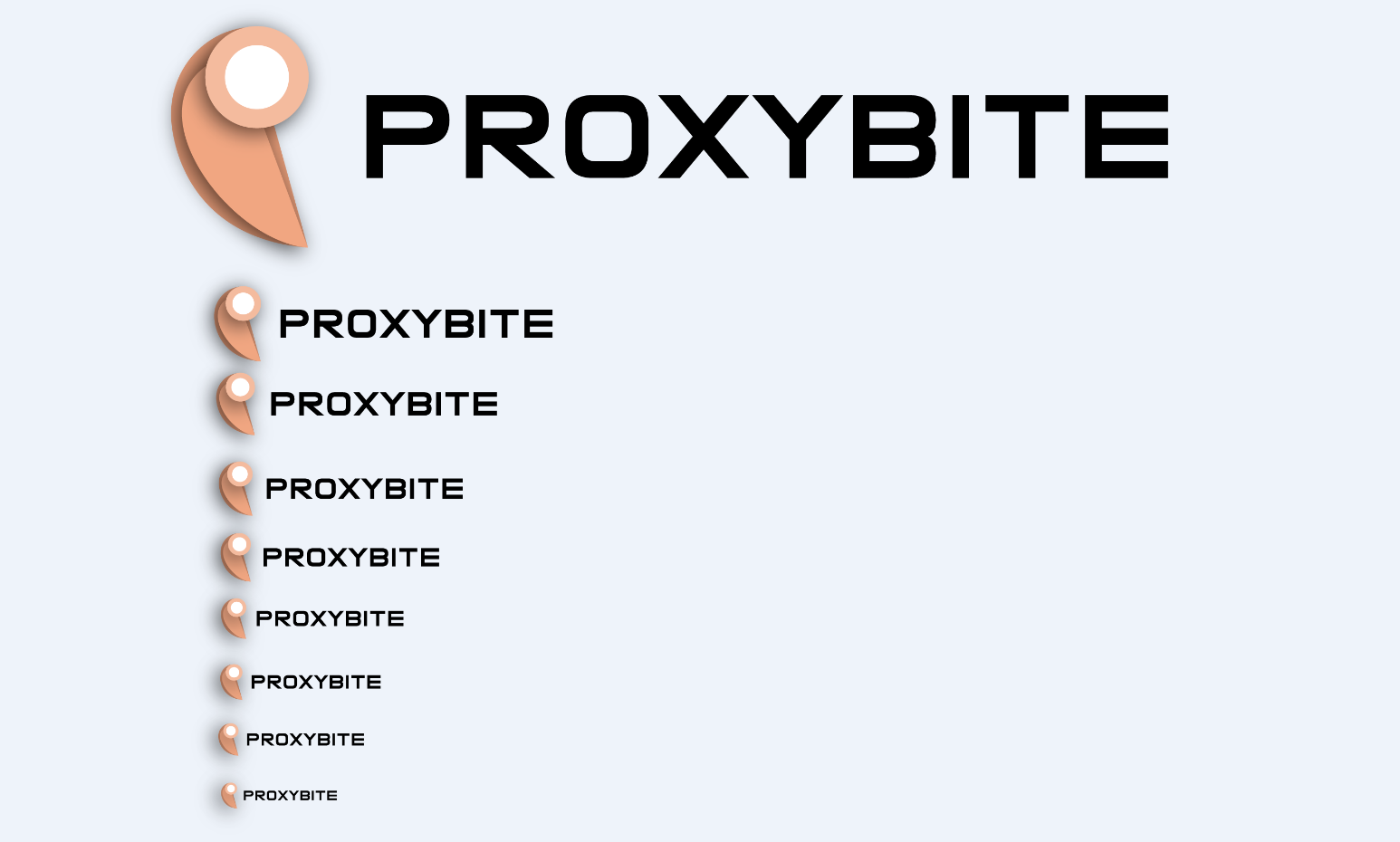
 ProxyBite - New Logo - Concept Design!!!
We are trying to design a new logo and brand identity, please give us your opinion about our new logo!!!
https://i.gyazo.com/021fa96eb17963655a0f2c9d46fbadcc.png
-
The Following User Says Thank You to ytsu12 For This Useful Post:
-
10-07-2014 #2Expert Member


- Join Date
- Jul 2013
- Gender
- Posts
- 569
- Reputation
- 34
- Thanks
- 81
- My Mood
-


i recon its a good design, a simple design that is great, color are good

My Skype: Chennyboi9
-
10-07-2014 #3


- Join Date
- Sep 2012
- Gender
- Location
- Posts
- 1,307
- Reputation
 546
546- Thanks
- 190

Nice and simplistic, I like it
Also you can put the URL inside an IMG tag to show it like this [IMG] URL HERE [/IMG] (All together of course)
Like so
-
10-07-2014 #4Banned
- Join Date
- Apr 2013
- Gender
- Location
- Posts
- 1,796
- Reputation
- 41
- Thanks
- 223
- My Mood
-


yes is good ,great work
-
10-07-2014 #5
Thinking is the Enemy of Creativity. It's Self-Conscious, & Anything Self-Conscious is Lousy. 
- Join Date
- Sep 2009
- Gender
- Location
- Posts
- 3,070
- Reputation
- 273
- Thanks
- 292
- My Mood
-

Simple, nice coloring. Clean and slick. Well done, good job.


Code:
-
10-07-2014 #6
ThreadstarterBanned
- Join Date
- Nov 2011
- Gender
- Posts
- 127
- Reputation
- 10
- Thanks
- 9
- My Mood
-
Thanks for all your input guys, one last question should we keep the white in the center of the design or make it transparent?
Last edited by ytsu12; 10-07-2014 at 01:57 PM.
-
10-08-2014 #7
ヽಠ_ಠᕤ Headrockin' ᕦಠ_ಠ╯ 

- Join Date
- Jan 2011
- Gender
- Posts
- 1,163
- Reputation
- 101
- Thanks
- 229
- My Mood
-

In my opinion, the logo lacks any element of "impact" to it.
That's because it's a weird reversed D with a circle on it, more than a P it looks like a bird.
Plus, the circle looks like another image put on top of the first, making the logo very inconsistent.
You should definetly try more shapes IMO.
-
10-08-2014 #8
ThreadstarterBanned
- Join Date
- Nov 2011
- Gender
- Posts
- 127
- Reputation
- 10
- Thanks
- 9
- My Mood
-
@IV2B I will go ahead and try more shapes, also any input helps alot!
-
10-08-2014 #9
ThreadstarterBanned
- Join Date
- Nov 2011
- Gender
- Posts
- 127
- Reputation
- 10
- Thanks
- 9
- My Mood
-
We are going ahead and sticking with our new logo until we can make a better design, any free-lancers or graphic designers want to help us make a new logo?
-
10-12-2014 #10Newbie
- Join Date
- Jul 2010
- Gender
- Posts
- 35
- Reputation
- 10
- Thanks
- 1
- My Mood
-

Hey i think you should make it transparent since no one replied to you!

Similar Threads
-
New Logo Design CnC Please!
By TheNoxifieD in forum ShowroomReplies: 7Last Post: 06-17-2011, 09:13 AM -
New Logo?
By Audi in forum Suggestions, Requests & General HelpReplies: 28Last Post: 03-30-2011, 05:06 PM -
[Poll] Mpgh's new logo
By youngbucks in forum GeneralReplies: 75Last Post: 04-20-2010, 01:33 AM -
Google's New Logo/Website
By arunforce in forum GeneralReplies: 36Last Post: 02-03-2010, 02:47 AM -
Final Firefox 3.5 update: a new logo
By EndRiT in forum GeneralReplies: 16Last Post: 05-19-2009, 08:45 PM