Thread: Ashe

Results 1 to 14 of 14

Hybrid View

  1. #1
    Fucking Moron's Avatar
    Join Date
    Mar 2014
    Gender
    male
    Location
    I need smoke
    Posts
    5,529
    Reputation
    1371
    Thanks
    1,618
    My Mood
    Buzzed

    Ashe

    Well enjoy
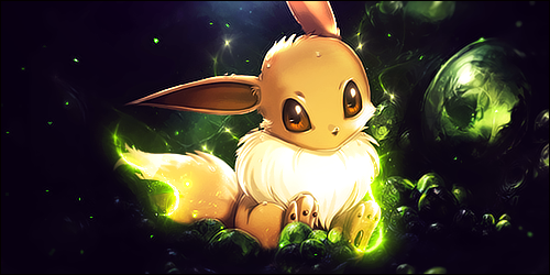
    3 Versions going chronologically from worst to best


    I couldn't decide which of thee last two was better so yea pl0x help me decide that would be greatly appreciated


    Thanks!


    @IV2B @deflorate CnC Thanks guys!
    Focused on depth and lighting here.
    Fractal on thee bow I just didn't know, could't find one that fitted best, but meh I got tired of working on it.
    Text choice improved a lot I believe.
    [/COLOR][/FONT][/COLOR][/FONT][/COLOR][/FONT]
    Last edited by Fucking Moron; 12-25-2014 at 07:16 PM.

  2. #2
    KillTheNoise's Avatar
    Join Date
    May 2013
    Gender
    female
    Posts
    5,444
    Reputation
    1073
    Thanks
    2,410
    "Text choice improved a lot I believe."


  3. The Following 2 Users Say Thank You to KillTheNoise For This Useful Post:

    Deflorate. (12-25-2014),IV2B (12-26-2014)

  4. #3
    Fucking Moron's Avatar
    Join Date
    Mar 2014
    Gender
    male
    Location
    I need smoke
    Posts
    5,529
    Reputation
    1371
    Thanks
    1,618
    My Mood
    Buzzed
    Quote Originally Posted by KillTheNoise View Post
    "Text choice improved a lot I believe."

    Thanks ya sarcastic prick

  5. #4
    ヽಠ_ಠᕤ Headrockin' ᕦಠ_ಠ╯
    MPGH Member
    IV2B's Avatar
    Join Date
    Jan 2011
    Gender
    male
    Posts
    1,163
    Reputation
    101
    Thanks
    229
    My Mood
    Inspired
    Quote Originally Posted by Organized Chaos View Post


    Thanks ya sarcastic prick
    Well that's true: the 3D feel is meh and the gradient you used leaved a colored corner in the first text, while the transition looks ugly with the second.
    The image has two focals: her bow and her face, which is bad. You tried to kind of remove the focus on her head by placing a big ass flare next to it...
    There are two horizontal lines, probably caused by some c4ds accidently cut.
    All the amount of random stuff you kept adding on top of everything makes the image look like printed on a sheet of paper, seriously, you did the same mistake again. :/
    The rays are too blurred and don't feel bright at all, plus one stops in the middle of nowhere.
    Lights are flawed.

    Congraturations! You just took two step backwards!

    What you shall do:
    1) Never ever place font again until you realize how to place them, people won't mind, i swear.
    2) Never ever...EVER...use a vignette effect again (or just never ever paint the corners black).
    3) Never ever use c4ds again, you focus on which one fits the best, when clearly putting zero would've been better.
    4) Never ever use flares again, every time you do a kitten dies.
    5) Realize that setting light layers as normal will flatten the image to a sheet of paper in almost any occasion.

    No really, pick up a rocket, shove it up your anus and light it up, cause you really need to get past the "place c4ds to fill my works" phase immediatly.

  6. #5
    Fucking Moron's Avatar
    Join Date
    Mar 2014
    Gender
    male
    Location
    I need smoke
    Posts
    5,529
    Reputation
    1371
    Thanks
    1,618
    My Mood
    Buzzed
    Quote Originally Posted by IV2B View Post
    Well that's true: the 3D feel is meh and the gradient you used leaved a colored corner in the first text, while the transition looks ugly with the second.
    The image has two focals: her bow and her face, which is bad. You tried to kind of remove the focus on her head by placing a big ass flare next to it...
    There are two horizontal lines, probably caused by some c4ds accidently cut.
    All the amount of random stuff you kept adding on top of everything makes the image look like printed on a sheet of paper, seriously, you did the same mistake again. :/
    The rays are too blurred and don't feel bright at all, plus one stops in the middle of nowhere.
    Lights are flawed.

    Congraturations! You just took two step backwards!

    What you shall do:
    1) Never ever place font again until you realize how to place them, people won't mind, i swear.
    2) Never ever...EVER...use a vignette effect again (or just never ever paint the corners black).
    3) Never ever use c4ds again, you focus on which one fits the best, when clearly putting zero would've been better.
    4) Never ever use flares again, every time you do a kitten dies.
    5) Realize that setting light layers as normal will flatten the image to a sheet of paper in almost any occasion.

    No really, pick up a rocket, shove it up your anus and light it up, cause you really need to get past the "place c4ds to fill my works" phase immediatly.
    I'm sorry X.X
    I actually didn't try spamming layers
    I spent like a good 3-4 days on this talking to @deflorate in thee process
    Could you add me on skype or tell me what your skype is?

  7. #6
    Dern.'s Avatar
    Join Date
    Apr 2013
    Gender
    male
    Location
    Sweden
    Posts
    515
    Reputation
    26
    Thanks
    1,348
    My Mood
    Angelic
    Text doesn't fit in.

  8. #7
    Fucking Moron's Avatar
    Join Date
    Mar 2014
    Gender
    male
    Location
    I need smoke
    Posts
    5,529
    Reputation
    1371
    Thanks
    1,618
    My Mood
    Buzzed
    Quote Originally Posted by Dern. View Post
    Text doesn't fit in.
    No one here on mpgh fits in
    I crei :{

  9. #8
    Dern.'s Avatar
    Join Date
    Apr 2013
    Gender
    male
    Location
    Sweden
    Posts
    515
    Reputation
    26
    Thanks
    1,348
    My Mood
    Angelic
    Quote Originally Posted by Organized Chaos View Post

    No one here on mpgh fits in
    I crei :{

  10. The Following User Says Thank You to Dern. For This Useful Post:

    Fucking Moron (12-26-2014)

  11. #9
    Fucking Moron's Avatar
    Join Date
    Mar 2014
    Gender
    male
    Location
    I need smoke
    Posts
    5,529
    Reputation
    1371
    Thanks
    1,618
    My Mood
    Buzzed
    Quote Originally Posted by Dern. View Post
    No shit post here

  12. #10
    Dern.'s Avatar
    Join Date
    Apr 2013
    Gender
    male
    Location
    Sweden
    Posts
    515
    Reputation
    26
    Thanks
    1,348
    My Mood
    Angelic
    Quote Originally Posted by Organized Chaos View Post


    No shit post here

  13. #11
    Mr.Seyeko's Avatar
    Join Date
    Sep 2011
    Gender
    female
    Posts
    7,498
    Reputation
    927
    Thanks
    1,208
    My Mood
    Stressed
    Why are you making your canvases so large?

    you're line work is random and kills what ever flow you have going..same with your background effects. Don't try and force depth let it come naturally in a way.. if you have to over blur or over sharpen to create depth then you are doing it wrong.. Good flow and lighting creates good depth.. you need to be able to see a background/middle ground and for ground.. now again not all tags need this.. but just work on it and take your time..

    Your text is not good.. if you didn't work with such huge canvas sizes you could of kept the text subtle and close to the focal.. but no you made it huge obnoxious weird color with weird effects that don't go well at all.. you made your text another focal and you never want that.. you don't want your eyes to wonder you want them to focus and follow a pattern in a way..


  14. #12
    Fucking Moron's Avatar
    Join Date
    Mar 2014
    Gender
    male
    Location
    I need smoke
    Posts
    5,529
    Reputation
    1371
    Thanks
    1,618
    My Mood
    Buzzed
    Quote Originally Posted by Mr.Seyeko View Post
    Why are you making your canvases so large?

    you're line work is random and kills what ever flow you have going..same with your background effects. Don't try and force depth let it come naturally in a way.. if you have to over blur or over sharpen to create depth then you are doing it wrong.. Good flow and lighting creates good depth.. you need to be able to see a background/middle ground and for ground.. now again not all tags need this.. but just work on it and take your time..

    Your text is not good.. if you didn't work with such huge canvas sizes you could of kept the text subtle and close to the focal.. but no you made it huge obnoxious weird color with weird effects that don't go well at all.. you made your text another focal and you never want that.. you don't want your eyes to wonder you want them to focus and follow a pattern in a way..
    Thanks man!
    It means alot you finally posted on one of my pieces :3
    Could you add me on skype? ******sucidialgraphcis

Similar Threads

  1. [Patched] Ashes v0.2 Hotkey
    By NSixx in forum Combat Arms Hacks & Cheats
    Replies: 53
    Last Post: 08-12-2012, 12:36 PM
  2. Ashe Abilities
    By Hexicidal in forum League of Legends Guides
    Replies: 0
    Last Post: 12-10-2011, 12:36 AM
  3. Ash's Tutorials
    By Dakota in forum CrossFire Tutorials
    Replies: 16
    Last Post: 02-03-2011, 06:47 AM
  4. Ash, UMAD?
    By Toshie in forum Flaming & Rage
    Replies: 24
    Last Post: 11-08-2010, 07:35 PM
  5. [Release] Burning ashes ak-74m
    By severage in forum Combat Arms Mods & Rez Modding
    Replies: 15
    Last Post: 07-14-2010, 12:35 AM