


 Reply With Quote
First one.
Thread: What's better?
Results 1 to 15 of 20
-
06-02-2016 #1Bobo's Trainer


- Join Date
- Apr 2015
- Gender

- Location
- Posts
- 870
- Reputation
 167
167- Thanks
- 178
- My Mood
-


What's better?
I feel like something is missing....
Here's two options but i love the white one but something is missing for me...
What do u think?
-
06-02-2016 #2Banned


- Join Date
- Jun 2015
- Gender
- Location
- Posts
- 6,228
- Reputation
 852
852- Thanks
- 1,669

-
06-02-2016 #3Banned
- Join Date
- Apr 2015
- Gender
- Location
- Posts
- 2,482
- Reputation
- 413
- Thanks
- 1,014


I prefer the first one. The second one with the other background doesn´t look good with the theme.
-
06-02-2016 #4Banned
- Join Date
- Jun 2015
- Gender
- Location
- Posts
- 6,228
- Reputation
- 852
- Thanks
- 1,669
Also the picture quality is ass. Originally Posted by AltsShop

-
06-02-2016 #5Banned
- Join Date
- Apr 2015
- Gender
- Location
- Posts
- 2,482
- Reputation
- 413
- Thanks
- 1,014
I think @Dezayn.77 blurred it a bit. Originally Posted by Gaar
-
06-02-2016 #6


- Join Date
- Jan 2015
- Gender
- Posts
- 1,705
- Reputation
- 87
- Thanks
- 272
- My Mood
-


None of them.
If you use a background image like this (which I like):
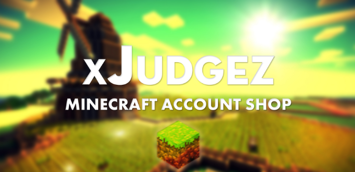
Keep using different images through the whole thread, but they have to be related (in this case, Minecraft).
First one is white-ish while the second one is gray-ish. If you use a colorful background image, keep using colorful things.
-
The Following User Says Thank You to Stack For This Useful Post:
Gaar (06-02-2016)
-
06-02-2016 #7Banned
- Join Date
- Jun 2015
- Gender
- Location
- Posts
- 6,228
- Reputation
- 852
- Thanks
- 1,669
Well it looks like ass. Originally Posted by AltsShop
-
06-02-2016 #8


- Join Date
- Mar 2012
- Gender
- Location
- Posts
- 898
- Reputation
- 28
- Thanks
- 78
- My Mood
-


First one but the texts under the Process and Prices could be more in the center.I mean its way to close to the edge imo...

-
06-02-2016 #9


- Join Date
- Oct 2012
- Gender

- Location
- Posts
- 1,166
- Reputation
- 857
- Thanks
- 570
- My Mood
-


First one

-
06-02-2016 #10


- Join Date
- May 2016
- Gender
- Location
- Posts
- 2,002
- Reputation
- 101
- Thanks
- 78
- My Mood
-


this is how it looked but he didnt like it:
Click on any of these for my service!


-
06-02-2016 #11
- Join Date
- May 2016
- Gender
- Location
- Posts
- 2,002
- Reputation
- 101
- Thanks
- 78
- My Mood
-
edit: wrong thread sorry
Click on any of these for my service!
-
06-02-2016 #12Banned
- Join Date
- Oct 2015
- Gender
- Location
- Posts
- 3,158
- Reputation
- 1004
- Thanks
- 3,082
- My Mood
-

i like the first one a lot more
-
06-03-2016 #13Banned
- Join Date
- Jun 2015
- Gender
- Location
- Posts
- 6,228
- Reputation
- 852
- Thanks
- 1,669
Well no shit he didn't like it, you can't see half the fucking text //dumb Originally Posted by Dezayn
-
06-03-2016 #14


- Join Date
- Nov 2015
- Gender
- Posts
- 260
- Reputation
- 89
- Thanks
- 34
- My Mood
-


Im minecraft designer, this minecraft picture its bad made, i suggest you using one from the naveox pack [deer] screenshot pack


-
06-03-2016 #15


- Join Date
- Sep 2010
- Gender
- Location
- Posts
- 1,445
- Reputation
- 80
- Thanks
- 530
- My Mood
-

Second one if you didn't write in black on that back ground.
NightOwl


Similar Threads
-
What's better A.V.A or Combat arms?
By failtown in forum Combat Arms DiscussionsReplies: 98Last Post: 05-14-2010, 06:55 PM -
What is better?
By timebomb99 in forum C++/C ProgrammingReplies: 2Last Post: 08-03-2009, 08:10 AM -
What is Better? Take The Poll
By xxjakeoxx98 in forum C++/C ProgrammingReplies: 20Last Post: 03-11-2009, 05:53 PM -
what is better zune or ipod ????
By klk101 in forum EntertainmentReplies: 4Last Post: 09-21-2008, 01:52 PM -
What is better????
By ghostface in forum WarRock - International HacksReplies: 11Last Post: 11-20-2007, 01:40 PM