

Thread: A KiD Named CuDi
Results 1 to 15 of 15
Hybrid View


-
01-11-2016 #1


- Join Date
- Mar 2014
- Gender

- Location
- Posts
- 5,529
- Reputation
 1371
1371- Thanks
- 1,618
- My Mood
-


A KiD Named CuDi
-
01-11-2016 #2Newbie


- Join Date
- Jan 2016
- Gender

- Posts
- 35
- Reputation
 10
10- Thanks
- 2
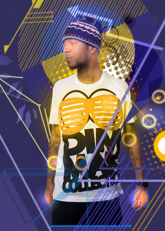
Not feelin the flares on the hands/face.
Might've been nicer with more contrast on him, and w/o the flares.
The rest of it/background is dope though.
-
01-11-2016 #3
Threadstarter
- Join Date
- Mar 2014
- Gender
- Location
- Posts
- 5,529
- Reputation
- 1371
- Thanks
- 1,618
- My Mood
-
Those aren't flares Originally Posted by VintageRandyOrton

Simply some soft brush strokes

ty tho
-
01-12-2016 #4Do not Trade - Blacklisted
Permanently 

- Join Date
- Sep 2010
- Gender
- Location
- Posts
- 10,088
- Reputation
- 515
- Thanks
- 690
- My Mood
-


image is broken, fix please.
Formerly known as gamer4evere


-
01-12-2016 #5Banned


- Join Date
- Jul 2015
- Gender
- Location
- Posts
- 1,126
- Reputation
- 29
- Thanks
- 503
- My Mood
-


Background is sick!
-
01-12-2016 #6New Member

- Join Date
- Oct 2014
- Gender
- Posts
- 21
- Reputation
- 10
- Thanks
- 153
- My Mood
-

Looks like shit.

-
The Following 3 Users Say Thank You to AdedBiatch For This Useful Post:
Elocrypt. (01-17-2016),IV2B (01-12-2016),Rated Designs (01-12-2016)
-
01-12-2016 #7Banned
- Join Date
- Jun 2009
- Gender
- Posts
- 8,332
- Reputation
- 648
- Thanks
- 1,680
Odd picture of cudi to use I like the background and what you've done with it in that part. Although to add on to what mostly everyone has stated before me about the soft brush strokes give off a flare effect and it just takes away from the image in my opinion.
-
01-12-2016 #8Banned
- Join Date
- Jun 2015
- Gender
- Location
- Posts
- 6,228
- Reputation
- 852
- Thanks
- 1,669

looks pretty good but the brush strokes on the hands look weird.


-
01-20-2016 #9MPGH Lord

- Join Date
- Dec 2013
- Gender
- Posts
- 5,322
- Reputation
- 453
- Thanks
- 1,717
- My Mood
-


I totally love his song DayNNight , but this image in first looks totally cool ,but his hand doenst look nice.

-
01-23-2016 #10Dual-Keyboard Member

- Join Date
- Mar 2015
- Gender
- Location
- Posts
- 253
- Reputation
- 10
- Thanks
- 23
i like that bro, thats dope !
-
01-25-2016 #11Novice

- Join Date
- Jan 2016
- Gender
- Posts
- 50
- Reputation
- 10
- Thanks
- 12

I don't really like it. But it's my opinion...
-
01-27-2016 #12


- Join Date
- Sep 2012
- Gender
- Location
- Posts
- 750
- Reputation
- 10
- Thanks
- 83
- My Mood
-


I just dont like the colours, would be cooler with shades of gray, white and black.
-
01-27-2016 #13Banned
- Join Date
- Oct 2013
- Gender
- Posts
- 151
- Reputation
- 10
- Thanks
- 112
- My Mood
-


looks great, love what you done with the colors
-
01-28-2016 #14Novice
- Join Date
- Aug 2013
- Gender
- Posts
- 56
- Reputation
- 10
- Thanks
- 203
- My Mood
-

My honest opinions.
-OTHER than the fact it looks like something I'd find on a shirt @K-Mart
-I like the colors you have, they seem to pull me. But something about them makes it look unbalanced to me.
-The circles around the bottom feel to "soft".
-The resolution of the image is very low, understandably the stock of him may have been low res, but this renders it almost 100% useless other than using it as a phone background :/
-The image as a whole feels too heavy on the right side, and doesn't follow the "Rule of Thirds" very well.
https://emptyeasel.com/2009/02/03/the...t-in-your-art/ (Link to and explanation of the rule of thirds.)
-The cutout you did looks a tad rough. Could use some pixel by pixel selection. Tedious, but better in the long run, makes it look less "rushed" and "zero fucks given" looking.
AND
Last, obvious, and stated a million times, the glow on the hands and face are WAY to open and need to be removed, replaced, or made more subtle.
Now that we got the negatives out of the way!
I like the blending between the different shapes you throw out.
I like the lighting you threw in by the middle of his shit
And I would like to see more effects given directly to the stock, instead of throwing a bunch of polys and lines around a stock image.
You have good potential,
but it seems like you rush a bit too much and are more eager to hear compliments or good feedback on a piece of work than actually taking the time to make sure the work is well made, original, or even well balanced.
-Stank---~~~---I do things. With stuff. And such, things happen.---~~~---
-
01-29-2016 #15Dual-Keyboard Member

- Join Date
- Feb 2015
- Gender
- Posts
- 394
- Reputation
- 13
- Thanks
- 37
- My Mood
-

Diff colors and it would be very good.
But its still good.


 Reply With Quote
Similar Threads
-
12 year old kid named crosssfires
By eronikz in forum CrossFire DiscussionsReplies: 1Last Post: 12-12-2015, 09:10 AM -
Hate this kid name "liberty"
By PashaAmd in forum Flaming & RageReplies: 11Last Post: 03-14-2011, 02:16 PM -
Me raging some kid named hamood, check it out!
By Hamoood987 in forum Flaming & RageReplies: 3Last Post: 10-09-2010, 07:03 AM -
Kid Cudi
By -ParallaX in forum ShowroomReplies: 12Last Post: 09-11-2009, 08:55 PM -
yeah man he is such a homo, that kid name diisasta
By oobio in forum Combat Arms Hacks & CheatsReplies: 3Last Post: 12-30-2008, 07:03 PM