

 kek
kek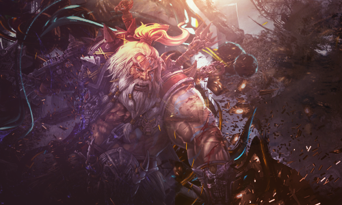

 Reply With Quote
I feel like the composition could be improved a bit. Those C4Ds could be integrated more into the tag, they look a bit out of place. I like the ilumination in it; the background could be less dirty.
Thread: Axeman
Results 1 to 15 of 18
-
02-21-2016 #1


- Join Date
- Mar 2014
- Gender

- Location
- Posts
- 5,529
- Reputation
 1371
1371- Thanks
- 1,618
- My Mood
-


-
02-21-2016 #2Newbie


- Join Date
- Jul 2014
- Gender
- Posts
- 33
- Reputation
 10
10- Thanks
- 6


-
The Following User Says Thank You to Pseudologia For This Useful Post:
Fucking Moron (02-21-2016)
-
02-21-2016 #3


- Join Date
- Oct 2015
- Gender
- Location
- Posts
- 8,001
- Reputation
- 2915
- Thanks
- 3,920
- My Mood
-


I am no graphics designer as I say once again but I'll tell ya what I think xD First off, better than anything I could make. A bit hard to see anything besides the actual man. If you were going for something a bit chaotic then you nailed it.

Always be aware of impostors, ask for verification by having the person send you a message on MPGH.
Please do not waste my time & your time with useless messages. These will be ignored and actions will be taken.
Make sure to read the MPGH Rules & each Section STICKY for extra information and rules that apply for that
specific section. *Please confirm my Identity before any transaction* If you have any questions, please feel
free to contact me using the links Below.Please make sure to SEARCH your question using the following link first |Search |
Useful Links >> |MPGH Rules | Report A Scammer | How to MPGH | Market Place Rules |
Contact Information >> | Private Message | Visitor Message |

-
The Following User Says Thank You to Hova For This Useful Post:
Fucking Moron (02-21-2016)
-
02-21-2016 #4


- Join Date
- Aug 2012
- Gender
- Posts
- 19,896
- Reputation
- 2588
- Thanks
- 7,864
- My Mood
-


This is one of your better pieces, I think it's a tad bit too dark.
Muh Tumblr (NSFW)
Click HERE to join the Night Owls if you stay up late on MPGH
Anime Recommendation (3/14/15) | Manga/Manhwa Recommendation (8/20/15)
^ I'll update one of these soon I swear ^
Member Since 8/05/2012
Editor 4/04/13 - 4/21/13
Middleman 7/14/13 - 11/4/13
Battlefield Minion 6/13/14-3/20/15
Steam Minion 7/16/14-3/20/15
Minion+ 10/1/14-3/20/15
M.A.T. Minion 10/19/14-3/20/15
ROTMG Minion 1/14/15-3/20/15
Donator Since 2/26/15 (Thanks @Cursed!)
Steam Minion 5/9/15 - 11/5/15
OSFPS Minion 9/15/15 - 11/5/15
-
The Following User Says Thank You to Color For This Useful Post:
Fucking Moron (02-21-2016)
-
02-21-2016 #5
Threadstarter
- Join Date
- Mar 2014
- Gender
- Location
- Posts
- 5,529
- Reputation
- 1371
- Thanks
- 1,618
- My Mood
-
Thanks haha Originally Posted by Color

Really worked on the color touch ups at the end.
Looks much better than the old stuff.
-
02-22-2016 #6Banned


- Join Date
- Jul 2015
- Gender
- Location
- Posts
- 1,126
- Reputation
- 29
- Thanks
- 503
- My Mood
-


It looks epic.
-
02-22-2016 #7


- Join Date
- Nov 2012
- Gender
- Location
- Posts
- 3,797
- Reputation
- 658
- Thanks
- 873
You're going to want to lessen the background noise and dimness of the overall image. I can hardly see the man with the axe unless I let my eyes really focus on it. Way too much going on in the image alone, but a nice work. I think it looks great other than the minor problems I mentioned earlier. I agree with Color this is one of your bests.
Originally Posted by Hova
-
02-22-2016 #8Bobo's Trainer

- Join Date
- Mar 2015
- Gender
- Location
- Posts
- 753
- Reputation
- 116
- Thanks
- 110
- My Mood
-


Fucking beautiful, I love it. It must take a lot of time coming up with that.


Donator/Premium since May 2015
Member of MPGH since March 2015
100 Posts [Done]
300 Posts [Done]
600 Posts [Done]
1K. Posts [x]
-
02-23-2016 #9New Member

- Join Date
- Feb 2016
- Gender
- Location
- Posts
- 1
- Reputation
- 10
- Thanks
- 0

I love the depth it has to it; great colour scheme too.
-
03-05-2016 #10Do not Trade - Blacklisted
Permanently 

- Join Date
- Sep 2010
- Gender
- Location
- Posts
- 10,088
- Reputation
- 515
- Thanks
- 690
- My Mood
-


Long time I don't visit MPGH xD
Anyway I think you need to work on the man's arm because around it its too dark, and the color transition is too harsh, perhaps by putting a layer with white on that zone and in Overlay at 20-30% would suffice to fix that problem a bit. Rest is 10/10, final rating of the piece is 9.5/10 @Organized ChaosFormerly known as gamer4evere


-
03-05-2016 #11Banned
- Join Date
- Dec 2015
- Gender
- Location
- Posts
- 251
- Reputation
- 22
- Thanks
- 26
- My Mood
-

Wow , this one looks really good man !
-
03-05-2016 #12
Threadstarter
- Join Date
- Mar 2014
- Gender
- Location
- Posts
- 5,529
- Reputation
- 1371
- Thanks
- 1,618
- My Mood
-
Thanks man :P Originally Posted by Mokou-Sama
 <3
<3
-
03-07-2016 #13MPGH Lord

- Join Date
- Dec 2013
- Gender
- Posts
- 5,322
- Reputation
- 453
- Thanks
- 1,717
- My Mood
-

Your best post there


-
03-07-2016 #14the greatest


- Join Date
- Mar 2010
- Gender
- Location
- Posts
- 30,484
- Reputation
- 6104
- Thanks
- 8,326
- My Mood
-

looks cool, nice work.


VIP Support // May 2011
CF Minion // January 2012
Newsforce // August 2012
Minion+ // March 2013
Moderator // August 2014
Former Staff // January 2015
General Minion // July 2015
Publicist // December 2015

-
03-07-2016 #15Dual-Keyboard Member

- Join Date
- Oct 2014
- Gender
- Location
- Posts
- 408
- Reputation
- 218
- Thanks
- 47
- My Mood
-

can barely see it. Have a raw file?
