


 Reply With Quote
Version 2 looks much better.
You could crop the image to make it look better. Cut as much as possible of the bottom part of the image.
I would also make your background a bit more blue so it blends better with he effects, or make the effects less blue by turning down the opacity.
It is still a pretty good job. I like it.
Thread: Space manipulation
Results 1 to 15 of 23
-
10-22-2016 #1Bobo's Trainer


- Join Date
- Jul 2013
- Gender

- Posts
- 903
- Reputation
 42
42- Thanks
- 134


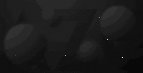
Space manipulation
im new to this kind of stuff, what do you think?
Normal version :

[New] More grain and rgb effect:

[OLD] V1 :

[OLD] V2 :

Original photo :

Last edited by Monstercookie; 10-23-2016 at 07:37 AM.
-
10-22-2016 #2Banned


- Join Date
- Feb 2016
- Gender
- Location
- Posts
- 3,235
- Reputation
 1606
1606- Thanks
- 1,851
- My Mood
-


-
10-23-2016 #3
ThreadstarterBobo's Trainer
- Join Date
- Jul 2013
- Gender
- Posts
- 903
- Reputation
- 42
- Thanks
- 134
What do you think about the 2 other versions that I just added Originally Posted by Dynasty

 ?
?
Last edited by Monstercookie; 10-23-2016 at 07:30 AM.
-
10-23-2016 #4Banned
- Join Date
- Aug 2016
- Gender
- Location
- Posts
- 864
- Reputation
- 51
- Thanks
- 186
- My Mood
-

They all feel kinda weird to me idk why just kinda unnatural in a way
-
10-23-2016 #5
ThreadstarterBobo's Trainer
- Join Date
- Jul 2013
- Gender
- Posts
- 903
- Reputation
- 42
- Thanks
- 134
Do you think that the newer versions also look unatural? Anything I could do better? Originally Posted by Wave
-
10-23-2016 #6Banned
- Join Date
- Aug 2016
- Gender
- Location
- Posts
- 864
- Reputation
- 51
- Thanks
- 186
- My Mood
-
newer versions look better but i just dont like it b/c he is looking down and it makes it feel like there is a floor or something. idk tbh Originally Posted by Monstercookie
-
10-23-2016 #7
ThreadstarterBobo's Trainer
- Join Date
- Jul 2013
- Gender
- Posts
- 903
- Reputation
- 42
- Thanks
- 134
I see what you mean. I just couldn't find any other pics of this guy looking up like he was flying or something. Originally Posted by Wave
-
10-23-2016 #8


- Join Date
- Oct 2009
- Gender
- Posts
- 13,715
- Reputation
- 2077
- Thanks
- 3,264
- My Mood
-

Top two, the focal point looks very low quality compared to the bottom 2.
When I look at the bottom 2 the backgrounds look low quality.
Not sure if it's from over filtering/effects or you simply used bad quality stocks.
-
10-23-2016 #9
ThreadstarterBobo's Trainer
- Join Date
- Jul 2013
- Gender
- Posts
- 903
- Reputation
- 42
- Thanks
- 134
Yeah I fucked up, because I forgot to save the psd file. So I took a lot of pictures with the gyazo tool and then the quality got bad. Originally Posted by Ethereal
-
10-23-2016 #10Banned
- Join Date
- Oct 2016
- Gender
- Location
- Posts
- 67
- Reputation
- 10
- Thanks
- 6
- My Mood
-


Pretty nice dude
-
10-24-2016 #11


- Join Date
- Aug 2016
- Gender
- Location
- Posts
- 1,732
- Reputation
- 261
- Thanks
- 476

Looks great .
-
10-24-2016 #12
ThreadstarterBobo's Trainer
- Join Date
- Jul 2013
- Gender
- Posts
- 903
- Reputation
- 42
- Thanks
- 134
^ Thanks both
-
10-24-2016 #13


- Join Date
- Jan 2014
- Gender
- Location
- Posts
- 2,372
- Reputation
- 266
- Thanks
- 513
- My Mood
-


Damn, that's some epic editting skills
[IMG]https://cdn129.picsar*****m/215837188000202.gif?r240x240[/IMG]
-
10-25-2016 #14
ThreadstarterBobo's Trainer
- Join Date
- Jul 2013
- Gender
- Posts
- 903
- Reputation
- 42
- Thanks
- 134
Thanks Originally Posted by Fartniture™
.
-
10-26-2016 #15New Member
- Join Date
- Oct 2016
- Gender
- Location
- Posts
- 11
- Reputation
- 10
- Thanks
- 1

Looks dope brah, terrible skills baby lets go
Similar Threads
-
Render Manipulation Using Filters - Signature
By Bull3t in forum TutorialsReplies: 23Last Post: 07-08-2009, 11:58 PM -
some secure (web-)space with ftp?
By d0n in forum General Game HackingReplies: 4Last Post: 03-08-2008, 02:19 AM -
what is the code and the right hotkey (space) for SJ
By floris12345! in forum Visual Basic ProgrammingReplies: 4Last Post: 01-20-2008, 01:37 PM -
Quick $10 do an 8th grade report, only 3 pages double spaced!
By x1xtomx1x in forum GeneralReplies: 14Last Post: 11-06-2007, 04:29 PM -
Space Cowboy Online
By wardo1926 in forum General GamingReplies: 3Last Post: 12-30-2005, 10:15 AM