


 Reply With Quote
I am not going to be "that guy" and say it's hideous and why even try, because everyone starts somewhere. Instead I am going to point out a bunch of flaws and how to fix them. First off you should use a better background to make things look cleaner. You should then find a font that really stands out and makes people think it looks nice. You can also have different decals and patterns to make it stand out. Instead of just adding a stroke to images, try and make something out of the image. Make sure the font is readable, you don't want people not knowing what is going on. When it comes to the whole "click here to view original image", you can make the width of the picture 700px. This will make it so it still looks nice and won't have that show up above it. Everyone starts off somewhere so just keep practicing and learning from others. If you want, you can add me on skype and I can give you tutorials on how to improve your designs. Skype is in my sig.
Results 1 to 13 of 13
-
03-23-2017 #1Dual-Keyboard Member


- Join Date
- Jan 2014
- Gender

- Location
- Posts
- 411
- Reputation
 23
23- Thanks
- 843
- My Mood
-


First Thread Design | Need Opinions
Hey everyone, quite new to this stuff, hoping to get better. Anyways here it is:
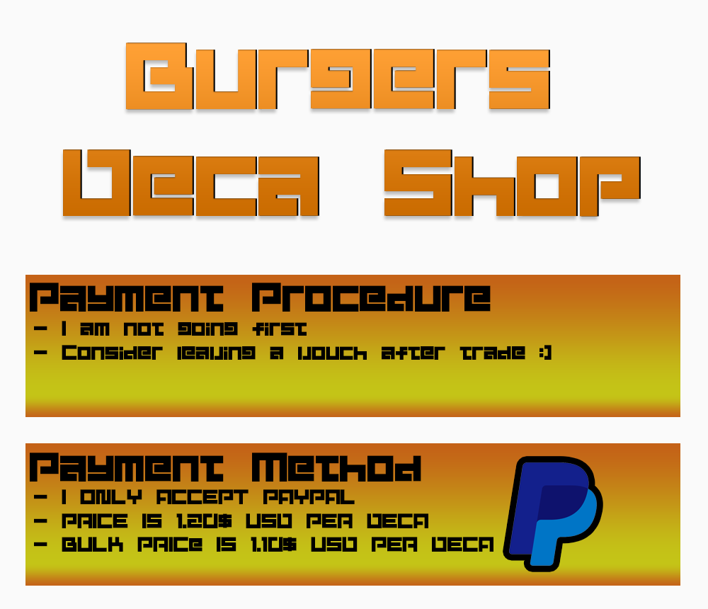

Fml thread design is ruined by the little thingy that says 'click here to view original size' - Anyway to remove that?
Anyways opinions are needed (things I can improve etc).Last edited by BurgerLoverMx; 03-23-2017 at 07:06 PM.
-
03-23-2017 #2Banned


- Join Date
- Oct 2015
- Gender
- Location
- Posts
- 185
- Reputation
- 10
- Thanks
- 203
- My Mood
-


-
The Following User Says Thank You to VAW$RfgW4TWW54 For This Useful Post:
BurgerLoverMx (03-24-2017)
-
03-24-2017 #3Banned

- Join Date
- Nov 2016
- Gender
- Location
- Posts
- 3,155
- Reputation
- 326
- Thanks
- 1,363
- My Mood
-


The font makes it hard to read and the background doesn't reflect well the title.
Try to adjust both to make it easier to navigate, thats the point of a thread design
-
The Following User Says Thank You to Rob For This Useful Post:
BurgerLoverMx (03-24-2017)
-
03-24-2017 #4New Member

- Join Date
- Mar 2017
- Gender
- Posts
- 17
- Reputation
- 10
- Thanks
- 1
Anyway nice choose of fonts.
-
The Following User Says Thank You to Fanatical For This Useful Post:
BurgerLoverMx (03-24-2017)
-
03-29-2017 #5


- Join Date
- Dec 2016
- Gender
- Location
- Posts
- 965
- Reputation
- 47
- Thanks
- 162
- My Mood
-

 head to dafont and go to the Sans Serif section
 Originally Posted by Fanatical
 [IMG]https://giant.gfyca*****m/UnimportantLiveHarrier.gif[/IMG]

-
04-05-2017 #6
ThreadstarterDual-Keyboard Member
- Join Date
- Jan 2014
- Gender
- Location
- Posts
- 411
- Reputation
- 23
- Thanks
- 843
- My Mood
-
Sorry for late update, but I remade one and it looks alot more slick imo!
https://www.mpgh.net/forum/showthread.php?t=1241192
The first one I made was completely awful lol
-
04-07-2017 #7Newbie

- Join Date
- Jan 2016
- Gender

- Posts
- 42
- Reputation
- 10
- Thanks
- 7
 This really depends on what age bracket market are you into with. It looks like you are going into 14-19 people. Because if you are going to make it more professional use a little colors (and should be in the same color shade or near the color shade), little details and be vigilant to details such as text and use font that would match the thread (most often it would be handwritten or calligraphy). You can also check other thread design not to copy but to gather ideas and put it into one. Originally Posted by BurgerLoverMx
Rate: 5/10
-
04-13-2017 #8Novice

- Join Date
- Aug 2016
- Gender
- Location
- Posts
- 97
- Reputation
- 10
- Thanks
- 11
- My Mood
-


The updated one is a huge improvement than the original
Overall it's fairly nice, fonts are good and colors are decent, but there is always room for improvement, don't give up and keep taking advice.
Would give it a 7/10 and I'm being fairly generous with that rating, it may appeal to some and others may hate it
-
04-13-2017 #9Expert Member

- Join Date
- Aug 2014
- Gender
- Location
- Posts
- 612
- Reputation
- 10
- Thanks
- 271
- My Mood
-

hey, we all start somewhere
-
04-16-2017 #10Banned
- Join Date
- Jan 2017
- Gender
- Location
- Posts
- 198
- Reputation
- 10
- Thanks
- 19
- My Mood
-

Like everyone else is saying, I personally don't think the font is nice. The font kinda makes this hard to read
-
04-24-2017 #11New Member
- Join Date
- Apr 2017
- Gender
- Posts
- 12
- Reputation
- 10
- Thanks
- 2

Awesome Post I like it....
Thank You
-
04-24-2017 #12Banned
- Join Date
- Apr 2017
- Gender
- Location
- Posts
- 180
- Reputation
- 10
- Thanks
- 61
- My Mood
-

Not a fan of the font and the background colors. Personally blue/silver/gold is more appealing. However, if you need some nice, cool, custom fonts, hmu on skype at ******mpghlegion
-
04-25-2017 #13


- Join Date
- Dec 2016
- Gender
- Location
- Posts
- 2,019
- Reputation
 1154
1154- Thanks
- 4,353
- My Mood
-


What I think you should change:
- Don't add stroke (Skype logo + Paypal logo)
- Fon't is awful [I'd say use Chosence/Opificio - Personal favorites]
- Background colors too dark
MPGH History:
Official Publicist (Wiki Manager) - 12-23-2017
Official Publicist (Wiki Editor) - 12-06-2017
Official News Team (Interviewer) - 09-09-2017
Official News Team (Sports News) - 08-07-2017
Premium Member - 02-05-2017
Registered - 12-19-2016


Similar Threads
-
My First Thread Design & First Time Using Photoshop [Need Feedback]
By xCoded in forum GalleriesReplies: 26Last Post: 04-27-2020, 04:28 AM -
[Graphic Art] My first thread design (CnC appreciated)
By UKrefund in forum GalleriesReplies: 1Last Post: 04-22-2019, 12:01 PM -
[Graphic Art] First Thread Design
By meme in forum GalleriesReplies: 16Last Post: 04-24-2017, 11:54 AM -
[Graphic Art] Thread Design, Need Critics & Comments.
By smsunarto in forum Art & Graphic DesignReplies: 5Last Post: 06-25-2016, 04:00 PM -
[WTB] Thread design needed (Amazon refund service)
By TripperNet in forum Buying Accounts/Keys/ItemsReplies: 1Last Post: 03-20-2016, 08:35 AM