


 Reply With Quote
Both are rather plain. The vector needs alot more detail to make it more appealing. The DP is a bit sketchy but I guess that was the concept you were after.
Thread: Oooo, Opinions?
Results 1 to 15 of 16
-
07-06-2010 #1Newbie


- Join Date
- Mar 2010
- Gender

- Posts
- 77
- Reputation
 10
10- Thanks
- 1
- My Mood
-


Oooo, Opinions?
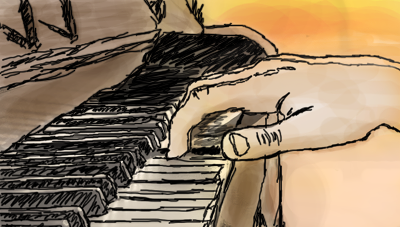
Gimme yo' opinions.
Fully vectored by me.

Scratch; digi.
-
07-06-2010 #2


- Join Date
- Dec 2008
- Gender

- Location
- Posts
- 24,316
- Reputation
 3869
3869- Thanks
- 5,890
- My Mood
-

 THE ABSOLUTE GREATEST


-
07-06-2010 #3MPGH God III


- Join Date
- Jul 2009
- Gender
- Location
- Posts
- 8,229
- Reputation
- 95
- Thanks
- 808
- My Mood
-

the vexel isnt that appealing
the colours on the digipaint arent either really
[IMG]https://i930.photobucke*****m/albums/ad149/MattPreston/God-of-the-ex.png[/IMG]
Shifty sexy shit
[IMG]https://i152.photobucke*****m/albums/s198/blackbliss11/scrcrwgift.png[/IMG]
-
07-07-2010 #4Dual-Keyboard Member

- Join Date
- Jul 2010
- Gender
- Location
- Posts
- 376
- Reputation
- 10
- Thanks
- 4
- My Mood
-

What did you use to make it?
-
07-07-2010 #5Leecher

- Join Date
- Jan 2010
- Gender
- Posts
- 24
- Reputation
- 10
- Thanks
- 0
- My Mood
-


nooooooooooooooooooo
-
07-07-2010 #6Dual-Keyboard Member
- Join Date
- Jul 2010
- Gender
- Location
- Posts
- 376
- Reputation
- 10
- Thanks
- 4
- My Mood
-
Shut up.

-
07-07-2010 #7
ThreadstarterNewbie
- Join Date
- Mar 2010
- Gender
- Posts
- 77
- Reputation
- 10
- Thanks
- 1
- My Mood
-
I used photoshop. 1~3 pixel brushes for the digi, and I pretty much pentooled the first one.
BTW guys. Are there any reasons why they aren't appealing?Last edited by Risqueyy; 07-07-2010 at 03:59 AM.
-
07-07-2010 #8Dual-Keyboard Member
- Join Date
- Jul 2010
- Gender
- Location
- Posts
- 376
- Reputation
- 10
- Thanks
- 4
- My Mood
-
Nice, you got a tablet?
-
07-07-2010 #9Fractal Whore

- Join Date
- Jun 2010
- Gender
- Location
- Posts
- 1,234
- Reputation
- 68
- Thanks
- 49
- My Mood
-

Pretty good, could use something else though, Make it stand out more.
-
07-07-2010 #10Dual-Keyboard Member
- Join Date
- Jul 2010
- Gender
- Location
- Posts
- 376
- Reputation
- 10
- Thanks
- 4
- My Mood
-
The colors are too neutral and the pictures are calm. Not exciting.
-
07-07-2010 #11
ThreadstarterNewbie
- Join Date
- Mar 2010
- Gender
- Posts
- 77
- Reputation
- 10
- Thanks
- 1
- My Mood
-
Noope. Mouse. >.> Originally Posted by serpentine back-up

And yeah I gotcha' on that one.
-
07-07-2010 #12Hush Little Heart

- Join Date
- Aug 2008
- Gender
- Posts
- 12,698
- Reputation
- 1277
- Thanks
- 4,294,967,295

First one is pretty fucking awesome, I can't really critique it much. I dislike your current avatar.

-
07-07-2010 #13
ThreadstarterNewbie
- Join Date
- Mar 2010
- Gender
- Posts
- 77
- Reputation
- 10
- Thanks
- 1
- My Mood
-
Don't hate, he's a handsome man. /yea Originally Posted by Czar
-
07-08-2010 #14Blackhat Hacker

- Join Date
- Aug 2008
- Gender
- Location
- Posts
- 1,623
- Reputation
- 22
- Thanks
- 176

-
07-08-2010 #15
ThreadstarterNewbie
- Join Date
- Mar 2010
- Gender
- Posts
- 77
- Reputation
- 10
- Thanks
- 1
- My Mood
-
Or very modest. /yea Originally Posted by serpentine
Similar Threads
-
I need your opinion.
By SadisticGrin in forum GeneralReplies: 11Last Post: 11-04-2006, 05:43 PM -
Opinion on Car Insurance
By arunforce in forum GeneralReplies: 17Last Post: 09-29-2006, 06:07 PM -
Opinions please
By SadisticGrin in forum Art & Graphic DesignReplies: 13Last Post: 07-30-2006, 04:25 AM -
Opinions WPE Pro or Tsearch?
By ypg_gamer in forum General Game HackingReplies: 11Last Post: 01-24-2006, 07:04 PM