


Too messy imo.
Assuming those particles are on different layers, add soft drop shadow on some of them, to give the sig more depth. I also think it's too contrasted, the girl is almost plain white (unless that's the renders fault).
The background looks kinda weird, that green comes out of nowhere. Either change the Hue to a more matching color (say purple), or incorporate more green objects near the focal.
Thread: Mysteries Behind
Results 1 to 10 of 10
-
06-07-2011 #1Novice


- Join Date
- Apr 2011
- Gender

- Posts
- 74
- Reputation
 13
13- Thanks
- 0
- My Mood
-


Mysteries Behind
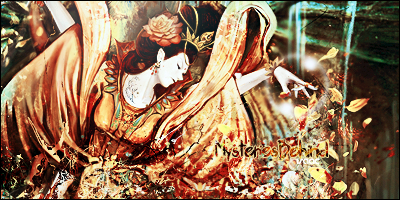
v2

-
06-08-2011 #2Dual-Keyboard Member

- Join Date
- Jul 2009
- Gender
- Location
- Posts
- 485
- Reputation
- 13
- Thanks
- 37
- My Mood
-


[IMG]https://i1225.photobucke*****m/albums/ee383/Artem_Cher/Signatures/artem-text-b.png[/IMG][IMG]https://i1225.photobucke*****m/albums/ee383/Artem_Cher/Signatures/HalfLife.png[/IMG]
So you think you can TAG? Learn more.
-
06-08-2011 #3Advanced Member

- Join Date
- Oct 2009
- Gender
- Location
- Posts
- 226
- Reputation
- 14
- Thanks
- 16
- My Mood
-


looks greats .. but the text it's off .. u can make that more visible .. and V2 Copy it's more dark ... this signature like me


-
06-08-2011 #4Do not Trade - Blacklisted
Permanently 

- Join Date
- Sep 2010
- Gender
- Location
- Posts
- 10,088
- Reputation
 515
515- Thanks
- 690
- My Mood
-


Make text come out more. And try not to scramble everything below the image...
8/10 either way.Formerly known as gamer4evere


-
06-08-2011 #5Banned


- Join Date
- Aug 2008
- Gender
- Location
- Posts
- 3,384
- Reputation
- 18
- Thanks
- 328
- My Mood
-


Whats the difference between v1 and v2? Is it the lighting? And this seems like it got topazed but actually didn't.
-
06-08-2011 #6


- Join Date
- Jun 2010
- Gender
- Location
- Posts
- 105
- Reputation
- 8
- Thanks
- 6
- My Mood
-


in v2 he increased the lighting
@artemon
its a stock the green background is supposed to be there some of the lighting and other effects seemed to increase the contrast of the background.
other than the text very nice 8/10 for me just work on text, blends to much

Roses are red, bacon is also red, poems are hard, bacon.
Freerunner, search it, watch it, I WAS IN IT!!!!!!
-
06-08-2011 #7Banned
- Join Date
- Aug 2008
- Gender
- Location
- Posts
- 3,384
- Reputation
- 18
- Thanks
- 328
- My Mood
-
... Originally Posted by XxhellsshadowxX


-
06-08-2011 #8
ThreadstarterNovice
- Join Date
- Apr 2011
- Gender
- Posts
- 74
- Reputation
- 13
- Thanks
- 0
- My Mood
-
LOL..
v2 Decreased xD
-
06-08-2011 #9
- Join Date
- Jun 2010
- Gender
- Location
- Posts
- 105
- Reputation
- 8
- Thanks
- 6
- My Mood
-
my bad xD its my monitor
 stop hattin
Roses are red, bacon is also red, poems are hard, bacon.
Freerunner, search it, watch it, I WAS IN IT!!!!!!
-
06-11-2011 #10Synthetic Hacker

- Join Date
- May 2009
- Gender
- Location
- Posts
- 1,344
- Reputation
- 33
- Thanks
- 272
- My Mood
-

