


Jabuuty671 (07-02-2011),ShadeyZzZz (07-03-2011)
Results 1 to 11 of 11
-
07-02-2011 #1Blackhat Hacker


- Join Date
- Mar 2011
- Gender

- Posts
- 1,846
- Reputation
 150
150- Thanks
- 361
- My Mood
-


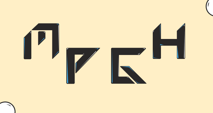
[56k]MPGH letters,webpage, and another DP

.
.
CNCLast edited by Keroaplt; 07-02-2011 at 09:58 AM.
-
The Following 2 Users Say Thank You to Keroaplt For This Useful Post:
-
07-02-2011 #2MPGH King


- Join Date
- Aug 2008
- Gender
- Location
- Posts
- 6,380
- Reputation
- 149
- Thanks
- 855

-
07-02-2011 #3
ThreadstarterBlackhat Hacker
- Join Date
- Mar 2011
- Gender
- Posts
- 1,846
- Reputation
- 150
- Thanks
- 361
- My Mood
-
But the webpage is really big tho

-
07-02-2011 #4Dual-Keyboard Member

- Join Date
- May 2011
- Gender
- Location
- Posts
- 352
- Reputation
 -103
-103- Thanks
- 27


First one is meh...
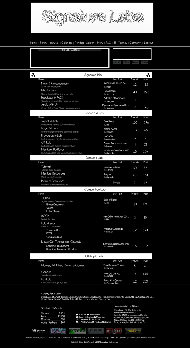
Second one is cool but delete everything that is below the white line under which it mentions the currently active users.
Third one
-
07-02-2011 #5MPGH Expert

- Join Date
- Oct 2010
- Gender

- Location
- Posts
- 1,070
- Reputation
- 18
- Thanks
- 41

I like the web theme
 .
.

R.I.P 346
-
07-02-2011 #6
ThreadstarterBlackhat Hacker
- Join Date
- Mar 2011
- Gender
- Posts
- 1,846
- Reputation
- 150
- Thanks
- 361
- My Mood
-
What do you mean by Originally Posted by 100% NOOB


-
07-02-2011 #7Banned

- Join Date
- Jul 2010
- Gender
- Location
- Posts
- 1,878
- Reputation
- 69
- Thanks
- 119
- My Mood
-


First one looks like a really bad drawing of a penis.
Forum looks okay, a little too plain though. I don't get the last one.
-
07-02-2011 #8Synthetic Hacker

- Join Date
- May 2009
- Gender
- Location
- Posts
- 1,344
- Reputation
- 33
- Thanks
- 272
- My Mood
-


The last one reminds me of a WIP.

-
07-02-2011 #9MPGH Keyboard Bully

- Join Date
- Sep 2009
- Gender
- Posts
- 21,229
- Reputation
 1468
1468- Thanks
- 4,098
Had to change the Mpgh to MPGH. i'm a butthurt asshole T_T
I don't get the point of the first 2 pictures what's the web page supposed to be?
that last logo thing wasn't really tickling my senses, but I do like that font style, maybe the yellow background and the fact that they're spaced out killed it.
-
07-02-2011 #10Banned

- Join Date
- Dec 2005
- Gender
- Location
- Posts
- 1,629
- Reputation
- 276
- Thanks
- 221

i don't know what the first one's supposed to be.
the second one, the webpage layout. gay as fuck.
third one, as jab said the font is cool. just spread out like that makes it retarded.
-
07-02-2011 #11Blackhat Hacker

- Join Date
- May 2010
- Gender
- Location
- Posts
- 1,593
- Reputation
- 58
- Thanks
- 411
- My Mood
-

indeed, cuz you need to look at it a sec more, than realize oh its "MPGH" Originally Posted by Jabuuty671
other than its good!

Leecher: 0 ✔
Newbie: 25 ✔
Member: 50 ✔
Advanced Member: 100 ✔
H4X0R Member: 150 ✔
Dual-Keyboard Member: 250 ✔
Expert Member: 500 ✔
Bobo's Trainer: 750 ✔
MPGH Expert: 1000 ✔
Synthetic Hacker: 1250✔
Blackhat Hacker: 1500 ✔
Whitehat Hacker: 2000 ✖
Bobo's Guardian: 2500 ✖
Upcoming MPGHiean: 3000 ✖
MPGH Addict: 3500 ✖
MPGHiean: 4000 ✖
MPGH Knight: 4500 ✖
MPGH Lord: 5000 ✖
MPGH Champion: 5500 ✖
MPGH King: 6000 ✖
MPGH Legend: 6500 ✖
MPGH God: 7000 ✖
MPGH God II: 7500 ✖
MPGH God III: 8000 ✖
MPGH God IV: 8500 ✖
MPGH God V: 9000 ✖
♚ Arun's Slave: 9500 ✖
♔ Dave's Slave: 10000 ✖