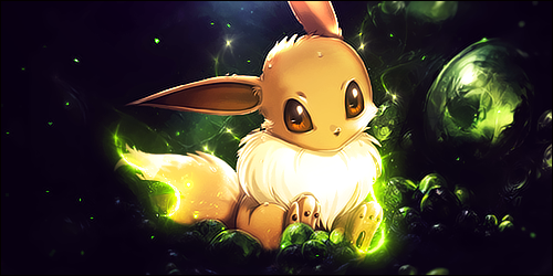
Thread: Extreme Green.

Page 1 of 2 12 LastLast
Results 1 to 15 of 20
  1. #1
    Parody's Avatar
    Join Date
    Sep 2011
    Gender
    male
    Posts
    383
    Reputation
    10
    Thanks
    16
    My Mood
    Amused

    Extreme Green.


    Judge it. comments, concerns, suggestions.
    Last edited by Parody; 09-10-2011 at 12:18 PM.

  2. #2
    Matt's Avatar
    Join Date
    Feb 2009
    Gender
    male
    Location
    The GFX section
    Posts
    3,966
    Reputation
    31
    Thanks
    423
    My Mood
    Relaxed
    Brush, render, text, it sucks. Read tutorials.
    Quote Originally Posted by ViciousArt
    And I've been doing photoshop work for a very long time, and I've never heard of BLANE.

  3. The Following User Says Thank You to Matt For This Useful Post:

    ARHQA$Y$YW4AYG4y (09-10-2011)

  4. #3
    ARHQA$Y$YW4AYG4y's Avatar
    Join Date
    Jan 2011
    Gender
    male
    Posts
    4,999
    Reputation
    20
    Thanks
    364
    My Mood
    Amused
    Pretty much what Matt said. The text has to be visible if you're going to put it, the blending sucks even though you tried blending the render with the C4D by erasing some parts.. Bad colour execution, too. Should do something to the black background, the black colour is boring as it is and whereas with no effects. Tutorials are a must if you plan to continue this.

  5. #4
    Parody's Avatar
    Join Date
    Sep 2011
    Gender
    male
    Posts
    383
    Reputation
    10
    Thanks
    16
    My Mood
    Amused
    Quote Originally Posted by Chuck Bartowski View Post
    Pretty much what Matt said. The text has to be visible if you're going to put it, the blending sucks even though you tried blending the render with the C4D by erasing some parts.. Bad colour execution, too. Should do something to the black background, the black colour is boring as it is and whereas with no effects. Tutorials are a must if you plan to continue this.
    alright thanks...
    Last edited by Parody; 09-10-2011 at 12:48 PM.

  6. #5
    Matt's Avatar
    Join Date
    Feb 2009
    Gender
    male
    Location
    The GFX section
    Posts
    3,966
    Reputation
    31
    Thanks
    423
    My Mood
    Relaxed
    If not a brush, then you just randomly pasted in a fractal to implement your background.
    Quote Originally Posted by ViciousArt
    And I've been doing photoshop work for a very long time, and I've never heard of BLANE.

  7. The Following User Says Thank You to Matt For This Useful Post:

    ARHQA$Y$YW4AYG4y (09-10-2011)

  8. #6
    Parody's Avatar
    Join Date
    Sep 2011
    Gender
    male
    Posts
    383
    Reputation
    10
    Thanks
    16
    My Mood
    Amused
    Quote Originally Posted by Matt View Post
    If not a brush, then you just randomly pasted in a fractal to implement your background.
    well i am sorry that i am not as gifted as you guys are... but everyone has to start somewhere.

  9. #7
    Matt's Avatar
    Join Date
    Feb 2009
    Gender
    male
    Location
    The GFX section
    Posts
    3,966
    Reputation
    31
    Thanks
    423
    My Mood
    Relaxed
    Quote Originally Posted by Parody View Post
    well i am sorry that i am not as gifted as you guys are... but everyone has to start somewhere.
    Tutorials. This is a bad way to start, start the right way.
    Quote Originally Posted by ViciousArt
    And I've been doing photoshop work for a very long time, and I've never heard of BLANE.

  10. The Following User Says Thank You to Matt For This Useful Post:

    ARHQA$Y$YW4AYG4y (09-10-2011)

  11. #8
    Mr.Seyeko's Avatar
    Join Date
    Sep 2011
    Gender
    female
    Posts
    7,498
    Reputation
    927
    Thanks
    1,208
    My Mood
    Stressed
    Dont let @Matt get to you @Parody
    hes just blunt and to the point, hes not the type of guy to suger coat what hes gonna say, trust me, ive been down that road, and now take his comments as helpful and not as disrespectful...

    Anyways man, you need to start reading some tutorials, you need help with
    Flow
    Lighting
    Depth

    Flow, This signatures flow is kinda messy and everything is wild, try erasing some of the effects to help the flow, as the guy is going from Bottom Right to Bottom Left, so try to make the flow go that way, also use Clipping Masks with some brushes to blend in the focal some more,

    Lighting, There is none in this tag, you can see where the lighting is coming from, from off the shadows on his hoodie, so for beginners like your self, make a new layer cover it black either put it on Screen, Lighter, or something like that take a 200px or smaller soft round brush ( white ) and just tap it once where the lighting is coming from, where you think it should be, dont make it look fake. and then take out your burn and dodge tool, Burn makes places darker, so try putting it on the darker colors on the tag, and Dodge to make it brighter.

    Depth, This also is a missing factor in your tag, Creating depth can be hard for beginners, so ill just keep it easy, stuff that seams far away or up really close to be blurred, so usually if you have an effect and you wanna make the illusion that its drifting away, blur like the top of if a lil bit and make sure it blends sorta,
    If you wanna just keep it simple just go make a new layer apply the image go to Gaussian Blur put it around 1.0 or lower and then go to edit>fade blur and put it around 50 or so, where it looks good and erase over the focal. and do the same with Sharpening, but instead of erasing focal, erase the background

    Text, Hardest thing in designs, if your not very good at it, just try to keep it simple, like use IMPACT font and maybe some clippy mask with a sexy cursive, font for subtext or your name.
    Text can make and break a signature so just be careful

    and best of luck to you bro
    Last edited by Mr.Seyeko; 09-10-2011 at 01:09 PM.


  12. #9
    Parody's Avatar
    Join Date
    Sep 2011
    Gender
    male
    Posts
    383
    Reputation
    10
    Thanks
    16
    My Mood
    Amused
    Quote Originally Posted by Matt View Post


    Tutorials. This is a bad way to start, start the right way.
    thanks.

    Quote Originally Posted by iTzSeyeko View Post
    Dont let @Matt get to you @Parody
    hes just blunt and to the point, hes not the type of guy to suger coat what hes gonna say, trust me, ive been down that road, and now take his comments as helpful and not as disrespectful...

    Anyways man, you need to start reading some tutorials, you need help with
    Flow
    Lighting
    Depth

    Flow, This signatures flow is kinda messy and everything is wild, try erasing some of the effects to help the flow, as the guy is going from Bottom Right to Bottom Left, so try to make the flow go that way, also use Clipping Masks with some brushes to blend in the focal some more,

    Lighting, There is none in this tag, you can see where the lighting is coming from, from off the shadows on his hoodie, so for beginners like your self, make a new layer cover it black either put it on Screen, Lighter, or something like that take a 200px or smaller soft round brush ( white ) and just tap it once where the lighting is coming from, where you think it should be, dont make it look fake. and then take out your burn and dodge tool, Burn makes places darker, so try putting it on the darker colors on the tag, and Dodge to make it brighter.

    Depth, This also is a missing factor in your tag, Creating depth can be hard for beginners, so ill just keep it easy, stuff that seams far away or up really close to be blurred, so usually if you have an effect and you wanna make the illusion that its drifting away, blur like the top of if a lil bit and make sure it blends sorta,
    If you wanna just keep it simple just go make a new layer apply the image go to Gaussian Blur put it around 1.0 or lower and then go to edit>fade blur and put it around 50 or so, where it looks good and erase over the focal. and do the same with Sharpening, but instead of erasing focal, erase the background

    Text, Hardest thing in designs, if your not very good at it, just try to keep it simple, like use IMPACT font and maybe some clippy mask with a sexy cursive, font for subtext or your name.
    Text can make and break a signature so just be careful

    and best of luck to you bro
    thanks for the help i like the text so i am not touching that... hope thats alright with you.
    Last edited by Parody; 09-10-2011 at 01:39 PM.

  13. #10
    Matt's Avatar
    Join Date
    Feb 2009
    Gender
    male
    Location
    The GFX section
    Posts
    3,966
    Reputation
    31
    Thanks
    423
    My Mood
    Relaxed
    Quote Originally Posted by Parody View Post
    thanks.


    thanks for the help i like the text so i am not touching that... hope thats alright with you.
    You may like it, but a large percentage of people will disagree.
    Quote Originally Posted by ViciousArt
    And I've been doing photoshop work for a very long time, and I've never heard of BLANE.

  14. The Following User Says Thank You to Matt For This Useful Post:

    ARHQA$Y$YW4AYG4y (09-10-2011)

  15. #11
    Parody's Avatar
    Join Date
    Sep 2011
    Gender
    male
    Posts
    383
    Reputation
    10
    Thanks
    16
    My Mood
    Amused
    Quote Originally Posted by Matt View Post


    You may like it, but a large percentage of people will disagree.
    @Matt

    did i ever say i was making it for anyone?

  16. #12
    Matt's Avatar
    Join Date
    Feb 2009
    Gender
    male
    Location
    The GFX section
    Posts
    3,966
    Reputation
    31
    Thanks
    423
    My Mood
    Relaxed
    Quote Originally Posted by Parody View Post
    @Matt

    did i ever say i was making it for anyone?
    Go to Image sharing. We are here to help you get better, and that text is horribly done. If you don't want us to tell you your errors, go to Image sharing.
    Quote Originally Posted by ViciousArt
    And I've been doing photoshop work for a very long time, and I've never heard of BLANE.

  17. #13
    Gamersgod's Avatar
    Join Date
    Aug 2010
    Gender
    male
    Location
    <~:gnBQA8-*r~>
    Posts
    725
    Reputation
    38
    Thanks
    44
    My Mood
    Bashful
    I would still say change text color, may be something like red or something brght that can be seen in green..

  18. #14
    Mr.Seyeko's Avatar
    Join Date
    Sep 2011
    Gender
    female
    Posts
    7,498
    Reputation
    927
    Thanks
    1,208
    My Mood
    Stressed
    Quote Originally Posted by Gamersgod View Post
    I would still say change text color, may be something like red or something brght that can be seen in green..
    Um no... that would take the attention away from the focal, which is a no no.. Dont give wrong feedback.


  19. #15
    Parody's Avatar
    Join Date
    Sep 2011
    Gender
    male
    Posts
    383
    Reputation
    10
    Thanks
    16
    My Mood
    Amused
    Quote Originally Posted by iTzSeyeko View Post
    Um no... that would take the attention away from the focal, which is a no no.. Dont give wrong feedback.
    thats what i was about to say.

Page 1 of 2 12 LastLast

Similar Threads

  1. {rel} Ztx Extreme V.1337 Fixed 5 Min Rel
    By ~claw~ in forum WarRock - International Hacks
    Replies: 27
    Last Post: 06-30-2007, 05:35 AM
  2. hand out only ZTX EXTREME BETA V.1337!
    By ~claw~ in forum WarRock - International Hacks
    Replies: 4
    Last Post: 06-26-2007, 03:22 AM
  3. exchange item bug ;), green chest,xmas event etc : KOL
    By AN1MAL in forum General Game Hacking
    Replies: 0
    Last Post: 12-26-2006, 05:43 AM
  4. Green Text
    By sealteam4 in forum WarRock - International Hacks
    Replies: 4
    Last Post: 09-05-2006, 02:35 PM
  5. changing traffic lights green
    By ace76543 in forum General Game Hacking
    Replies: 10
    Last Post: 07-18-2006, 10:34 AM