Results 1 to 11 of 11
  1. #1
    Black Eyed Peas's Avatar
    Join Date
    Jun 2011
    Gender
    male
    Location
    Croatia
    Posts
    835
    Reputation
    42
    Thanks
    74
    My Mood
    Cool

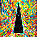
    52 LAYERS OF SMUDGING AWESOMENESS

    Tell me which one is better and then CnC.


    Last edited by Black Eyed Peas; 05-06-2012 at 01:17 PM.
    TUMBLR
     

    My Full Gallery:
    [x]

    My Best Work:
    [x][x][x][x][x][x]


  2. #2
    Cynic's Avatar
    Join Date
    Aug 2009
    Gender
    male
    Location
    Bed
    Posts
    2,038
    Reputation
    62
    Thanks
    246
    no text is better, and I hate to say this but it doesn't look as if you put 52 layers of effort in.. it looks like 1 layer of smudge

    [IMG]https://i281.photobucke*****m/albums/kk231/drsynyster/cynic.png[/IMG]

  3. The Following User Says Thank You to Cynic For This Useful Post:

    Black Eyed Peas (05-06-2012)

  4. #3
    Black Eyed Peas's Avatar
    Join Date
    Jun 2011
    Gender
    male
    Location
    Croatia
    Posts
    835
    Reputation
    42
    Thanks
    74
    My Mood
    Cool
    Quote Originally Posted by Cynic View Post
    no text is better, and I hate to say this but it doesn't look as if you put 52 layers of effort in.. it looks like 1 layer of smudge
    What do you mean?
    Does it lack depth or something or does it just look simplistic?
    I can give you guys my PSD when I get on my PC...

    EDIT: Let's hear more opinions:
    @Ethereal
    @Keroaplt
    @Ryan
    @iTzSeyeko
    @Matt
    Last edited by Black Eyed Peas; 05-06-2012 at 07:10 AM.
    TUMBLR
     

    My Full Gallery:
    [x]

    My Best Work:
    [x][x][x][x][x][x]


  5. #4
    Ryan's Avatar
    Join Date
    Jan 2009
    Gender
    male
    Posts
    7,919
    Reputation
    411
    Thanks
    998
    My Mood
    Relaxed
    I can see what it is you were trying to do, and the only issue I see is not including the render in the smudging nearly enough.
    That, and I would make the smudging a but more intense. Displacement maps maybe.

  6. The Following User Says Thank You to Ryan For This Useful Post:

    Black Eyed Peas (05-06-2012)

  7. #5
    Cynic's Avatar
    Join Date
    Aug 2009
    Gender
    male
    Location
    Bed
    Posts
    2,038
    Reputation
    62
    Thanks
    246
    Quote Originally Posted by Black Eyed Peas View Post


    What do you mean?
    Does it lack depth or something or does it just look simplistic?
    I can give you guys my PSD when I get on my PC...

    EDIT: Let's hear more opinions:
    @Ethereal
    @Keroaplt
    @Ryan
    @iTzSeyeko
    @Matt
    I mean that it is lacking depth, contrast, and it's really simple.

    [IMG]https://i281.photobucke*****m/albums/kk231/drsynyster/cynic.png[/IMG]

  8. #6
    Ethereal's Avatar
    Join Date
    Oct 2009
    Gender
    male
    Posts
    13,715
    Reputation
    2077
    Thanks
    3,264
    My Mood
    Amused
    Smudging looks too flat and kind of blurry..
    Like RY said, render could use some smudge love..
    I'm not sure what you smudged into the bg,
    but it lacks any real texture which makes the trails look too smooth.
    You could have done a few things to fix that.
    Either by adding textures, or I find that well executed clipping masks work.
    Sharpen and burn tool will be your friend after you get that part down.
    Last edited by Ethereal; 05-06-2012 at 09:06 AM.

  9. The Following User Says Thank You to Ethereal For This Useful Post:

    Black Eyed Peas (05-06-2012)

  10. #7
    Ryan's Avatar
    Join Date
    Jan 2009
    Gender
    male
    Posts
    7,919
    Reputation
    411
    Thanks
    998
    My Mood
    Relaxed
    Quote Originally Posted by Ethereal View Post
    Smudging looks too flat and kind of blurry..
    Like RY said, render could use some smudge love..
    I'm not sure what you smudged into the bg,
    but it lacks any real texture which makes the trails look too smooth.
    You could have done a few things to fix that.
    Either by adding textures, or I find that well executed clipping masks work.
    Sharpen and burn tool will be your friend after you get that part down.
    This, and then now that I think about it, be sure to keep your focal out of the center. If you're going to use the text as the focal, make sure to do some resizing. If not, follow a thirds grid and burn/dodge accordingly.

  11. The Following User Says Thank You to Ryan For This Useful Post:

    Black Eyed Peas (05-06-2012)

  12. #8
    Black Eyed Peas's Avatar
    Join Date
    Jun 2011
    Gender
    male
    Location
    Croatia
    Posts
    835
    Reputation
    42
    Thanks
    74
    My Mood
    Cool
    Looks like I fucked up more than I thought I would.
    TUMBLR
     

    My Full Gallery:
    [x]

    My Best Work:
    [x][x][x][x][x][x]


  13. #9
    Ethereal's Avatar
    Join Date
    Oct 2009
    Gender
    male
    Posts
    13,715
    Reputation
    2077
    Thanks
    3,264
    My Mood
    Amused
    Quote Originally Posted by Black Eyed Peas View Post
    Looks like I fucked up more than I thought I would.
    I wouldn't say you fucked up. Just could use some improvement in a few areas.

  14. #10
    Black Eyed Peas's Avatar
    Join Date
    Jun 2011
    Gender
    male
    Location
    Croatia
    Posts
    835
    Reputation
    42
    Thanks
    74
    My Mood
    Cool
    Thanks for the feedback, but I really can't be fucked to mess too much with the psd, I did a lot of edits on flattened images and if I deleted those I'd have to do half of the piece from the beginning.
    I did although make a few tweaks.

    Last edited by Black Eyed Peas; 05-06-2012 at 02:59 PM.
    TUMBLR
     

    My Full Gallery:
    [x]

    My Best Work:
    [x][x][x][x][x][x]


  15. #11
    Doc's Avatar
    Join Date
    Dec 2008
    Gender
    female
    Location
    In your meatus
    Posts
    24,316
    Reputation
    3869
    Thanks
    5,890
    My Mood
    Twisted
    Quote Originally Posted by Black Eyed Peas View Post
    Thanks for the feedback, but I really can't be fucked to mess too much with the psd, I did a lot of edits on flattened images and if I deleted those I'd have to do half of the piece from the beginning.
    I did although make a few tweaks.

    Definitely looks better already. The contrast alone has added depth. I think, like you've pointed out, that because you've already finished your work it'll be too hard to make drastic changes. Just keep the points Ry and Eth said in mind when making your next piece
    THE ABSOLUTE GREATEST


Similar Threads

  1. Awesome Warrock Vidz!!!
    By loky614 in forum WarRock - International Hacks
    Replies: 1
    Last Post: 05-06-2007, 07:17 PM
  2. I will create awesome public trainers with built in bypasses
    By domin8666 in forum WarRock - International Hacks
    Replies: 2
    Last Post: 05-01-2007, 09:32 PM
  3. Awesome Marien Ladder Hack!!! (4-27-07)
    By nukeist in forum WarRock - International Hacks
    Replies: 25
    Last Post: 04-29-2007, 10:27 AM
  4. Mike is awesome!
    By Dave84311 in forum General
    Replies: 0
    Last Post: 05-05-2006, 09:32 PM
  5. Awesome New Gfx Site
    By A7X Oblivian in forum Art & Graphic Design
    Replies: 1
    Last Post: 03-19-2006, 09:13 AM