


 [/URL]

 Reply With Quote
Post the original, since you said "you don't take much credit for this"
Thread: .Liquid.
Results 1 to 10 of 10
-
08-22-2011 #1

Young angel; if you hate me tell me burn in heaven♥. 

- Join Date
- May 2011
- Gender

- Location
- Posts
- 1,778
- Reputation
 339
339- Thanks
- 4,456
- My Mood
-


.Liquid.
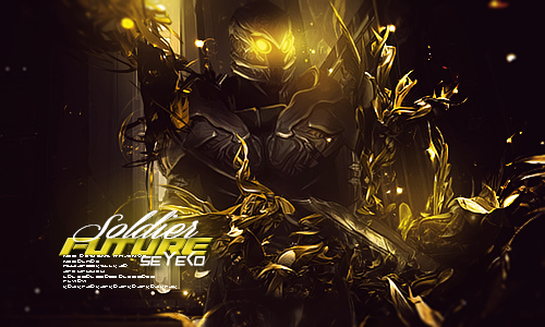
Don't really take much credit for this..

CnC?
The Original.

Last edited by Katy; 08-22-2011 at 08:15 PM.
"Do not argue with an idiot. He will drag you down to his level and beat you with experience."Princess since: 7/3/2012Need something translated from/to English? PM/VM me!
-
08-22-2011 #2MPGH Expert

- Join Date
- Jun 2010
- Gender

- Location
- Posts
- 1,091
- Reputation
- 148
- Thanks
- 119


-
08-22-2011 #3
Threadstarter
Young angel; if you hate me tell me burn in heaven♥.
- Join Date
- May 2011
- Gender
- Location
- Posts
- 1,778
- Reputation
- 339
- Thanks
- 4,456
- My Mood
-
Original. Originally Posted by Not Bawls

MY editted verison.

The tutorial came with steps...? I skipped a few, sorry."Do not argue with an idiot. He will drag you down to his level and beat you with experience."Princess since: 7/3/2012Need something translated from/to English? PM/VM me!
-
08-22-2011 #4Brony


- Join Date
- Feb 2009
- Gender
- Location
- Posts
- 3,966
- Reputation
- 31
- Thanks
- 423
- My Mood
-

Text is horribly done, but that's with a lot of people. Don't do it unless your SURE it works with the image. Also, this doesn't look like you changed much besides colors, and a few other few aspects.
-
08-22-2011 #5Title removed. Pornographic url. Will result in a ban in the future.


- Join Date
- Jan 2010
- Gender
- Location
- Posts
- 5,072
- Reputation
- 204
- Thanks
- 665
- My Mood
-


looks like u saturated it and erased

-
08-22-2011 #6
Threadstarter
Young angel; if you hate me tell me burn in heaven♥.
- Join Date
- May 2011
- Gender
- Location
- Posts
- 1,778
- Reputation
- 339
- Thanks
- 4,456
- My Mood
-
actually, i generated the tut (that comes with images) and basically started from a random point in the tutorial.. so, it looks all funny..
"Do not argue with an idiot. He will drag you down to his level and beat you with experience."Princess since: 7/3/2012Need something translated from/to English? PM/VM me!
-
08-22-2011 #7Expert Member

- Join Date
- Apr 2009
- Gender
- Posts
- 742
- Reputation
- 23
- Thanks
- 51
- My Mood
-

I love the color you went with, and i think i would use personaly a different Text, my favorite is a default one called Impact and i love to use that and then put maybe a drop shadow and then some clippy mask in it to blend into the signature, and then put maybe a cursive fancy lookn font and put my name but thats just me, thats just what i stick to because i think it looks nice sometimes and i suck at text ^^
But the text in this is bringing the signature down, never ever put the text at an angle, or try not to, but keep up the good work
-
08-22-2011 #8Reality is a lie


- Join Date
- Jan 2009
- Gender
- Location
- Posts
- 19,893
- Reputation
 659
659- Thanks
- 1,349
- My Mood
-

Original is better.

-
08-22-2011 #9
Threadstarter
Young angel; if you hate me tell me burn in heaven♥.
- Join Date
- May 2011
- Gender
- Location
- Posts
- 1,778
- Reputation
- 339
- Thanks
- 4,456
- My Mood
-
Oh hey! Thanks for the CnC. I hate those kinds of people. Originally Posted by Empire
"Do not argue with an idiot. He will drag you down to his level and beat you with experience."Princess since: 7/3/2012Need something translated from/to English? PM/VM me!
-
08-23-2011 #10Dual-Keyboard Member

- Join Date
- Aug 2011
- Gender
- Posts
- 295
- Reputation
- 22
- Thanks
- 35
 If you're posting your stuff, expect replies other than cnc.. Originally Posted by katylovez
people can give their opinions if they want.


Similar Threads
-
Acer Liquid S120 Metal (Silver)
By Ravallo in forum GeneralReplies: 20Last Post: 03-08-2011, 02:21 PM -
Liquid-Radio
By sundin in forum GeneralReplies: 12Last Post: 03-07-2011, 03:23 AM -
Purple Burst Liquid Explosion Thing
By Whisper in forum ShowroomReplies: 8Last Post: 11-10-2009, 05:55 AM -
Liquid Tension Experiment
By Zhellbound in forum GeneralReplies: 0Last Post: 04-10-2009, 10:33 AM -
Liquid Texture: GIMP
By Jackal in forum TutorialsReplies: 5Last Post: 07-09-2006, 03:20 PM