Page 1 of 2 12 LastLast
Results 1 to 15 of 22
  1. #1
    Roxter's Avatar
    Join Date
    Aug 2009
    Gender
    male
    Posts
    305
    Reputation
    10
    Thanks
    22
    My Mood
    Pensive

    RainDrops [Expose]

    v1

    v2
    Here's the same thing with lighting:

    OK, here's the same colours but actual lighting:
    v3

    Final Version, same colours, no actual lighting, but increased text visibility.
    v4

    v5

    v6
    Last edited by Roxter; 04-01-2011 at 08:42 PM.

  2. #2
    Decobez's Avatar
    Join Date
    Mar 2011
    Gender
    male
    Location
    Graphics Section <3
    Posts
    411
    Reputation
    28
    Thanks
    113
    My Mood
    Twisted
    @Roxter
    nice man i like these more

  3. #3
    ChocolateWaxx's Avatar
    Join Date
    Mar 2011
    Gender
    male
    Location
    United States
    Posts
    27
    Reputation
    11
    Thanks
    1
    My Mood
    Breezy
    Very nice. I prefer v1 over all the others because the lighting isn't too defined. I personally think that too much lighting ruins the details of pictures.

  4. #4
    Title removed. Pornographic url. Will result in a ban in the future.
    Premium Member
    Paradox's Avatar
    Join Date
    Jan 2010
    Gender
    male
    Location
    Perth :)
    Posts
    5,072
    Reputation
    204
    Thanks
    665
    My Mood
    Cheeky
    overdone text
    render too blurred

  5. #5
    Roxter's Avatar
    Join Date
    Aug 2009
    Gender
    male
    Posts
    305
    Reputation
    10
    Thanks
    22
    My Mood
    Pensive
    Quote Originally Posted by [PROTOTYPE] View Post
    overdone text
    render too blurred
    Hmm, how can I improve on render?

  6. #6
    Title removed. Pornographic url. Will result in a ban in the future.
    Premium Member
    Paradox's Avatar
    Join Date
    Jan 2010
    Gender
    male
    Location
    Perth :)
    Posts
    5,072
    Reputation
    204
    Thanks
    665
    My Mood
    Cheeky
    Quote Originally Posted by Roxter View Post
    Hmm, how can I improve on render?
    undo what u did to it or place another one and erase bits out

  7. #7
    Jabuuty671's Avatar
    Join Date
    Sep 2009
    Gender
    male
    Posts
    21,229
    Reputation
    1468
    Thanks
    4,098
    preset texture gradient on BLACK
    ?


  8. #8
    Title removed. Pornographic url. Will result in a ban in the future.
    Premium Member
    Paradox's Avatar
    Join Date
    Jan 2010
    Gender
    male
    Location
    Perth :)
    Posts
    5,072
    Reputation
    204
    Thanks
    665
    My Mood
    Cheeky
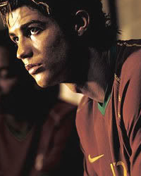
    \

    RED=REMOVE

  9. #9
    Austin's Avatar
    Join Date
    Mar 2010
    Gender
    male
    Location
    Great White North
    Posts
    30,484
    Reputation
    6104
    Thanks
    8,326
    My Mood
    Lurking


    v3 is best.


    VIP Support // May 2011
    CF Minion // January 2012
    Newsforce // August 2012
    Minion+ // March 2013
    Moderator // August 2014
    Former Staff // January 2015
    General Minion // July 2015
    Publicist // December 2015


  10. #10
    Roxter's Avatar
    Join Date
    Aug 2009
    Gender
    male
    Posts
    305
    Reputation
    10
    Thanks
    22
    My Mood
    Pensive
    Quote Originally Posted by [PROTOTYPE] View Post
    \

    RED=REMOVE
    There, two more versions. BetteR?

  11. #11
    Keroaplt's Avatar
    Join Date
    Mar 2011
    Gender
    male
    Posts
    1,846
    Reputation
    150
    Thanks
    361
    My Mood
    Bored
    just looks too blurry for me the text is really distracting from where i think you wanted your focal to be it really has no flow and the effects are novice the colors seem too dull they dont "pop" but they match at least

  12. #12
    Roxter's Avatar
    Join Date
    Aug 2009
    Gender
    male
    Posts
    305
    Reputation
    10
    Thanks
    22
    My Mood
    Pensive
    Quote Originally Posted by Keroaplt View Post
    just looks too blurry for me the text is really distracting from where i think you wanted your focal to be it really has no flow and the effects are novice the colors seem too dull they dont "pop" but they match at least
    I wasn't really going for a focal point, and I would say it does have flow as the ripples are all moving in the right direction. But maybe that's just my opinion and I fucked up at another signature. I tried to make the colours pop in the last two versions but I guess I failed. Thanks for the advice though!
    Also I feel I should mention this, this signature was made to be dark and depressing. (At least that's what the request was)
    P.S.
    I would love to know what I did well or OK, not just what I failed @ so I can distribute my skill into the appropriate areas.
    Last edited by Roxter; 04-01-2011 at 09:26 PM.

  13. #13
    Ethereal's Avatar
    Join Date
    Oct 2009
    Gender
    male
    Posts
    13,715
    Reputation
    2077
    Thanks
    3,264
    My Mood
    Amused
    Quote Originally Posted by Roxter View Post
    I wasn't really going for a focal point, and I would say it does have flow as the ripples are all moving in the right direction. But maybe that's just my opinion and I fucked up at another signature. I tried to make the colours pop in the last two versions but I guess I failed. Thanks for the advice though!
    Also I feel I should mention this, this signature was made to be dark and depressing. (At least that's what the request was)
    P.S.
    I would love to know what I did well or OK, not just what I failed @ so I can distribute my skill into the appropriate areas.
    The problem is that you're focusing too much time on trying to create a "solid" nice signature,
    pretty much neglecting individuality and creativity.
    I can tell that you've been studying old school styles of text placement..
    A year to two years ago, this type of text gave all taggers a giant erection,
    but now..that bullshit doesn't really matter.
    What matters now is being creative, and how well your overall execution of a tag is.
    Do this, and you will be one step closer to achieving a penis in your ear.
    Last edited by Ethereal; 04-01-2011 at 09:35 PM.

  14. The Following User Says Thank You to Ethereal For This Useful Post:

    Roxter (04-01-2011)

  15. #14
    Roxter's Avatar
    Join Date
    Aug 2009
    Gender
    male
    Posts
    305
    Reputation
    10
    Thanks
    22
    My Mood
    Pensive
    Quote Originally Posted by Ethereal View Post
    The problem is that you're focusing too much time on trying to create a "solid" nice signature,
    pretty much neglecting individuality and creativity.
    I can tell that you've been studying old school styles of text placement..
    A year to two years ago, this type of text gave all taggers a giant erection,
    but now..that bullshit doesn't really matter.
    What matters now is being creative, and how well your overall execution of a tag is.
    Do this, and you will be one step closer to achieving a penis in your ear.
    I've been trying and will keep trying, I've been practicing a lot lately hoping to become better. Thanks again for the advice. However, I don't want a dick in my ear.

  16. #15
    Dorado's Avatar
    Join Date
    Mar 2009
    Gender
    male
    Location
    Under Join Date :@
    Posts
    2,891
    Reputation
    25
    Thanks
    353
    My Mood
    Sneaky
    I like the swirly ripples.
    they make it look wet

    [IMG]https://i648.photobucke*****m/albums/uu201/rnjsgurwn96/METALLICA-1.png[/IMG]
    [IMG]https://i648.photobucke*****m/albums/uu201/rnjsgurwn96/Untitled-1-2.gif[/IMG]

Page 1 of 2 12 LastLast