


 Reply With Quote
even though there is a hq version it looks lq 0.0 is it my eyers
Thread: E=mc2
Results 1 to 12 of 12
-
08-29-2011 #1Title removed. Pornographic url. Will result in a ban in the future.


- Join Date
- Jan 2010
- Gender

- Location
- Posts
- 5,072
- Reputation
 204
204- Thanks
- 665
- My Mood
-


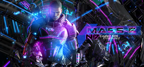
E=mc2
If we would of used this render i would of won @Keroaplt

click for hq size
https://fc09.deviantart.net/fs71/f/20...to-d4876hd.png
V2:
Last edited by Paradox; 08-29-2011 at 09:51 PM.
-
08-29-2011 #2Whitehat Hacker

- Join Date
- Aug 2009
- Gender
- Posts
- 2,421
- Reputation
- 212
- Thanks
- 196
- My Mood
-


-
08-29-2011 #3
ThreadstarterTitle removed. Pornographic url. Will result in a ban in the future.
- Join Date
- Jan 2010
- Gender
- Location
- Posts
- 5,072
- Reputation
- 204
- Thanks
- 665
- My Mood
-
Its actually a bit oversharpened Originally Posted by mAULed

get ur eyes checked niggah
Maybe its ur screen or ur not blinking enough
-
08-29-2011 #4Banned


- Join Date
- Jan 2011
- Gender
- Posts
- 4,999
- Reputation
- 20
- Thanks
- 364
- My Mood
-


A little oversharpened maybe, but it's okay.
-
08-29-2011 #5MPGH Keyboard Bully

- Join Date
- Sep 2009
- Gender
- Posts
- 21,229
- Reputation
 1468
1468- Thanks
- 4,098


 why no light blue glow on his face.
-
The Following User Says Thank You to Jabuuty671 For This Useful Post:
Cynic (08-29-2011)
-
08-29-2011 #6MPGH Expert


- Join Date
- Jun 2010
- Gender
- Location
- Posts
- 1,091
- Reputation
- 148
- Thanks
- 119

What jab said...
also everything looks too sharp.
Parts of your bg shouldn't be as sharp as your focal.
You lose depth when you keep everything on the same level like that.
also, work on your composition more, try to keep things a bit more organized.
I do like this one better than your last.
-
08-29-2011 #7Blackhat Hacker

- Join Date
- Mar 2011
- Gender
- Posts
- 1,846
- Reputation
- 150
- Thanks
- 361
- My Mood
-


I like this better than your other stuff
What bawls said also really work on your lighting I see that's a problem that you've had since you first started and you dot seem to be improving it your render should be illuminated from both sides not just the right and your c4ds need to look backlit since your background behind the c4ds is so bright
Bitch I would own you at this style
-
The Following User Says Thank You to Keroaplt For This Useful Post:
Paradox (08-29-2011)
-
08-29-2011 #8
ThreadstarterTitle removed. Pornographic url. Will result in a ban in the future.
- Join Date
- Jan 2010
- Gender
- Location
- Posts
- 5,072
- Reputation
- 204
- Thanks
- 665
- My Mood
-
Come at me bro Originally Posted by Keroaplt
-
08-29-2011 #9Expert Member
- Join Date
- Jan 2010
- Gender
- Posts
- 565
- Reputation
- 15
- Thanks
- 37
- My Mood
-


dat text
i r no liek[IMG]https://i152.photobucke*****m/albums/s198/blackbliss11/blackorbs_zps443616a7.png[/IMG]
-
08-29-2011 #10
ThreadstarterTitle removed. Pornographic url. Will result in a ban in the future.
- Join Date
- Jan 2010
- Gender
- Location
- Posts
- 5,072
- Reputation
- 204
- Thanks
- 665
- My Mood
-
Originally Posted by +dd.Shift
 LEAVE MY TEXT ALONE
-
08-29-2011 #11Leecher
- Join Date
- Aug 2011
- Gender
- Posts
- 22
- Reputation
- 10
- Thanks
- 1
Really like the color scheme at least.
-
08-29-2011 #12
ThreadstarterTitle removed. Pornographic url. Will result in a ban in the future.
- Join Date
- Jan 2010
- Gender
- Location
- Posts
- 5,072
- Reputation
- 204
- Thanks
- 665
- My Mood
-
@Jabuuty671
@Not Bawls
@Keroaplt
This better ?
?