


 Reply With Quote
Not bright enough, might look better if you lightened up the picture
Thread: Alternative Reality ATK
Results 1 to 12 of 12
-
09-23-2011 #1Blackhat Hacker


- Join Date
- Mar 2011
- Gender

- Posts
- 1,846
- Reputation
 150
150- Thanks
- 361
- My Mood
-


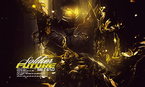
Alternative Reality ATK
[IMG]https://i1114.photobucke*****m/albums/k538/ImminentJM/krowbattle.png[/IMG]
I got a new style this time not a style rip
so proud.
CNC
shit.things look better in photoshop.......
-
09-23-2011 #2Brony


- Join Date
- Feb 2009
- Gender
- Location
- Posts
- 3,966
- Reputation
- 31
- Thanks
- 423
- My Mood
-


-
The Following User Says Thank You to Matt For This Useful Post:
ARHQA$Y$YW4AYG4y (09-28-2011)
-
09-23-2011 #3Expert Member

- Join Date
- Apr 2009
- Gender

- Posts
- 742
- Reputation
- 23
- Thanks
- 51
- My Mood
-

I agree what with matt said, ligthen it up abit and bring out some effects
-
09-23-2011 #4Banned


- Join Date
- Sep 2011
- Gender
- Posts
- 383
- Reputation
- 10
- Thanks
- 16
- My Mood
-

lmao i have that render.
-
09-23-2011 #5Brony
- Join Date
- Feb 2009
- Gender
- Location
- Posts
- 3,966
- Reputation
- 31
- Thanks
- 423
- My Mood
-
Again, not CnC. Originally Posted by Parody

-
09-24-2011 #6Expert Member

- Join Date
- Dec 2009
- Gender
- Location
- Posts
- 586
- Reputation
- 26
- Thanks
- 38

work on the lighting, make it look more realistic, also, try to do it like that so it would look like the lighting from behing is kinda coming to the front, over the c4d's, but dont overdo it.
You could try doing it by making a new layer and just soft brushing, try it [img]https://www.**********/image/1926094/Apocalypse.png[/img]
-
09-24-2011 #7
ThreadstarterBlackhat Hacker
- Join Date
- Mar 2011
- Gender
- Posts
- 1,846
- Reputation
- 150
- Thanks
- 361
- My Mood
-
That what I tried to do I think I did it right on the right c4ds but I know I didn't pull the effect off on the left c4ds
Lighting I've always had a problem with and Ima try to look more into that
-
09-25-2011 #8Banned
- Join Date
- Aug 2011
- Gender
- Location
- Posts
- 11,788
- Reputation
 854
854- Thanks
- 1,216
late but it looks so beautiful

-
09-25-2011 #9MPGH God II


- Join Date
- Sep 2011
- Gender
- Posts
- 7,498
- Reputation
- 927
- Thanks
- 1,208
- My Mood
-


 Alright kidd, if your gonna start being a Reg here, dont start spamming this BS! Originally Posted by Greed☠☣
Give some CnC or don't post, this isnt General where you can just spam all you want..

-
The Following 3 Users Say Thank You to Mr.Seyeko For This Useful Post:
ARHQA$Y$YW4AYG4y (10-05-2011),[MPGH]Ethereal (09-25-2011),Matt (09-25-2011)
-
09-25-2011 #10


- Join Date
- Oct 2009
- Gender
- Posts
- 13,715
- Reputation
- 2077
- Thanks
- 3,264
- My Mood
-
Not a fan of the compo or lighting. When you look at the outer left of the tag,
I can see where the quality just really takes a shit..most likely from adjustment layers.
You got way more talent than this bro, but I can relate to making lack luster tags.
Still looking for my style, and I know you are too.
-
The Following User Says Thank You to Ethereal For This Useful Post:
ARHQA$Y$YW4AYG4y (09-28-2011)
-
09-25-2011 #11Banned
- Join Date
- Aug 2011
- Gender
- Posts
- 418
- Reputation
- 107
- Thanks
- 26

eff me no liek
 brink out the light from the back, would give some depth and an overall smexier sig
-
09-28-2011 #12Banned
- Join Date
- Jan 2011
- Gender
- Posts
- 4,999
- Reputation
- 20
- Thanks
- 364
- My Mood
-

Do not want. Get back to 3D illustrations, they make you look pro.

Similar Threads
-
Site IP Changed/VIP Hacks/Alternative Domain
By Dave84311 in forum News & AnnouncementsReplies: 0Last Post: 05-23-2007, 12:45 PM -
Hardware UnBaN alternative?
By W$t$5TA34TYTHSETH5Y5 in forum WarRock - International HacksReplies: 0Last Post: 04-22-2007, 04:13 PM