


 Reply With Quote
Love the first one although the flow seems off.
Nice c4d work in the second one.
They both seem too wide considering everything is focused on the right,and the left is pretty much left blank.
Thread: 2 new pieces :)
Results 1 to 10 of 10
-
07-21-2012 #1New Member


- Join Date
- Jun 2012
- Gender

- Posts
- 21
- Reputation
 13
13- Thanks
- 2


2 new pieces :)


Thoughts?
Spent about 1 hour on the cloud one so...
-
07-21-2012 #2I'm dead.


- Join Date
- Nov 2009
- Gender
- Location
- Posts
- 8,852
- Reputation
 917
917- Thanks
- 1,305
- My Mood
-


Ex-Minion
Ex-Mod
8/17/11

-
The Following User Says Thank You to Jacket For This Useful Post:
Btrials (07-21-2012)
-
07-22-2012 #3Banned

- Join Date
- Nov 2011
- Gender
- Location
- Posts
- 1,327
- Reputation
- 279
- Thanks
- 137
- My Mood
-


Nice work man :P mine sucks me a NEWBIEE!
-
07-22-2012 #4


- Join Date
- Dec 2008
- Gender

- Location
- Posts
- 24,316
- Reputation
- 3869
- Thanks
- 5,890
- My Mood
-


Good concepts, and they are both nice, but the conrast is way too harsh and add on the sharpen and you get an off putting grainy look.
THE ABSOLUTE GREATEST


-
The Following User Says Thank You to Doc For This Useful Post:
Btrials (04-17-2013)
-
07-23-2012 #5You have enemies? Good, that means you stood up for something.


- Join Date
- Apr 2012
- Gender
- Location
- Posts
- 2,851
- Reputation
- 99
- Thanks
- 220
- My Mood
-


They both look really nice, kind of small though. :S I prefer bigger tags. Second one also feels a little empty, but still really bad ass. :P
Overall, I like them a lot. ^_^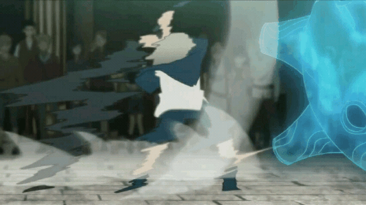


-
07-24-2012 #6


- Join Date
- Apr 2012
- Gender
- Posts
- 3,262
- Reputation
- 234
- Thanks
- 425
- My Mood
-

they are really nice. But they show a bit of emptiness, if u catch my drift.

-
07-26-2012 #7Novice

- Join Date
- Nov 2011
- Gender
- Posts
- 56
- Reputation
- 10
- Thanks
- 4
The first one is amazing in my opinion. I still really like the second one too because it's cloud and i'm a fanboy of cloud haha
-
07-26-2012 #8Blackhat Hacker

- Join Date
- Mar 2011
- Gender
- Posts
- 1,846
- Reputation
- 150
- Thanks
- 361
- My Mood
-


The first one looks really well put together though it seems too empty on the far left because its pure black the second one lacks many thing since most of it is just blurred pit on some of those effect c4ds in the first one on the left but make them less noticeable and it's pretty much perfect

-
The Following User Says Thank You to Keroaplt For This Useful Post:
Btrials (04-17-2013)
-
07-28-2012 #9
ThreadstarterNew Member
- Join Date
- Jun 2012
- Gender
- Posts
- 21
- Reputation
- 13
- Thanks
- 2
If you want the psd, I can give it to you, I'd like to see the changes

-
07-28-2012 #10Banned
- Join Date
- Sep 2009
- Gender
- Location
- Posts
- 9,021
- Reputation
- 704
- Thanks
- 2,073
- My Mood
-


abstract work in the first one looks very nice


Similar Threads
-
Happy New Years err Dave BDay!
By Dave84311 in forum News & AnnouncementsReplies: 12Last Post: 01-30-2012, 06:48 AM -
Happy New Year.
By Flawless in forum GeneralReplies: 29Last Post: 11-26-2009, 01:52 AM -
My New Years Gift.
By Flawless in forum Spammers CornerReplies: 193Last Post: 10-16-2009, 05:01 PM -
New Years!
By arunforce in forum GeneralReplies: 8Last Post: 08-25-2008, 11:56 PM -
My new signature
By arunforce in forum Art & Graphic DesignReplies: 5Last Post: 01-10-2006, 03:41 PM