


 Reply With Quote
Hmm could look a lot better the quality isnt that good. 5/10
Thread: My render Project =]
Results 1 to 10 of 10
-
05-29-2013 #1Banned


- Join Date
- Jan 2013
- Gender

- Location
- Posts
- 661
- Reputation
 47
47- Thanks
- 879
- My Mood
-


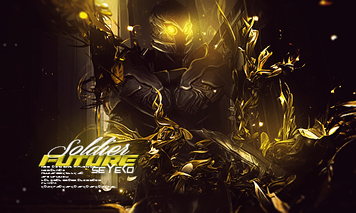
My render Project =]

Take a Look And Post feed back
-
05-30-2013 #2MPGH Addict


- Join Date
- Sep 2012
- Gender
- Location
- Posts
- 3,931
- Reputation
 629
629- Thanks
- 6,034
 SOCIAL ENGINEERING SECTION! - FREE EBOOKS AND METHODS! CLICK ME
THANK ME
And be thankful that you thanked me
 Im so wise
-
05-30-2013 #3
ThreadstarterBanned
- Join Date
- Jan 2013
- Gender
- Location
- Posts
- 661
- Reputation
- 47
- Thanks
- 879
- My Mood
-
Better Quality ? Click The image to view the Original quality . Originally Posted by GriffoSwag

-
05-30-2013 #4MPGH Addict
- Join Date
- Sep 2012
- Gender
- Location
- Posts
- 3,931
- Reputation
- 629
- Thanks
- 6,034
Yeah but like the text looks a bit weird you gotta make it kinda blend into the background. Originally Posted by Maroon5.
SOCIAL ENGINEERING SECTION! - FREE EBOOKS AND METHODS! CLICK ME
THANK ME
And be thankful that you thanked me
Im so wise
-
05-30-2013 #5Expert Member


- Join Date
- Apr 2009
- Gender

- Posts
- 742
- Reputation
- 23
- Thanks
- 51
- My Mood
-

Hows that a render?
-
05-31-2013 #6I'm the fallen angel from heaven.


- Join Date
- Jan 2009
- Gender
- Location
- Posts
- 3,635
- Reputation
- 70
- Thanks
- 746
- My Mood
-

2/10 (3/10 max) can be done in a minute with the right stocks.
@ Anime Section,Otaku/weeabo (orz.) @Graphics Section, Novice DigiArtist
neuest gift from Yura~Chan:
https://bakyurayuu.deviantar*****m/#/d372taw
2nd Place MOTM#9 Theme: CharMods - Combat Arms [No - Thanks] button
come on you know that don't want to push that ordinary button
-
05-31-2013 #7Novice

- Join Date
- Apr 2013
- Gender
- Location
- Posts
- 80
- Reputation
- 10
- Thanks
- 7
- My Mood
-


Nice!
/msg2short
Its all about Dubstep and House music.
Contact me at.
Skype QuickNight-css
MPGH
50 Posts
100 Posts
150 Posts
200 Posts
-
05-31-2013 #8Banned

- Join Date
- Jun 2012
- Gender
- Location
- Posts
- 5,389
- Reputation
- 785
- Thanks
- 16,091
- My Mood
-


I'll give a 2.5/10
-
06-03-2013 #9Banned
- Join Date
- Jun 2013
- Gender
- Location
- Posts
- 498
- Reputation
- 35
- Thanks
- 172
- My Mood
-


4/10 :P Nice try though.
-
06-03-2013 #10Dual-Keyboard Member

- Join Date
- Dec 2008
- Gender
- Posts
- 346
- Reputation
- 6
- Thanks
- 61
Better than where I was when I started. That said, I don't get what you're going for. Doesn't seem to have a point, tbh.
Sidenote: Heavy use of bevel is never a good thing. Lesson #1 for you, Maroon: Less is more, and subtle is generally the way to go.Last edited by McGinley; 06-03-2013 at 05:39 AM.


Similar Threads
-
The Uptime Project
By Dave84311 in forum GeneralReplies: 14Last Post: 10-09-2009, 04:16 PM -
Render Pop-Out Tutorial
By Bull3t in forum TutorialsReplies: 15Last Post: 07-05-2006, 10:46 PM -
C4D renders that Bull3t wanted
By A7X Oblivian in forum Art & Graphic DesignReplies: 2Last Post: 06-08-2006, 10:28 AM -
how do u render
By darkone1149 in forum Art & Graphic DesignReplies: 2Last Post: 02-07-2006, 12:25 AM -
How To Use A Render By Phate
By Paolo1993 in forum TutorialsReplies: 0Last Post: 01-27-2006, 08:03 PM