


 Reply With Quote
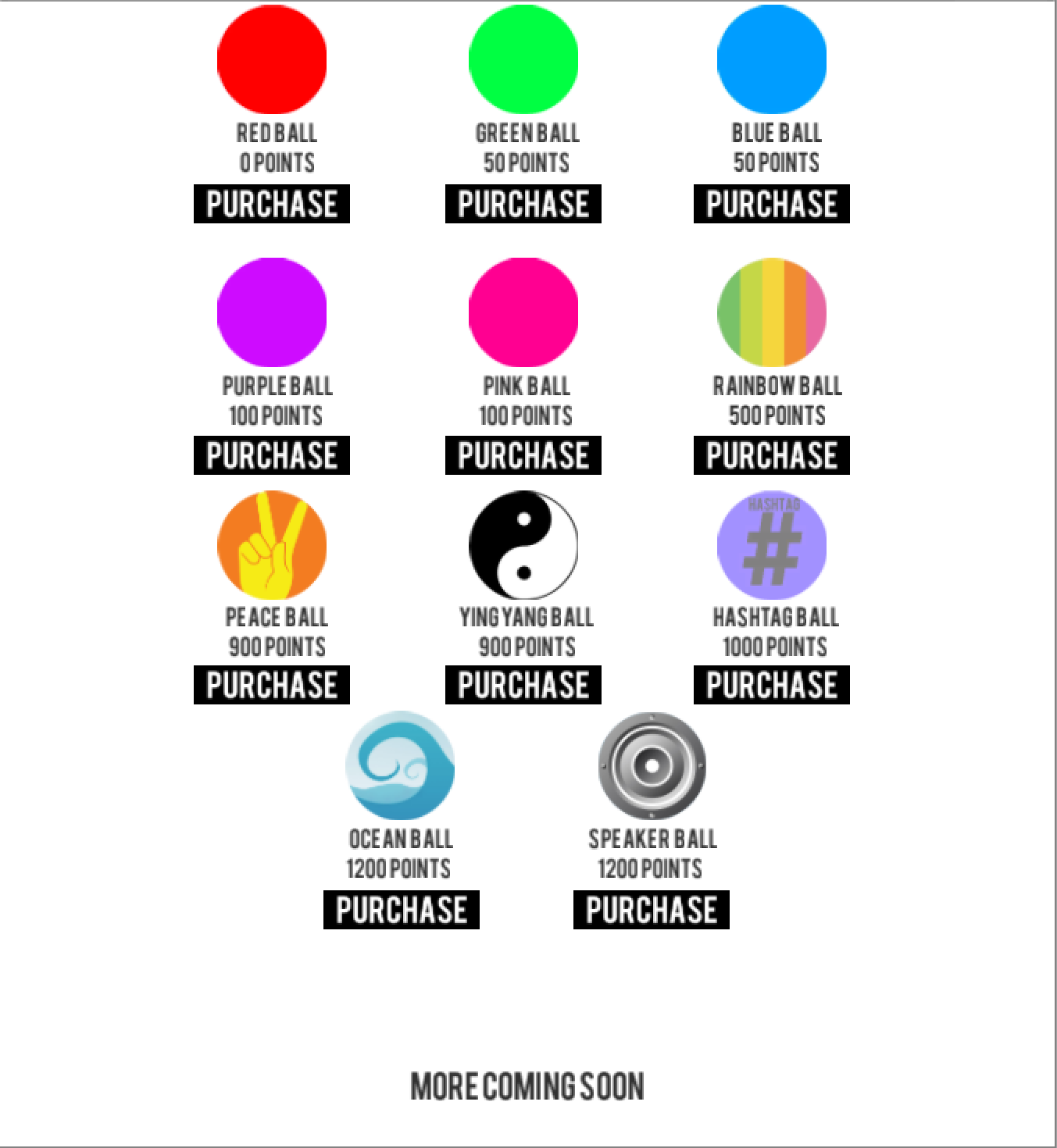
The circle, or rather "ball" edges are cut off. Also the buttons don't look good in black. I'd suggest looking up flatuicolors (because I can't post links yet) and test out some of those, they make for very clean designs.
Thread: [UI] My new iPhone Game
Results 1 to 13 of 13
-
04-22-2015 #1


- Join Date
- May 2012
- Gender

- Location
- Posts
- 467
- Reputation
 42
42- Thanks
- 613


[UI] My new iPhone Game
Constructive Criticism Please!

I am better at the coding part haha
-
04-23-2015 #2Novice


- Join Date
- Jul 2014
- Gender
- Posts
- 61
- Reputation
- 10
- Thanks
- 10
-
The Following User Says Thank You to iSynHD For This Useful Post:
Chase (04-23-2015)
-
04-23-2015 #3
Threadstarter
- Join Date
- May 2012
- Gender
- Location
- Posts
- 467
- Reputation
- 42
- Thanks
- 613
thoughts?

-
04-23-2015 #4Do not Trade - Blacklisted
Permanently 

- Join Date
- Sep 2010
- Gender
- Location
- Posts
- 10,088
- Reputation
 515
515- Thanks
- 690
- My Mood
-


Somehow around some letters like the "A" letter the edges are pixelated, and the circles have square edges in some parts that should be round up. Also prefer the gray BG to the white BG, like you did in third pic.
Formerly known as gamer4evere


-
04-23-2015 #5Novice
- Join Date
- Jul 2014
- Gender
- Posts
- 61
- Reputation
- 10
- Thanks
- 10
There you go, that looks much cleaner. And as Mokou-Sama said the letters seem very pixelated and too sharp, though it may just be the picture quality with Gyazo. Other than that it looks great! Originally Posted by Chase™

-
04-23-2015 #6
Threadstarter
- Join Date
- May 2012
- Gender
- Location
- Posts
- 467
- Reputation
- 42
- Thanks
- 613
Its also designed for iPhone, so they will be a lot smaller Originally Posted by iSynHD
-
04-23-2015 #7Novice
- Join Date
- Jul 2014
- Gender
- Posts
- 61
- Reputation
- 10
- Thanks
- 10
Fair enough, have you found a way to fix the circles or rather re-do them? Originally Posted by Chase™
-
04-24-2015 #8
Threadstarter
- Join Date
- May 2012
- Gender
- Location
- Posts
- 467
- Reputation
- 42
- Thanks
- 613
The graphics are fine, when I imported them into the build they showed up like that, idk how to fix... Originally Posted by iSynHD
-
04-25-2015 #9


- Join Date
- Nov 2011
- Gender
- Location
- Posts
- 1,662
- Reputation
- 848
- Thanks
- 1,013
- My Mood
-

 Do you need any help with the graphic part? If you do PM me, I will try help you Originally Posted by Chase™
 Reputation power: 20
Previous names:
Kakershi
Player
You wanna help me cause I helped you? Click in "Donate"!

-
04-25-2015 #10
Threadstarter
- Join Date
- May 2012
- Gender
- Location
- Posts
- 467
- Reputation
- 42
- Thanks
- 613
Nah the issue is Unity cropping incorrectly. Originally Posted by Kakershi
-
05-05-2015 #11Newbie

- Join Date
- Mar 2015
- Gender
- Posts
- 34
- Reputation
- 10
- Thanks
- 2

Personally, I really like the simple black buttons & white background,
Make the title on first picture "cracks" darker ( or maybe it's just my iPad screen..)
And change that 'hashtag ball's background color, and center the hashtag, removing the text on it.
-
05-07-2015 #12


- Join Date
- Sep 2012
- Gender
- Location
- Posts
- 750
- Reputation
- 10
- Thanks
- 83
- My Mood
-


Seem's pretty nice and simple, I would move the name and the menu a little bit more up.
-
05-08-2015 #13Newbie

- Join Date
- Apr 2015
- Gender
- Posts
- 28
- Reputation
- 10
- Thanks
- 4
- My Mood
-
Hello, I like Hisoka too Originally Posted by iSynHD


Similar Threads
-
[News] New AQ Game: Oversoul [ALPHA TEST LIVE AS OF 9/13]
By Phailsauce in forum BattleOn Games Hacks, Cheats & TrainersReplies: 4Last Post: 11-13-2012, 04:40 AM -
new online game
By 0wner in forum EntertainmentReplies: 6Last Post: 05-20-2009, 08:13 PM -
New online game with prices (hack)
By smiths in forum EntertainmentReplies: 0Last Post: 10-21-2008, 08:27 AM -
New FPS Game Release.
By thug-s0uljah in forum GeneralReplies: 4Last Post: 08-13-2008, 01:01 PM -
the new Nexon Game manager difficulty
By angrytater in forum WarRock Korea HacksReplies: 15Last Post: 09-29-2007, 11:08 AM