


 Reply With Quote
7.5/10
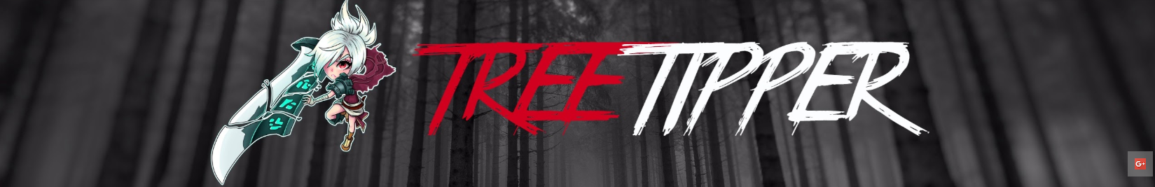
Looks pretty decent tbh. Put some more shade effect on it I would say.
Thread: Rate my youtube banner
Results 16 to 30 of 113
-
12-26-2018 #16


- Join Date
- Nov 2013
- Gender

- Location
- Posts
- 268
- Reputation
 25
25- Thanks
- 24
- My Mood
-


Felt like all these were just grabbed off Google.. Maybe try to be a little more unique, Hope it helps
-
12-27-2018 #17Newbie


- Join Date
- Dec 2018
- Gender
- Posts
- 31
- Reputation
- 57
- Thanks
- 0

-
12-27-2018 #18Member

- Join Date
- Dec 2018
- Gender
- Posts
- 141
- Reputation
- 10
- Thanks
- 7
- My Mood
-

I've always loved the contrast of Red and White. Nice.
-
01-04-2019 #19New Member

- Join Date
- Nov 2018
- Gender
- Posts
- 19
- Reputation
- 10
- Thanks
- 3

7/10. good but can be better
-
01-05-2019 #20Team Ehrenlos Co-Founder

- Join Date
- Aug 2017
- Gender
- Posts
- 461
- Reputation
- 427
- Thanks
- 347
- My Mood
-


 Try maybe this style?
 Originally Posted by time007

A version made by me:

-
The Following User Says Thank You to defaulto For This Useful Post:
Glass (11-22-2019)
-
01-05-2019 #21Dual-Keyboard Member

- Join Date
- Mar 2018
- Gender
- Location
- Posts
- 306
- Reputation
- 10
- Thanks
- 14
- My Mood
-

6.5/10
it needs some more things going on and not just riven but its cool IM
IM
Click on "contact me" to add me on IM
-
01-08-2019 #22
Time's Pimp 


- Join Date
- Jun 2015
- Gender
- Posts
- 9,617
- Reputation
 2835
2835- Thanks
- 3,002
- My Mood
-

 I'd put OP at 4/10, and this at maybe a 9, so much better. Originally Posted by defaulto


I am not a middleman nor do I buy/sell anything. If you are being contacted by someone off-site from MPGH then it's not me! Please report these to me via PM. Don't be stupid, think first.
-
01-09-2019 #23New Member

- Join Date
- Jan 2019
- Gender
- Posts
- 12
- Reputation
- 10
- Thanks
- 1
- My Mood
-

A bit too flat and color choices are a bit awkward
-
01-19-2019 #24Dual-Keyboard Member

- Join Date
- Nov 2018
- Gender
- Location
- Posts
- 448
- Reputation
- 10
- Thanks
- 25
- My Mood
-


You'd include detail. Improvement required.
This world is rotten, and those who are making it rot deserve to die..."
-
01-21-2019 #25Newbie

- Join Date
- Nov 2018
- Gender
- Posts
- 21
- Reputation
- 10
- Thanks
- 3
- My Mood
-

7/10 try a more interesting background I would say
-
01-21-2019 #26New Member
- Join Date
- Jan 2018
- Gender
- Posts
- 18
- Reputation
- 10
- Thanks
- 0

really enjoy it, simple and clean nice work.
-
01-22-2019 #27New Member

- Join Date
- Jan 2019
- Gender
- Location
- Posts
- 19
- Reputation
- 10
- Thanks
- 0
- My Mood
-


5/10 u can't more
-
01-26-2019 #28New Member

- Join Date
- Jan 2019
- Gender
- Posts
- 15
- Reputation
- 10
- Thanks
- 0
- My Mood
-

it doesnt really stand out to me. basic font, just a copy pasted image. i'd recommend getting some custom drawn art and use a non flat background
-
02-03-2019 #29New Member
- Join Date
- Jan 2019
- Gender
- Posts
- 20
- Reputation
- 10
- Thanks
- 0
not bad work
-
02-06-2019 #30New Member
- Join Date
- Jan 2019
- Gender
- Posts
- 23
- Reputation
- 10
- Thanks
- 8

not bad at all. would add a few more color though
Similar Threads
-
[Graphic Art] Rate My New *New* (youtube) Banner
By sponers in forum Art & Graphic DesignReplies: 26Last Post: 07-17-2017, 03:03 AM -
[Graphic Art] Rate My New (youtube) Banner
By sponers in forum Art & Graphic DesignReplies: 7Last Post: 06-21-2017, 10:58 AM -
Youtube banner?
By InfernoClan in forum Art & Graphic DesignReplies: 1Last Post: 01-21-2015, 07:39 AM -
[Request] For free Youtube banner, simple is fine
By QuasiChill in forum Help & RequestsReplies: 1Last Post: 07-27-2013, 10:58 PM -
Youtube banner , cool
By JacketJr in forum GeneralReplies: 17Last Post: 10-10-2011, 07:27 PM