


They all look extremely Low quality..
Thread: The rest of my jobs.
Results 1 to 6 of 6
-
05-01-2011 #1Newbie


- Join Date
- Dec 2010
- Gender

- Posts
- 55
- Reputation
 10
10- Thanks
- 2
- My Mood
-


The rest of my jobs.
Sorry for my mistake.
Take a look at my jobs:

-
05-01-2011 #2


- Join Date
- Oct 2009
- Gender
- Posts
- 13,715
- Reputation
 2077
2077- Thanks
- 3,264
- My Mood
-


-
05-01-2011 #3Banned


- Join Date
- Dec 2008
- Gender
- Location
- Posts
- 4,376
- Reputation
- 430
- Thanks
- 409
- My Mood
-

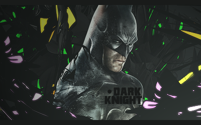
Batman; doesnt really mesh with the BG, text blows
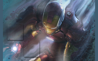
Iron man; Nice, could do without the squares
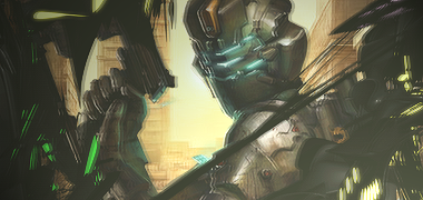
Dead Space; Perfect, effect works nicely
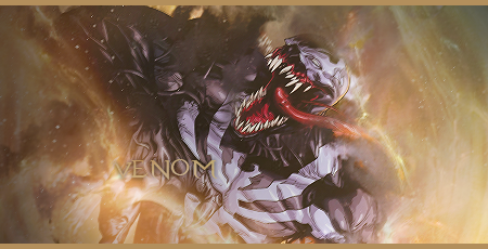
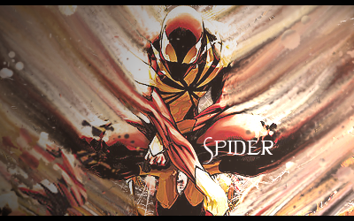
Whatever the venom thing is; Flow could use some work on the right side
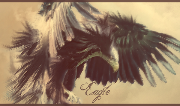
Eagle; Just no
Old Tiger guy; Effect ruins it, likewise with the latter
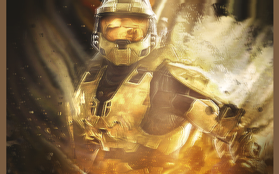
Halo; ^
Whatever the bottom thing is; Smudging is pretty awful
-
05-01-2011 #4


- Join Date
- Aug 2010
- Gender
- Location
- Posts
- 2,402
- Reputation
- 57
- Thanks
- 155

they make me feel dizzy -_-

-
05-01-2011 #5


- Join Date
- Dec 2008
- Gender

- Location
- Posts
- 24,316
- Reputation
- 3869
- Thanks
- 5,890
- My Mood
-

Download some psd's and stuff. Ease up on the exposure/lighten
https://www.mpgh.net/forum/8-graphic-...eyes-only.htmlTHE ABSOLUTE GREATEST


-
05-02-2011 #6Do not Trade - Blacklisted
Permanently 

- Join Date
- Sep 2010
- Gender
- Location
- Posts
- 10,088
- Reputation
- 515
- Thanks
- 690
- My Mood
-

Like them, not very bad, but need some improvement.
Formerly known as gamer4evere


