


 Reply With Quote
a nice render would do
Thread: I'm seeing Stars.
Results 1 to 15 of 15
-
08-23-2011 #1Hollywood Undead's Bitches.


- Join Date
- Jun 2010
- Gender

- Location
- Posts
- 4,811
- Reputation
 306
306- Thanks
- 398
- My Mood
-


I'm seeing Stars.
[IMG]https://i290.photobucke*****m/albums/ll245/XMOONFIREX/stars-1.jpg[/IMG]
Looks a bit empty on the left. Suggestions please I see what you did there.
-
08-23-2011 #2MPGH rules.


- Join Date
- Jan 2009
- Gender
- Location
- Posts
- 841
- Reputation
- 46
- Thanks
- 275
- My Mood
-

 A.K.A Lilleanders
 Originally Posted by Ghost

[IMG]https://i218.photobucke*****m/albums/cc13/drunkenfistmaster/gifs/arianakissu.gif[/IMG]
-
08-23-2011 #3


- Join Date
- Jan 2011
- Gender

- Posts
- 11,299
- Reputation
 783
783- Thanks
- 1,287
- My Mood
-

-
08-23-2011 #4
ThreadstarterHollywood Undead's Bitches.
- Join Date
- Jun 2010
- Gender
- Location
- Posts
- 4,811
- Reputation
- 306
- Thanks
- 398
- My Mood
-
air brushing Originally Posted by ᴡɪᴢ ᴋʜᴀʟɪғᴀ
 I see what you did there.
-
08-23-2011 #5
- Join Date
- Jan 2011
- Gender
- Posts
- 11,299
- Reputation
- 783
- Thanks
- 1,287
- My Mood
-
-
08-23-2011 #6Banned


- Join Date
- Jul 2010
- Gender
- Location
- Posts
- 1,878
- Reputation
- 69
- Thanks
- 119
- My Mood
-


Text would go perfectly on the left.
-
08-23-2011 #7
Young angel; if you hate me tell me burn in heaven♥. 

- Join Date
- May 2011
- Gender
- Location
- Posts
- 1,778
- Reputation
- 339
- Thanks
- 4,456
- My Mood
-


Put the text "Pretend to see"
 "Do not argue with an idiot. He will drag you down to his level and beat you with experience."Princess since: 7/3/2012Need something translated from/to English? PM/VM me!
-
08-23-2011 #8Blackhat Hacker

- Join Date
- Mar 2011
- Gender
- Posts
- 1,846
- Reputation
- 150
- Thanks
- 361
- My Mood
-


Not having a random black spot would be nice also it looks intentional
Borders also dont work
-
08-23-2011 #9Expert Member

- Join Date
- Apr 2009
- Gender
- Posts
- 742
- Reputation
- 23
- Thanks
- 51
- My Mood
-

Signatures like this need a smaller canvas to work with. Theres to much empty space on the left which ruins it, and if you put text on the left it will just bring the attention away from the focal...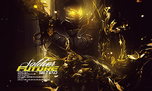
-
08-23-2011 #10
ThreadstarterHollywood Undead's Bitches.
- Join Date
- Jun 2010
- Gender
- Location
- Posts
- 4,811
- Reputation
- 306
- Thanks
- 398
- My Mood
-
a bit too long? / Originally Posted by katylovez
Originally Posted by fecher
Thanks, I'll get to it Originally Posted by Keroaplt
 I see what you did there.
-
08-23-2011 #11
Young angel; if you hate me tell me burn in heaven♥.
- Join Date
- May 2011
- Gender
- Location
- Posts
- 1,778
- Reputation
- 339
- Thanks
- 4,456
- My Mood
-
Hmm. Then, "In the Sky" / Originally Posted by Da Kurlzz
idk
"Do not argue with an idiot. He will drag you down to his level and beat you with experience."Princess since: 7/3/2012Need something translated from/to English? PM/VM me!
-
08-24-2011 #12LIL ADMIN, R.I.P. LIL DAVE


- Join Date
- Feb 2011
- Gender
- Location
- Posts
- 40,134
- Reputation
- 4764
- Thanks
- 9,674

I would've added and spread more space/star stocks on that empty place, lower the fill and opacity and set it to overlay, that way you can get a bit of flow into that space and it wouldn't looked to drenched out. Also that open space would be perfect for text, maybe something transparent, bold, and good looking. The black border on the bottom and top is unneeded, without it it becomes better looking.
I love the "glow" beside his right shoulder on the signature, but maybe just lower it down slightly.
Overall IMO getting rid of the border, lowering the lighting beside his shoulder, adding more space/star stocks to that empty space - setting it to overlay - lowering fill and opacity, and adding text would make it look nice. [ ] [ ] [ ] [ ][ ]
Editor from 06142011 2014
Donator since 09162011
Minion from 10102011 01062011
Minion+ from 01062012 08082012
Moderator from 08082012 10062012
Global Moderator from 10062012 12052017
Staff Administrator from 12052017 05012019
Trusted Member since 07132019
Global Moderator since 09112020

-
08-24-2011 #13


- Join Date
- Jun 2011
- Gender
- Location
- Posts
- 7,339
- Reputation
- 413
- Thanks
- 2,397
- My Mood
-

-
08-24-2011 #14
ThreadstarterHollywood Undead's Bitches.
- Join Date
- Jun 2010
- Gender
- Location
- Posts
- 4,811
- Reputation
- 306
- Thanks
- 398
- My Mood
-
i see thanks Originally Posted by Hero
i don't really get under which circumstances where you'd use a border and when not to I see what you did there.
-
08-26-2011 #15Banned
- Join Date
- Aug 2011
- Gender
- Posts
- 1,599
- Reputation
- 2
- Thanks
- 68
- My Mood
-
10/10 Very good work!


 [/URL]

Similar Threads
-
Star Wars Episode 7
By arunforce in forum SCI-FIReplies: 16Last Post: 04-17-2019, 04:35 PM -
something you might wanna see
By Associate in forum GeneralReplies: 10Last Post: 05-27-2010, 02:52 PM -
lets see what everyone looks like
By yocinfluence in forum GeneralReplies: 96Last Post: 05-02-2006, 07:43 PM -
I see dead people
By arunforce in forum Art & Graphic DesignReplies: 2Last Post: 01-19-2006, 04:21 PM -
Battle Star Galactica
By Dave84311 in forum SCI-FIReplies: 4Last Post: 01-05-2006, 10:31 AM