

Thread: Team AIR here i come
Results 1 to 14 of 14
Hybrid View


-
10-31-2011 #1Title removed. Pornographic url. Will result in a ban in the future.


- Join Date
- Jan 2010
- Gender

- Location
- Posts
- 5,072
- Reputation
 204
204- Thanks
- 665
- My Mood
-


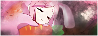
Team AIR here i come
-
The Following User Says Thank You to Paradox For This Useful Post:
The Philosopher (10-31-2011)
-
10-31-2011 #2Brony


- Join Date
- Feb 2009
- Gender
- Location
- Posts
- 3,966
- Reputation
- 31
- Thanks
- 423
- My Mood
-


Gotdamn man, too bright.
-
10-31-2011 #3Banned


- Join Date
- Oct 2011
- Gender
- Location
- Posts
- 319
- Reputation
- 22
- Thanks
- 12
- My Mood
-


Looks like brush overwhore even though I'm not sure what that's made of.
And bright tags are so last year.
-
10-31-2011 #4


- Join Date
- Oct 2009
- Gender
- Posts
- 13,715
- Reputation
 2077
2077- Thanks
- 3,264
- My Mood
-

Too much crap on your focal I think, and yeah it is quite bright.
Least that rectangle is out of there tho.

-
10-31-2011 #5Blackhat Hacker


- Join Date
- Mar 2011
- Gender
- Posts
- 1,846
- Reputation
- 150
- Thanks
- 361
- My Mood
-


Holy fuck yes that is so good
Except first I need to know what you did to make the effects
-
The Following User Says Thank You to Keroaplt For This Useful Post:
The Philosopher (10-31-2011)
-
10-31-2011 #6Banned
- Join Date
- Oct 2011
- Gender
- Location
- Posts
- 319
- Reputation
- 22
- Thanks
- 12
- My Mood
-
Tutorial/PSD

-
10-31-2011 #7Expert Member
- Join Date
- Jan 2010
- Gender
- Posts
- 565
- Reputation
- 15
- Thanks
- 37
- My Mood
-


https://fc02.deviantart.net/fs70/f/20...hy-d35eulb.png
dis tut?
cuhs its the same render[IMG]https://i152.photobucke*****m/albums/s198/blackbliss11/blackorbs_zps443616a7.png[/IMG]
-
10-31-2011 #8Brony
- Join Date
- Feb 2009
- Gender
- Location
- Posts
- 3,966
- Reputation
- 31
- Thanks
- 423
- My Mood
-
el nop . Originally Posted by +dd.Shift

-
10-31-2011 #9Dual-Keyboard Member

- Join Date
- Oct 2011
- Gender
- Posts
- 368
- Reputation
 -14
-14- Thanks
- 11
- My Mood
-

Looks sick. make me a sig lmao
-
10-31-2011 #10Brony
- Join Date
- Feb 2009
- Gender
- Location
- Posts
- 3,966
- Reputation
- 31
- Thanks
- 423
- My Mood
-
el you didn't give CnC ya retard Originally Posted by iToXiK
-
10-31-2011 #11


- Join Date
- Dec 2008
- Gender

- Location
- Posts
- 24,316
- Reputation
- 3869
- Thanks
- 5,890
- My Mood
-

Too one directional, too many lightning brushes, loooks even worse when some are on lower opacity. The colours are okay, and the smudging is pretty good, just the elements I listed make the tags messy to look at.
THE ABSOLUTE GREATEST


-
10-31-2011 #12Banned
- Join Date
- Aug 2008
- Gender
- Location
- Posts
- 6,208
- Reputation
- 292
- Thanks
- 778
- My Mood
-


also used this render in like '09 lololo

anyways, i'm liking the effects but other than that.. its sort of plain and looks kinda messy to me.
-
11-01-2011 #13
ThreadstarterTitle removed. Pornographic url. Will result in a ban in the future.
- Join Date
- Jan 2010
- Gender
- Location
- Posts
- 5,072
- Reputation
- 204
- Thanks
- 665
- My Mood
-
the top right hand was "cut off" tried to cover it up with low opacity smudging xD
-
11-01-2011 #14Blackhat Hacker

- Join Date
- Aug 2009
- Gender
- Location
- Posts
- 1,752
- Reputation
- 34
- Thanks
- 232
- My Mood
-


Swag <3 ;3

 Reply With Quote
Similar Threads
-
Puberty here i come!
By Mr.Magicman in forum GeneralReplies: 40Last Post: 07-12-2010, 10:38 AM -
Microsoft Fag Here I Come
By zmansquared in forum GeneralReplies: 60Last Post: 07-11-2010, 01:33 PM -
scrim team apply here
By invisible29 in forum CrossFire Hacks & CheatsReplies: 3Last Post: 01-13-2010, 06:52 AM -
Failboat, here it comes *CHOO CHOO*
By Mexiforce in forum GeneralReplies: 6Last Post: 03-21-2008, 10:17 AM -
Bananas... here I come!
By Beer_Hunter in forum GeneralReplies: 3Last Post: 06-25-2006, 07:02 PM