You should darken the blue a bit
Results 1 to 10 of 10
-
05-15-2012 #1
 Pre-release opinions: [Monster Hunter] Tigrex MP7

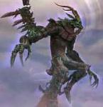
Before I release this, (unless I change my mind and plan on not releasing it) should I keep the blue tiger stripes, fix it by increasing/decreasing the visibility, do something else to improve it, or get rid of it? It kind of makes the gun look strange, but it's supposed to be camouflaged like Tigrex from Monster Hunter, which is basically yellow-orange with blue stripes. Should I resize or reposition the main image on the gun, or is it fine where it is? If I should reposition it anywhere else, where should I place it? Also, should I add dragon scales for fun, or is that overdoing it? I could easily add them without completely destroying the gun, but then again, maybe plain guns are better... (or I could release one with scales and one without them...) Besides that, is there anything else that should be changed on the gun? I'm not a huge fan of flaws in my mods, so I want to know what everyone thinks. Don't worry i'll take criticism, if you like it or hate it, i'll hear you out.
-
05-15-2012 #2


Mods-25
-
The Following User Says Thank You to ray4139 For This Useful Post:
adoramereku (05-15-2012)
-
05-15-2012 #3
-
05-15-2012 #4
In my opinion it makes it more noticeable


Mods-25
-
05-15-2012 #5
-
The Following User Says Thank You to aeronyx For This Useful Post:
adoramereku (05-15-2012)
-
05-15-2012 #6
-
05-16-2012 #7
-
The Following User Says Thank You to aeronyx For This Useful Post:
adoramereku (05-16-2012)
-
05-16-2012 #8
-
The Following User Says Thank You to adoramereku For This Useful Post:
aeronyx (05-16-2012)
-
05-16-2012 #9
@adoramereku
MUCH better. This time, change the fill option instead of opacity.
The saturation of the blue stripes is kinda lacking atm
-
The Following User Says Thank You to aeronyx For This Useful Post:
adoramereku (05-16-2012)
-
05-16-2012 #10
 ThreadstarterDual-Keyboard Member

- Join Date
- Sep 2010
- Gender

- Location
- Posts
- 297
- Reputation
 144
144- Thanks
- 78
- My Mood
-

When I change the fill or the saturation, it doesn't seem to make too much of a difference, and it still ends up looking like I just darkened/lightened it with opacity. I'm probably doing something wrong, so i'll just leave the stripes alone until I can figure out how to use fill and saturation better.
Similar Threads
-
[Pre-Release]First Public Hack
By deathbomb3 in forum WarRock - International HacksReplies: 12Last Post: 10-19-2007, 01:08 AM -
Warrock international Pre-Release
By Saprk in forum WarRock - International HacksReplies: 47Last Post: 07-21-2007, 02:32 AM -
JBDrag v6.0 (BlackDrag6) Pre Release
By Jeckels in forum WarRock - International HacksReplies: 29Last Post: 06-06-2007, 10:35 AM -
Pre-Release?
By Hispiforce in forum WarRock - International HacksReplies: 3Last Post: 06-01-2007, 02:25 AM -
Warrock Pre-Pre-Release
By Dave84311 in forum WarRock - International HacksReplies: 88Last Post: 05-24-2006, 03:30 AM


 General


