Thread: Finally

Results 1 to 15 of 15
  1. #1
    Fucking Moron's Avatar
    Join Date
    Mar 2014
    Gender
    male
    Location
    I need smoke
    Posts
    5,529
    Reputation
    1371
    Thanks
    1,618
    My Mood
    Buzzed

    Finally

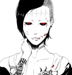
    So yea, here's a piece I was finally in some shape happy about.
    3 Versions


    Tell meh which one you like/ what you do like!
    CnC Please!
    @Color @Mr.Seyeko @KillTheNoise @Ryan @Mokou-Sama @Prince Zuko

  2. #2
    Color's Avatar
    Join Date
    Aug 2012
    Gender
    male
    Posts
    19,896
    Reputation
    2588
    Thanks
    7,864
    My Mood
    Lurking
    You're doing the same thing practically every time, try some different effects and try different color schemes. Still looks bad.

    Member Since 8/05/2012
    Editor 4/04/13 - 4/21/13
    Middleman 7/14/13 - 11/4/13

    Battlefield Minion 6/13/14-3/20/15
    Steam Minion 7/16/14-3/20/15

    Minion+ 10/1/14-3/20/15
    M.A.T. Minion 10/19/14-3/20/15
    ROTMG Minion 1/14/15-3/20/15

    Donator Since 2/26/15 (Thanks @Cursed!)
    Steam Minion 5/9/15 - 11/5/15
    OSFPS Minion 9/15/15 - 11/5/15


  3. #3
    Prince Zuko's Avatar
    Join Date
    May 2013
    Gender
    male
    Location
    The Fire Nation
    Posts
    904
    Reputation
    64
    Thanks
    678
    My Mood
    Aggressive
    I agree with Color, I don't think it looks bad, but it is the same color pattern you use a lot....

    But the 2nd one looks good

  4. #4
    Fucking Moron's Avatar
    Join Date
    Mar 2014
    Gender
    male
    Location
    I need smoke
    Posts
    5,529
    Reputation
    1371
    Thanks
    1,618
    My Mood
    Buzzed
    Quote Originally Posted by Color View Post
    You're doing the same thing practically every time, try some different effects and try different color schemes. Still looks bad.
    Still don't understand why you said it looks bad because I overuse a color scheme. That doesn't make a piece bad fyi
    Quote Originally Posted by Prince Zuko View Post
    I agree with Color, I don't think it looks bad, but it is the same color pattern you use a lot....

    But the 2nd one looks good
    Hehe okai...
    I just like dem Color Schemas haha
    So @Color it's alright if I still do C4D Sigs but different color schemes?

  5. #5
    Prince Zuko's Avatar
    Join Date
    May 2013
    Gender
    male
    Location
    The Fire Nation
    Posts
    904
    Reputation
    64
    Thanks
    678
    My Mood
    Aggressive
    Quote Originally Posted by Organized Chaos View Post


    Still don't understand why you said it looks bad because I overuse a color scheme. That doesn't make a piece bad fyi


    Hehe okai...
    I just like dem Color Schemas haha
    So @Color it's alright if I still do C4D Sigs but different color schemes?
    yee just drop the blue/green/yellowish scheme... it is sorta repetitive.

    But still I like the pieces.

  6. The Following User Says Thank You to Prince Zuko For This Useful Post:

    Fucking Moron (03-11-2015)

  7. #6
    Doc's Avatar
    Join Date
    Dec 2008
    Gender
    female
    Location
    In your meatus
    Posts
    24,316
    Reputation
    3869
    Thanks
    5,890
    My Mood
    Twisted
    Quote Originally Posted by Organized Chaos View Post


    Still don't understand why you said it looks bad because I overuse a color scheme. That doesn't make a piece bad fyi
    An overused and ugly colour scheme does make a piece bad fyi.

    But you have managed to pull it off somewhat okay, I can't say which one is the best version as they all have pro's and cons, but I do suggest changing it up in terms of colour.
    THE ABSOLUTE GREATEST


  8. #7
    Ayanami Rei's Avatar
    Join Date
    Dec 2014
    Gender
    male
    Posts
    458
    Reputation
    42
    Thanks
    76
    awesome art, i love it

  9. #8
    Mokou-Sama's Avatar
    Join Date
    Sep 2010
    Gender
    male
    Location
    Akihabara
    Posts
    10,088
    Reputation
    515
    Thanks
    690
    My Mood
    Amused
    I'd say its an improvement.
    BUT:

    1st pic: Too dark to the left
    2nd pic and 3rd pic: too much light especially around the face, plus there is something bugging me, that makes the face look kinda blurred somehow...
    Dont know how to explain well...
    Formerly known as gamer4evere


    Participated on:
    MPGH GAMING NIGHT 08/03/2015 - Town of Salem


  10. #9
    "We all can be only who we are, no more, no less."
    MPGH Member
    taken4time's Avatar
    Join Date
    May 2009
    Gender
    male
    Posts
    1,076
    Reputation
    12
    Thanks
    43
    Quote Originally Posted by Mokou-Sama View Post
    I'd say its an improvement.
    BUT:

    1st pic: Too dark to the left
    2nd pic and 3rd pic: too much light especially around the face, plus there is something bugging me, that makes the face look kinda blurred somehow...
    Dont know how to explain well...
    I think the explanation you're looking for is defocus..

    as for cnc/ I would advise playing around with a complimentary colors chart..

    "You talk like a drunk man walks: in every direction but where he be headed."
    [IMG]https://i343.photobucke*****m/albums/o450/destructionzone/Edits/Wizardsaresupposedtohavebeards2_zps8b203955.png[/IMG]
    “You mean that it’s not only what he does that makes him dangerous, but also what he feels justified in doing?”

  11. #10
    Fucking Moron's Avatar
    Join Date
    Mar 2014
    Gender
    male
    Location
    I need smoke
    Posts
    5,529
    Reputation
    1371
    Thanks
    1,618
    My Mood
    Buzzed
    Quote Originally Posted by taken4time View Post


    I think the explanation you're looking for is defocus..

    as for cnc/ I would advise playing around with a complimentary colors chart..
    2nd and 3rd are made to look that way...
    Maybe there's to much on the 3rd one thou :/

  12. #11
    Thinking is the Enemy of Creativity. It's Self-Conscious, & Anything Self-Conscious is Lousy.
    Premium Member
    Elocrypt.'s Avatar
    Join Date
    Sep 2009
    Gender
    male
    Location
    Amazon.
    Posts
    3,070
    Reputation
    273
    Thanks
    292
    My Mood
    Amused
    The second one is the better of the three. The left side has a bit of unused black space, seems pointless. The character blends into the whole of the photo too much. The lighting is kinda scattered and confusing, it doesn't flow naturally. The red in the image seems to distract from what I believe should be the focal point of the image, the character in the center.

    I would recommend working a bit on your image depth (Foreground, Middle ground, and Background), your lights (key light, fill light, kicker light, bounce light, and figuring if your image should be high or low key). Also, try practicing with flipping your image horizontally, this will help you get a different perspective on the image and will help balance it out, sometimes you may start focusing on one area and then lose focus on the rest of the image.

  13. #12
    Fucking Moron's Avatar
    Join Date
    Mar 2014
    Gender
    male
    Location
    I need smoke
    Posts
    5,529
    Reputation
    1371
    Thanks
    1,618
    My Mood
    Buzzed
    Quote Originally Posted by Invis. View Post
    The second one is the better of the three. The left side has a bit of unused black space, seems pointless. The character blends into the whole of the photo too much. The lighting is kinda scattered and confusing, it doesn't flow naturally. The red in the image seems to distract from what I believe should be the focal point of the image, the character in the center.

    I would recommend working a bit on your image depth (Foreground, Middle ground, and Background), your lights (key light, fill light, kicker light, bounce light, and figuring if your image should be high or low key). Also, try practicing with flipping your image horizontally, this will help you get a different perspective on the image and will help balance it out, sometimes you may start focusing on one area and then lose focus on the rest of the image.
    Omg x.x
    You're back!

  14. #13
    DavidSulina's Avatar
    Join Date
    Jul 2012
    Gender
    male
    Location
    Croatia
    Posts
    445
    Reputation
    10
    Thanks
    657
    My Mood
    Angelic
    Lovin' the art, keep it up.
    "Peace cannot be kept by force. It can only be achieved by understanding."
    Albert Einstein

  15. #14
    BioHazard's Avatar
    Join Date
    Feb 2013
    Gender
    male
    Location
    Phasing the Shadows
    Posts
    1,074
    Reputation
    27
    Thanks
    253
    My Mood
    Pensive
    In my opinion, you already have them ranked. 1st being the best 3rd being my least favourite. (Just my opinion) but all of them are good m8!

    [IMG]https://i1316.photobucke*****m/albums/t602/xUndeadCamperx/BioHazardSiggy_zps313cd15a.png[/IMG]
    Formerly known as - GangsterDemon
     

  16. #15
    Thinking is the Enemy of Creativity. It's Self-Conscious, & Anything Self-Conscious is Lousy.
    Premium Member
    Elocrypt.'s Avatar
    Join Date
    Sep 2009
    Gender
    male
    Location
    Amazon.
    Posts
    3,070
    Reputation
    273
    Thanks
    292
    My Mood
    Amused
    Quote Originally Posted by Organized Chaos View Post


    Omg x.x
    You're back!
    I am back, I've been busy.

Similar Threads

  1. Finally Found you Guys
    By Chronologix in forum General
    Replies: 11
    Last Post: 09-26-2009, 01:04 PM
  2. Finally 50gb Blue Ray
    By ~Viper~ in forum General
    Replies: 14
    Last Post: 10-10-2006, 10:21 PM
  3. Final Fantasy + Kalmah
    By Chronologix in forum General
    Replies: 4
    Last Post: 09-23-2006, 11:29 PM
  4. joe zombie 6 finally released
    By -[standoff]- in forum General
    Replies: 0
    Last Post: 08-24-2006, 07:10 PM
  5. WORLD CUP! Finals
    By Dave84311 in forum General
    Replies: 27
    Last Post: 07-13-2006, 08:54 AM