Save Me
ArtSave Me
Nice image :O
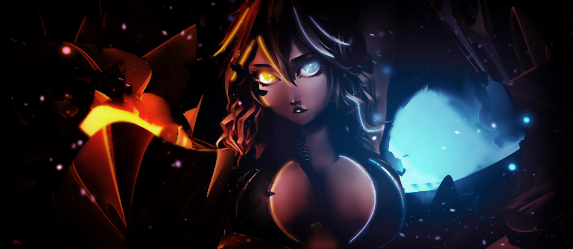
I like the two main colors and how you separate them on the render i guess i would like to see a text in there it may look cooler.Overall its really good ^^
 Originally Posted by Cloud Anarchy

i never do text.
Originally Posted by Organized Chaos
 Originally Posted by Organized Chaos
 Originally Posted by Cloud Anarchy
Text should not be a focal, and as I look at your signature below
The contrast between the BG and your text makes me look to your text first.
So there's that tag ruined
Just one example
If I sounded harsh here, I absolutely don't mean it
Sorry
 Originally Posted by Organized Chaos
you would sound harsh if i thought you were important to me (i think my grammar is fucked up in this setence lol).You may be ok/good on whats your doing but that doesn't mean i have to take your words as a rule xD.Anyway keep up the good work bubby and if you really have some usefull comments about the my singatures please don't hold back i would love to hear them
i like it did you draw it yourself?
Good work however bad image. (the girl looks like she got tit surgery)
I like it ^_^
Appreciate the mention! I like it a lot actually only thing that sticks out to me is that on the left with the fire element if that's what you were going for sticks out a lot more the it's opposite end on the right. Other than that I think it's a pretty good peice good job.
I honestly feel like this sig is boring and 'save me' isn't an appropriate title, the signature just doesn't show that kind of emotion.
I really like the coloring/lighting, you did a awesome job on having appropriate bounce light and the strength of the lighting. The lighting is well balanced and are placed nicely.
What I believe is a C4D on the left side of the image, makes no sense. It has no correlation to what's on the right side of the image, they don't go together even as opposites, just doesn't make sense. This also makes the left side feel like a void, just with a C4D placed in the middle of it. While on the right side, it shows property and and whole, there is actually something there, a place.
The lighting definitely adds some flow to the image.
Here I will point out a couple things:

1. The circle around her face, what is that within the circle (I'm not talking about the eye). It just seems odd, and I found it a little distracting.
2-3. These spots are showing some stair-stepping, quality wise, that's not good. You may have sharpened the image too much, or tried enlarging a non-vector image or even adding some kind of border attribute. If you ever come across stair-stepping, I would try smoothing that part out a little or add an outer glow and then smoothing it out. I believe blur is something you could do as well, but not recommended if you are trying to keep it sharp and, obviously, in focus.
Originally Posted by Organized Chaos
I really like the coloring/lighting, you did a awesome job on having appropriate bounce light and the strength of the lighting. The lighting is well balanced and are placed nicely.
What I believe is a C4D on the left side of the image, makes no sense. It has no correlation to what's on the right side of the image, they don't go together even as opposites, just doesn't make sense. This also makes the left side feel like a void, just with a C4D placed in the middle of it. While on the right side, it shows property and and whole, there is actually something there, a place.
The lighting definitely adds some flow to the image.
Here I will point out a couple things:
1. The circle around her face, what is that within the circle (I'm not talking about the eye). It just seems odd, and I found it a little distracting.
2-3. These spots are showing some stair-stepping, quality wise, that's not good. You may have sharpened the image too much, or tried enlarging a non-vector image or even adding some kind of border attribute. If you ever come across stair-stepping, I would try smoothing that part out a little or add an outer glow and then smoothing it out. I believe blur is something you could do as well, but not recommended if you are trying to keep it sharp and, obviously, in focus.
Originally Posted by Organized Chaos
Originally Posted by Elocrypt.
glad too see yo alive
Really hot one ! Great job, I'm im Love with this one☺


