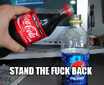
The sub-text is a little too small to read, but other than that, nice job.
Originally Posted by airbag
The sub-text is a little too small to read, but other than that, nice job.
I agree with this, Make the image or the sub-text larger
Looks ripped.
He put his name in the bottom left corner.
shouldn't that make it look not ripped?
Originally Posted by serpentine
shouldn't that make it look not ripped?
No, it makes it look more ripped.
Unless he actually puts his name in a correct place with the correct font and the correct execution and the correct shit that works with this sig, it makes it look more ripped.
nice compiment if you guys think its ripped XD
but i have the PSD
i didnt want my name that big in the middle you know. so i putt in in the lower left in a low opacity against rippers, but i made it by myself
Personally, I think its ripped. Just looks like it is, as Ryan said. But meh, there are better things to worry about.
doesn't matter if you have the psd, sombody could of released it.
and no glow on sub text
subtext is usually used for effect, not to be read.
exactly, and why is everybody's thinking that i have ripped this ?
0 Results
Searched over 1.6630 billion images.
not ripped.
Originally Posted by SofaKingH4rd
0 Results
Searched over 1.6630 billion images.
not ripped.
Tineye is never the base for a final verdict.
They're still growing, plus this image is newly altered and not the original, so there won't be any results.
@kable:
Either that's just an effect, or you're right an he used content aware fill to take something out.
Uhh... anyone notice in the bottom right? Looks kinda... erased :\

 Originally Posted by airbag