Oh, and you said it looks like I barely do anything in my sigs -
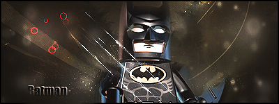
This one to me looks like a star/space background, few added textures, render, and text.
Its good, but why a lego batman xD.
@Wootsters, you are right.
@Devin, BECUZ
It's decent.
Could have a bit more depth.
It seems to be all over the place, and has no decent lighting effects.
The text is a bit plain, and the red circles are out of place.
The render also kills it for me.
I'd give this a 5/10
High Beginner.
Look up some tutorials and practice.
Keep up the good work!
-More depth?
-Lightning effects?
-Red circles out of place? Where should I put them?
Please explain a bit more.
Originally Posted by .Amnesia
-More depth?
-Lightning effects?
-Red circles out of place? Where should I put them?
Please explain a bit more.
The red circles don't fit in with the rest of the signature.
The rest is a bit difficult to explain.
You're using Photoshop correct?
If so, what version?

 Originally Posted by .Amnesia


