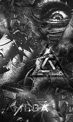
WIP - Lightning

Posts 1–9 of 9 · Page 1 of 1
WIP - Lightning


What font would look nice here?

Any comments, suggestions and critique?

EDIT: According to the critique I've received so far,


Again, what font should be used here, if at all?
Looks like the pliers are the main focus of this... don't think it should be though.
Quote Originally Posted by KABLE View Post
Looks like the pliers are the main focus of this... don't think it should be though.
I didn't catch that, the lighting is messed up!

Thanks!
i like how to sword/ or w/e is the focus but you should brighten up the chick as well to add a layer of lighting to it, (the sword, then the chick holding the sword, then the background.)= what is seen.
Right side is way to empty bro,
blending needs work, put some affects in there, move the focal over to the right a little and just blend it in, and i think this would look nice
Quote Originally Posted by Mr.Seyeko View Post
Right side is way to empty bro,
blending needs work, put some affects in there, move the focal over to the right a little and just blend it in, and i think this would look nice


It's still a WIP, but thanks for the critique.

EDIT: does anyone have a suggested font?

o:
Quote Originally Posted by OxygenLite View Post


It's still a WIP, but thanks for the critique.

EDIT: does anyone have a suggested font?

o:
Impact with Clippy mask, always works maybe with a shadow and some strokes on it also, just play around with it.
I don't feel the flow, its good for a first though
Thanks for all the comments and feedback, guys.
Posts 1–9 of 9 · Page 1 of 1

Post a Reply

Similar Threads

Tags for this Thread

None

Talk with us