Axeman
ArtAxeman
 kek
kek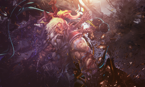
I feel like the composition could be improved a bit. Those C4Ds could be integrated more into the tag, they look a bit out of place. I like the ilumination in it; the background could be less dirty.
I am no graphics designer as I say once again but I'll tell ya what I think xD First off, better than anything I could make. A bit hard to see anything besides the actual man. If you were going for something a bit chaotic then you nailed it.
This is one of your better pieces, I think it's a tad bit too dark.
 Originally Posted by Color

Really worked on the color touch ups at the end.
Looks much better than the old stuff.
It looks epic.
You're going to want to lessen the background noise and dimness of the overall image. I can hardly see the man with the axe unless I let my eyes really focus on it. Way too much going on in the image alone, but a nice work. I think it looks great other than the minor problems I mentioned earlier. I agree with Color this is one of your bests.
Fucking beautiful, I love it. It must take a lot of time coming up with that.
I love the depth it has to it; great colour scheme too.
Long time I don't visit MPGH xD
Anyway I think you need to work on the man's arm because around it its too dark, and the color transition is too harsh, perhaps by putting a layer with white on that zone and in Overlay at 20-30% would suffice to fix that problem a bit. Rest is 10/10, final rating of the piece is 9.5/10 @Organized Chaos
Anyway I think you need to work on the man's arm because around it its too dark, and the color transition is too harsh, perhaps by putting a layer with white on that zone and in Overlay at 20-30% would suffice to fix that problem a bit. Rest is 10/10, final rating of the piece is 9.5/10 @Organized Chaos
Originally Posted by Mokou-Sama
 <3
<3Wow , this one looks really good man !
Your best post there 
looks cool, nice work.
can barely see it. Have a raw file?