ArtSimple thread design
Simple thread design
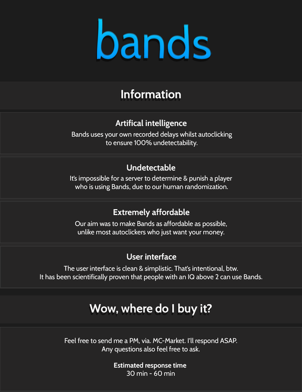
it looks nice but it is a bit bare with just texts and background gradients. My IQ > 2
I like it a lot besides the top text bend, maybe find another way to warp it.
If you're going for simple then take the warp off the "band" text, just leave it white and either put it in all caps or as "Bands" to maintain uniformity.
The "information" text looks slightly smaller than the "Wow, where do I buy it" text. Make them exactly the same size.
The "information" text looks slightly smaller than the "Wow, where do I buy it" text. Make them exactly the same size.
not but except font can be better
looks good, simple