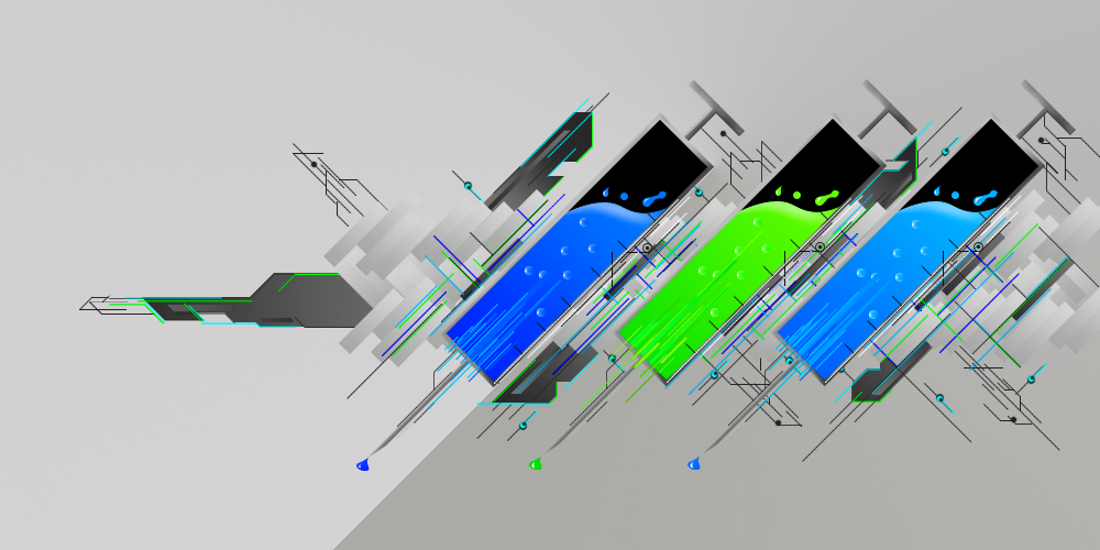
Crazy shit man, 9.5/10.0 it kind of just abruptly ends towards the left, and the background isn't that dazzling, I gave you a 9.5 though cause i knew you hand drew it with the pen tool so yayz for you!
which one is better though
Posts 1–15 of 22 · Page 1 of 2
Post a Reply
Tags for this Thread
None
v2 flows better 2 me.. but its amazing painstaking work. great job.
I like v2, it looks better with the lighter background =)
i reckon v2 aswell
and yes liz incredibly painstaking
V2, and I usually like darker colors too :P
Did this really take 6 hours :O
yes
this is made 100% from scratch
took me around 6hrs total
this shit is amazing dude ima thank + rep ure post just bcuz its so nice(:
I swear ive seen something like this before (not saying you ripped) it looks good :P
i really dont have the patience nor the skill to create something like this
the tag i based it on was in one of our classing sets
and shifts been doing this style
Wow, this takes some patience and dedication. Great job.
Originally Posted by tehshiz
I swear ive seen something like this before (not saying you ripped) it looks good :P
i really dont have the patience nor the skill to create something like this
its based off of this but he made hsi from scratch
[IMG]http://i114.photobucke*****m/albums/n278/zond.png[/IMG]
v2 , but make it a bit darker like v1, but not as dark
nicejob
9.9/10. I like it a lot, only problem is i can't imagine 6 hours for one piece.