The last two are fine, just not the best of them.
What's your deal?
V1.
V3 and V4 are too washed out, and V2, the shades of purple and dark yellow don't work well together when there's a blue as well.
KIU.
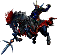
The blurring on the render is odd.
their good man bettter then what i can do haah
I don't like the coloring tbh. I think you should make the bg yellow to go with the render.
Nice job though.
Originally Posted by Haze
I don't like the coloring tbh. I think you should make the bg yellow to go with the render.
Nice job though.
Hehehehe... You're forum name is Haze just like the render... hehe... /facepalm/
I like that one the most.
Originally Posted by Doc
I like that one the most.
Yep i'd agree with that, its not as harsh as the others and the blues are better. I think the render is too big tho and you should have had some yellow in the bg at least.
I think this would look great as a duo-tone piece.
stop with all the variations
most of the time the normal is the best
and dont use borders or center focals
dont center your focal and try not to leave only the head in the sig, try to include the body aswell
Hmm.. I like the V2 with borders, i know i am not too good at sigs, but i think the V2 is more "colorful".