The first one is the best only because the render already has a desaturated feel to it.
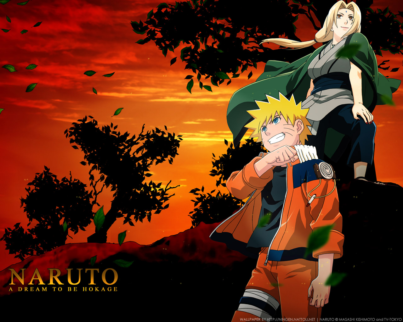
It's not bad but this is a completely different style than your last few. One main thing that I notice in this piece is the lack of flow. You're render seems like it's just kind of placed there.
For the most part I can point out a few reasons why your piece has that sort of effect. For one your have two vertical lines on opposite sides of the render which run almost parallel to each other. In addition to that you also have horizontal smudge lines running across the background. And finally you have a second focus point. All of these things running together really through off the flow of your piece and my eyes are running all over the place when I look at it.
Other than that not bad, glad to see you considered placement and the absence of text. The boarders are a bit thick but I do believe they are necessary for this piece.




 Originally Posted by NextGen1

