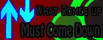
New usertitle.....
Which one looks better?
This:
[IMG]http://i907.photobucke*****m/albums/ac273/Lil_Shorty_B/Whatcomesupmustcomedownnewcolou.jpg[/IMG]
Or This:
[IMG]http://i907.photobucke*****m/albums/ac273/Lil_Shorty_B/Whatcomesupmustcomedown.jpg[/IMG]
I like the Second one the colors seem to flow more together + i like blue
neither, the text just totally drowns out.
use different colors and possibly different font
place the arrows layer BEHIND / UNDER the text layer