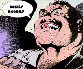
has a white border, just the text with white stroke looks kinda weird with white bg
It's not bad. I feel like you toned down the brightness in some spots that should be brighter. Such as the orange part near his head. Should make that brighter and try and make it more like the light is coming from behind.
---------- Post added at 11:06 AM ---------- Previous post was at 10:44 AM ----------
Originally Posted by SquareSpoon
It's not bad. I feel like you toned down the brightness in some spots that should be brighter. Such as the orange part near his head. Should make that brighter and try and make it more like the light is coming from behind.

 Originally Posted by KING