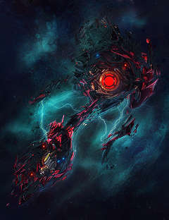
It should be cleaner around his head, because I want to focus at this eyes, not the shitty c4d's around it. Ehm, the lightning is correct, the depth looks good. Nothing more to be added I guess. Keep the rule of thirds in mind, and please, PLEASE, remove the red bar at the bottom.
2nd one,I know that it is abstract, but it's waaaaaaaaaaaaay too small. You can't really see any details because of that size, either expand it or turn it into a wallpaper.
Keep it up, you're improving rapidly.

 (blane style /
 )
) Originally Posted by .Amnesia