 ProxyBite - New Logo - Concept Design!!!
ProxyBite - New Logo - Concept Design!!!
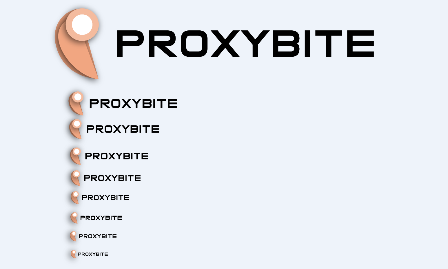
We are trying to design a new logo and brand identity, please give us your opinion about our new logo!!!
http://i.gyazo.com/021fa96eb17963655a0f2c9d46fbadcc.png
http://i.gyazo.com/021fa96eb17963655a0f2c9d46fbadcc.png
i recon its a good design, a simple design that is great, color are good
Nice and simplistic, I like it
Also you can put the URL inside an IMG tag to show it like this [IMG] URL HERE [/IMG] (All together of course)
Like so
Also you can put the URL inside an IMG tag to show it like this [IMG] URL HERE [/IMG] (All together of course)
Like so
Similar Threads
- 7Last post
- 16Last post
- 28Last post