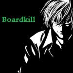
Looks pretty good,That white thing on the top of his head looks odd though.
I like the B&W version personally. 8/10
b&w imo, pretty good, work on lighting, gj, 7.5/10, keep it up
thanks both :X i like b/w more 2..
I like the black and white one too.
Ehmz, effects are pretty cool.
Render isn't blended in really.
No text? :-(
Lightning could be better, as well as depth.
Good sig mang, keep it up. 8/10.
B&W
Try and only have the c4d around the render, instead of taking up the whole bg.
I like the B&W. The depth is pretty good, and the effects are nice, but it feels as if something is missing. I cant put my finger on it though.
Thanks
if anyone wants to try to put a name on it, go ahead.